Context
This section provides information about VersionAbsolute. Feel free to skip ahead if you are already familiar with their work. To know more, please visit versionabsolute.com.
The following project was undertaken at VersionAbsolute Design Studio, a full service wayfinding and sign design consultancy based out of its two studios in India and Hong Kong. It is in the business of creating engaging user experiences for spaces and places. Its work is helping users make sense of the surrounding and navigate complexity while creating memorable experiences.
Project Brief
Description
Wayfinding for Amrita Institute of Medical Sciences (AIMS), an upcoming 2000-bed super-specialty hospital block, medical college, hostel and housing facilities.
Client
PPAL Architects
My Role
Developing wayfinding layouts, product illustrations and mockup drawings, refining signage design and strategy based on initial concept, case study and preliminary sign design.
Objectives
- To navigate people from the city to the hospital campus, within the campus and its buildings and back to the city as conveniently and as intuitively as possible
- To create a ‘speak & recall’ friendly addressing system for easy navigation
- To educate and inform the users of various health & wellness related information
- To create a system that is easy to upgrade and maintain
- To propagate the philosophy of Mata Amritanandamayi Math (MAM), the parent organization behind Amrita institutes and hospitals
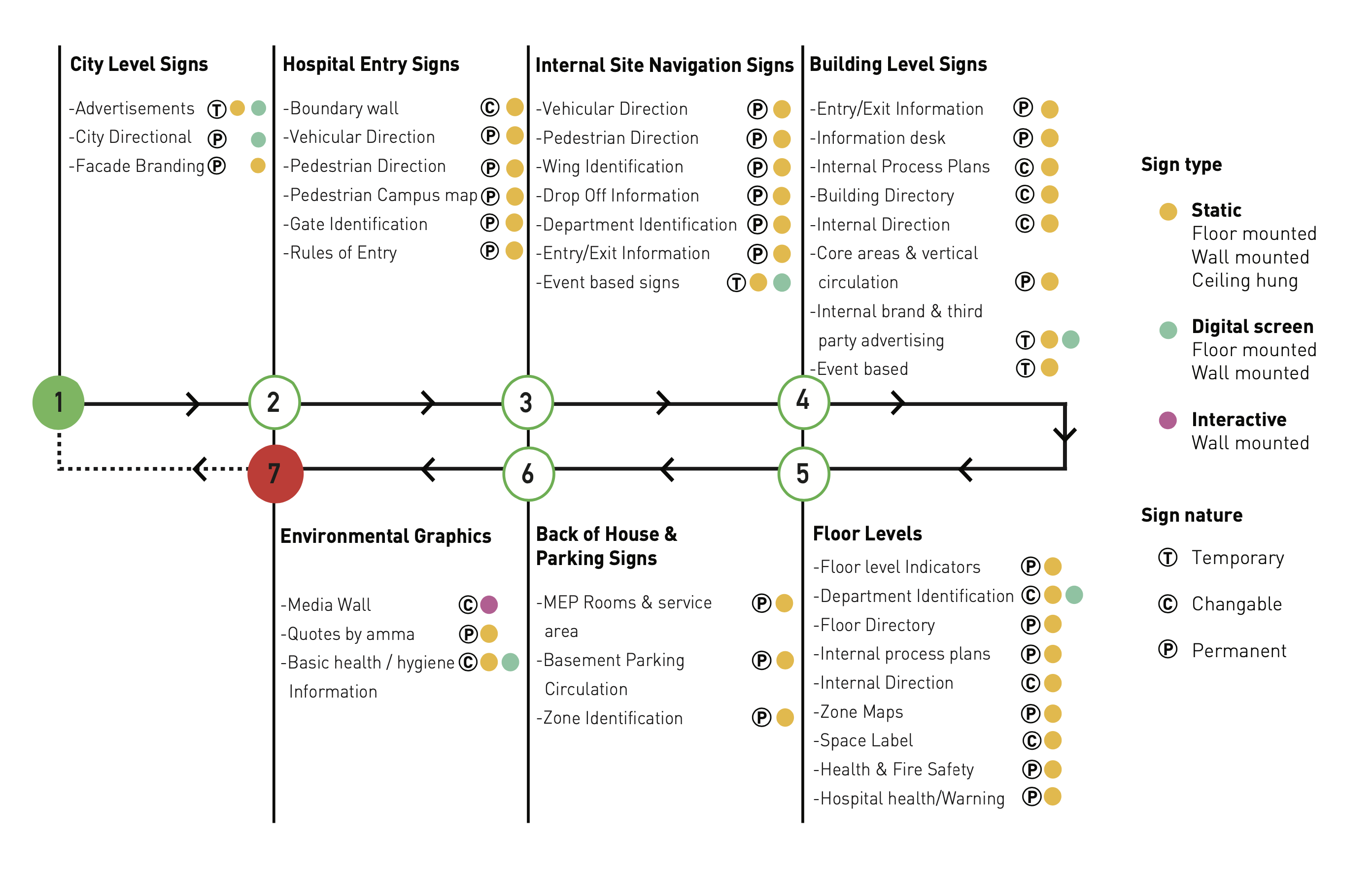
Information Sequence
Developing an information sequence to guide visitors to and from the site, its amenities and out in a sequential, systematic way.
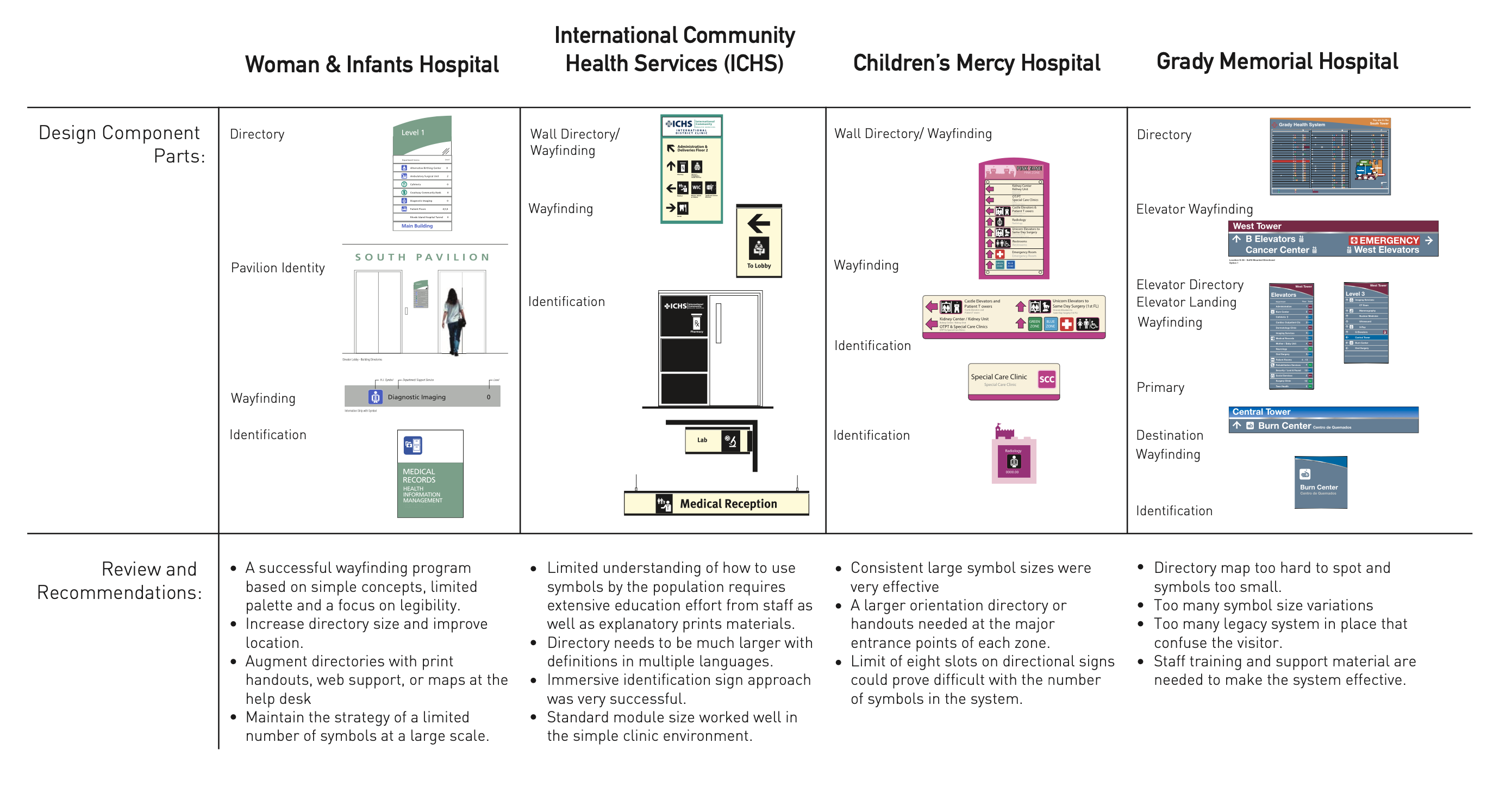
Information Strategy: Best Practices
Looking at best practices in healthcare wayfinding systems worldwide to compare and align learnings and design proposals with international standards.
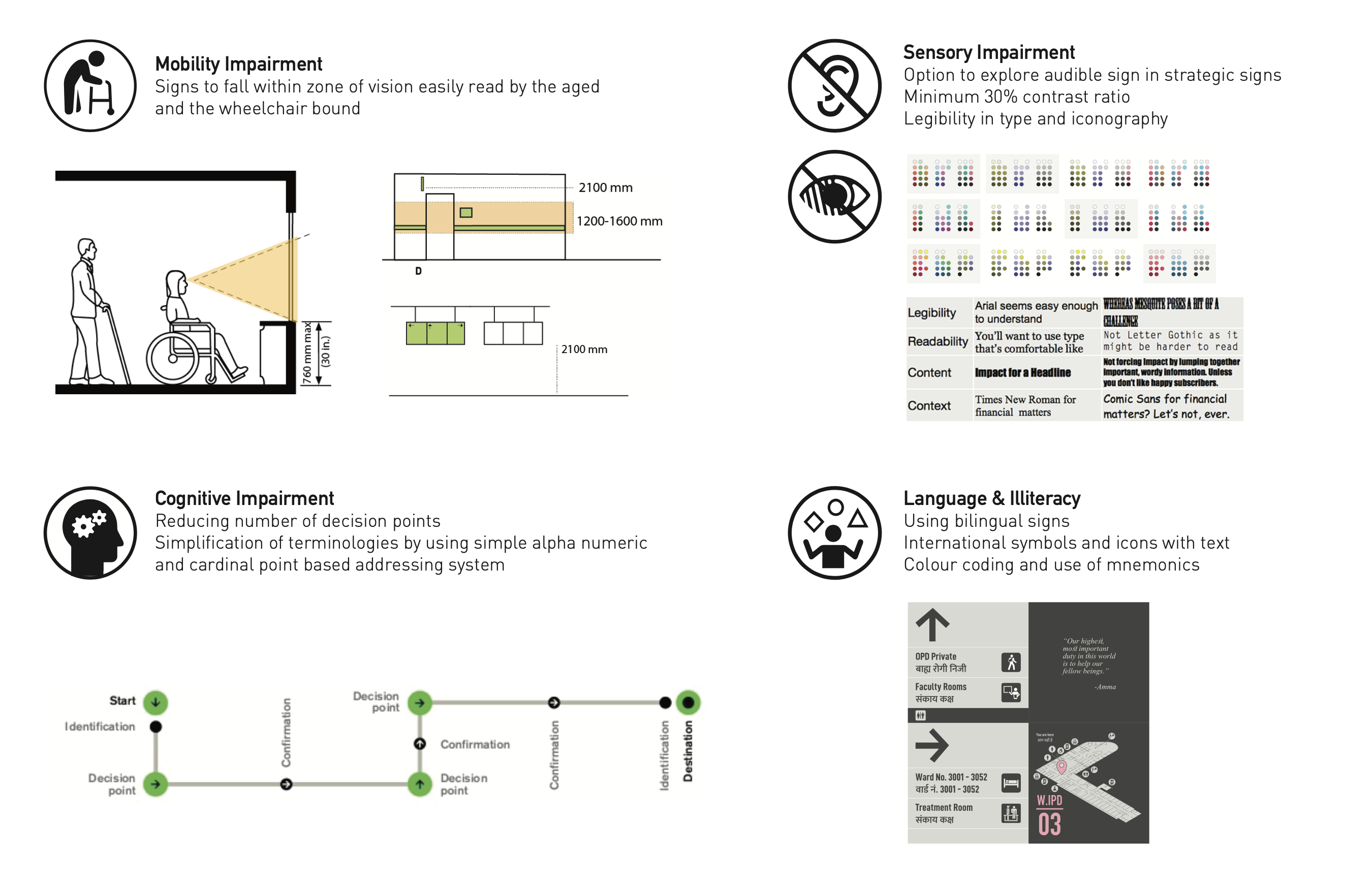
Information Strategy: Standards and Benchmarks
The Hospital has infrastructure catering to an international audience, so the International Health Facility guidelines (IHF 2016) have been followed. The objective is to communicate effectively with the broadest possible group (visitors, patients, and patients with special needs).
Colour Coding & Visual Strategy
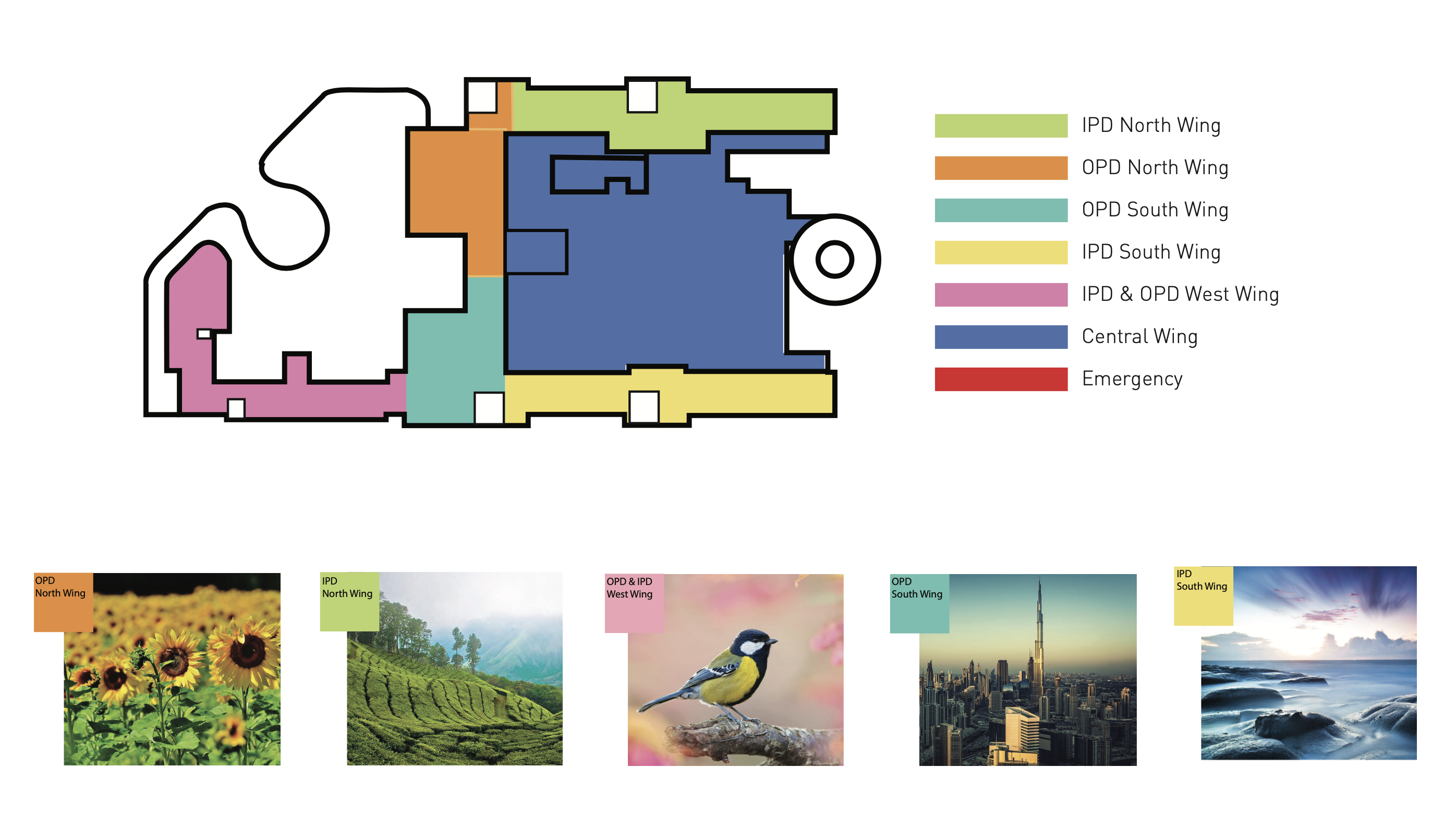
The colour coding and visual strategy has been developed in order to create a ‘speak & recall’ friendly system. This mnemonic strategy is to help navigate, inform and educate users many of whom are not familiar with or read information from signs.
Typography
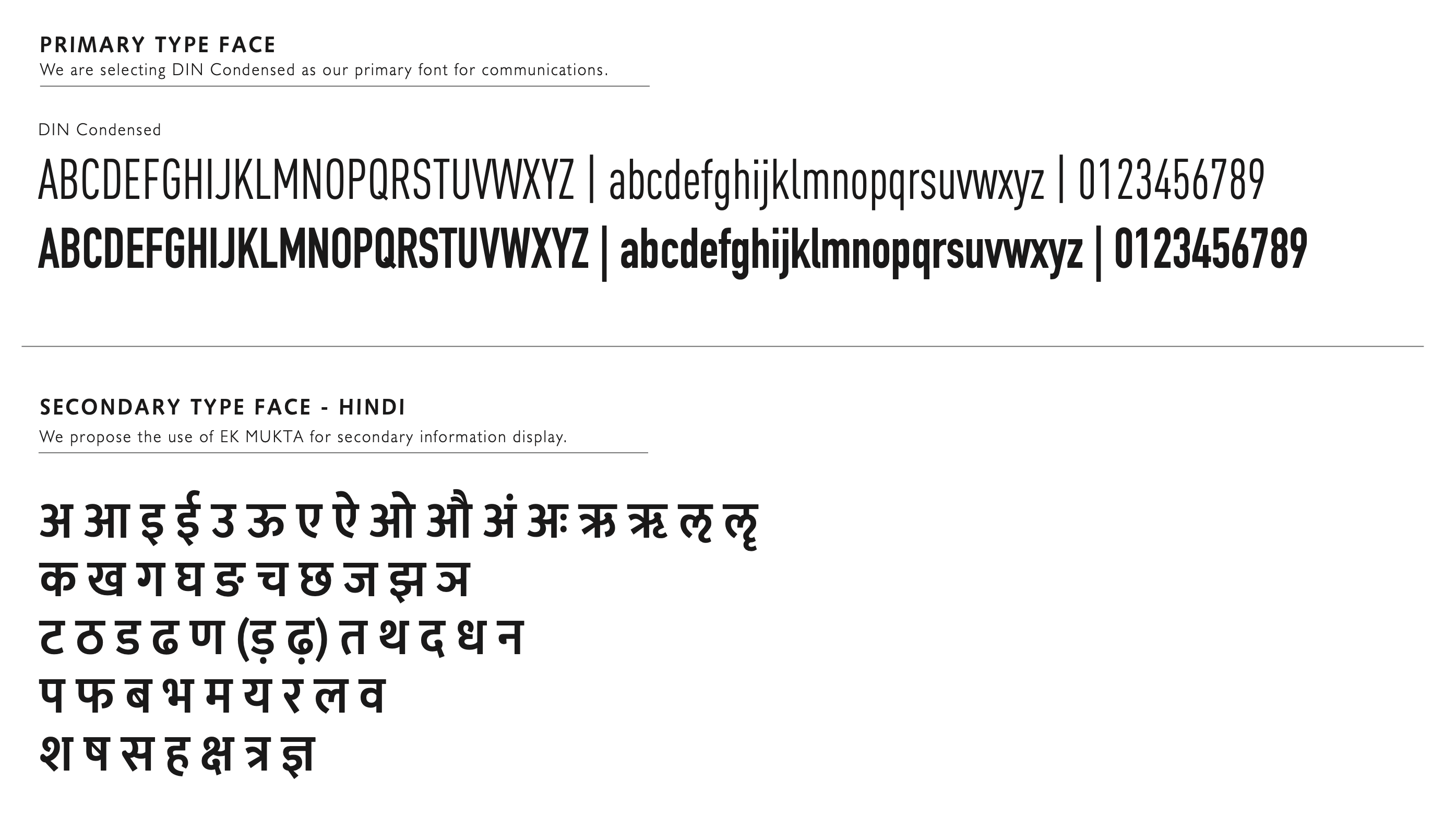
A bilingual typeface strategy has been developed for this project. A condensed font has been selected to be able to fit more information in a smaller area, very useful for hospital signages where departmental or room identification information can frequently exceed provided space.
Iconography: Universal Symbols for Healthcare
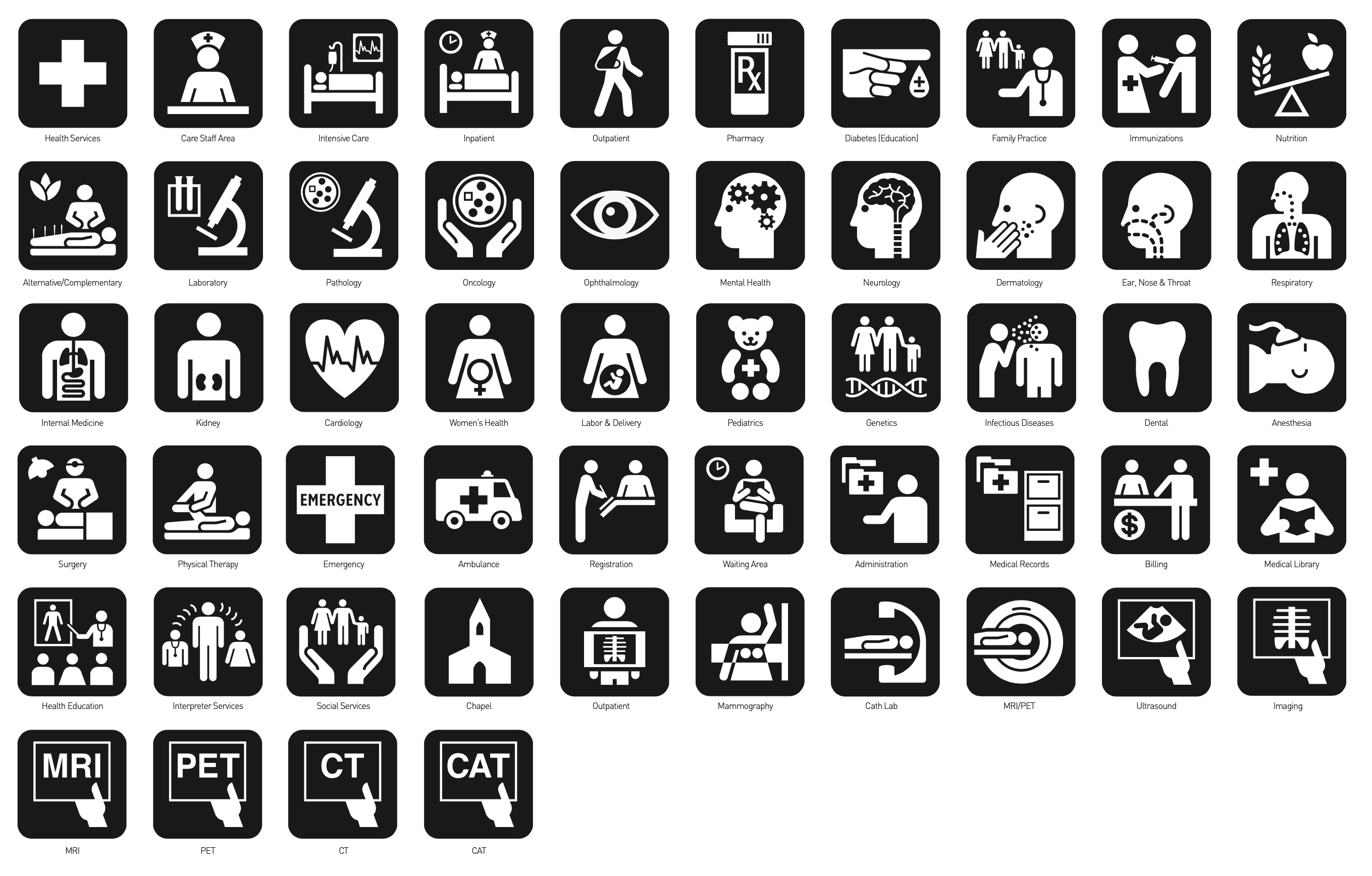
The Universal Symbols for Healthcare developed by SEGD (Society for Experiential Graphic Designs) have been used as the base for the icons and symbols used in the project. The base set of 54 symbols has been expanded upon, keeping in line with the original graphic style, based on the departmental requirements of this project.
Product Design
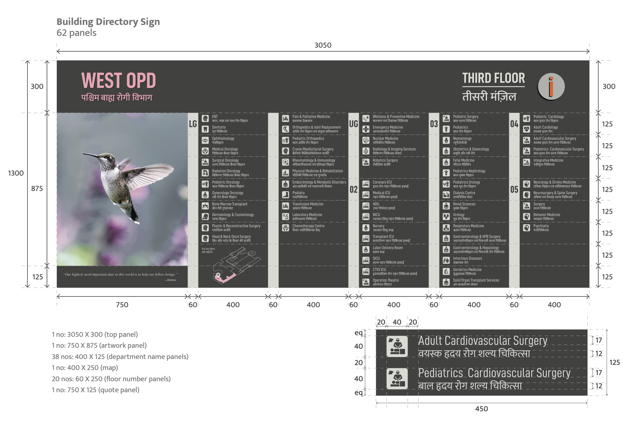
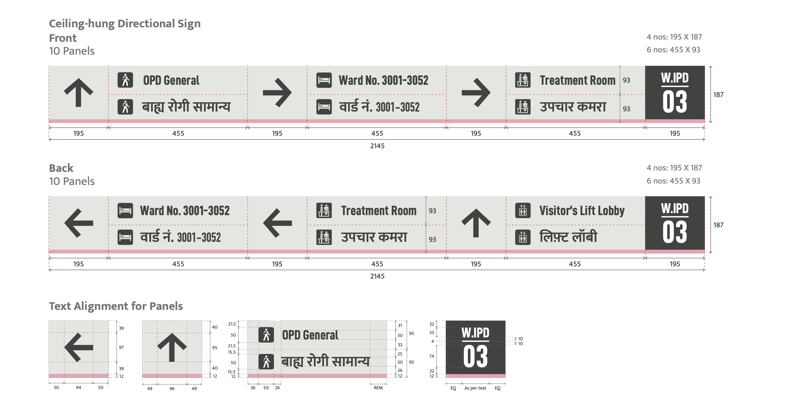
The design of the signages takes into account a diverse set of factors including information design, legibility, identifiability, placemaking, modular replaceability, accessibility, and brand philosophy integration.
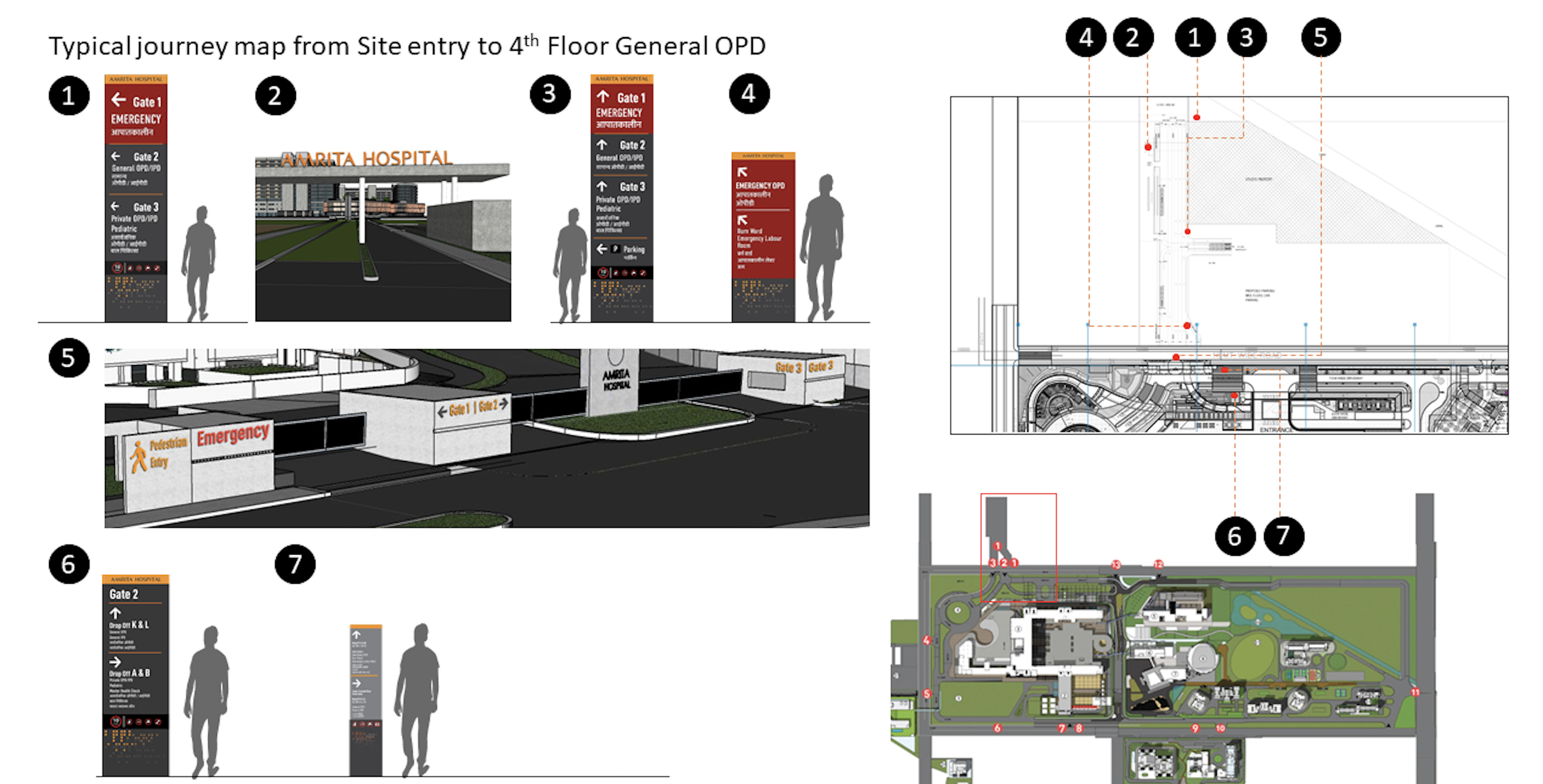
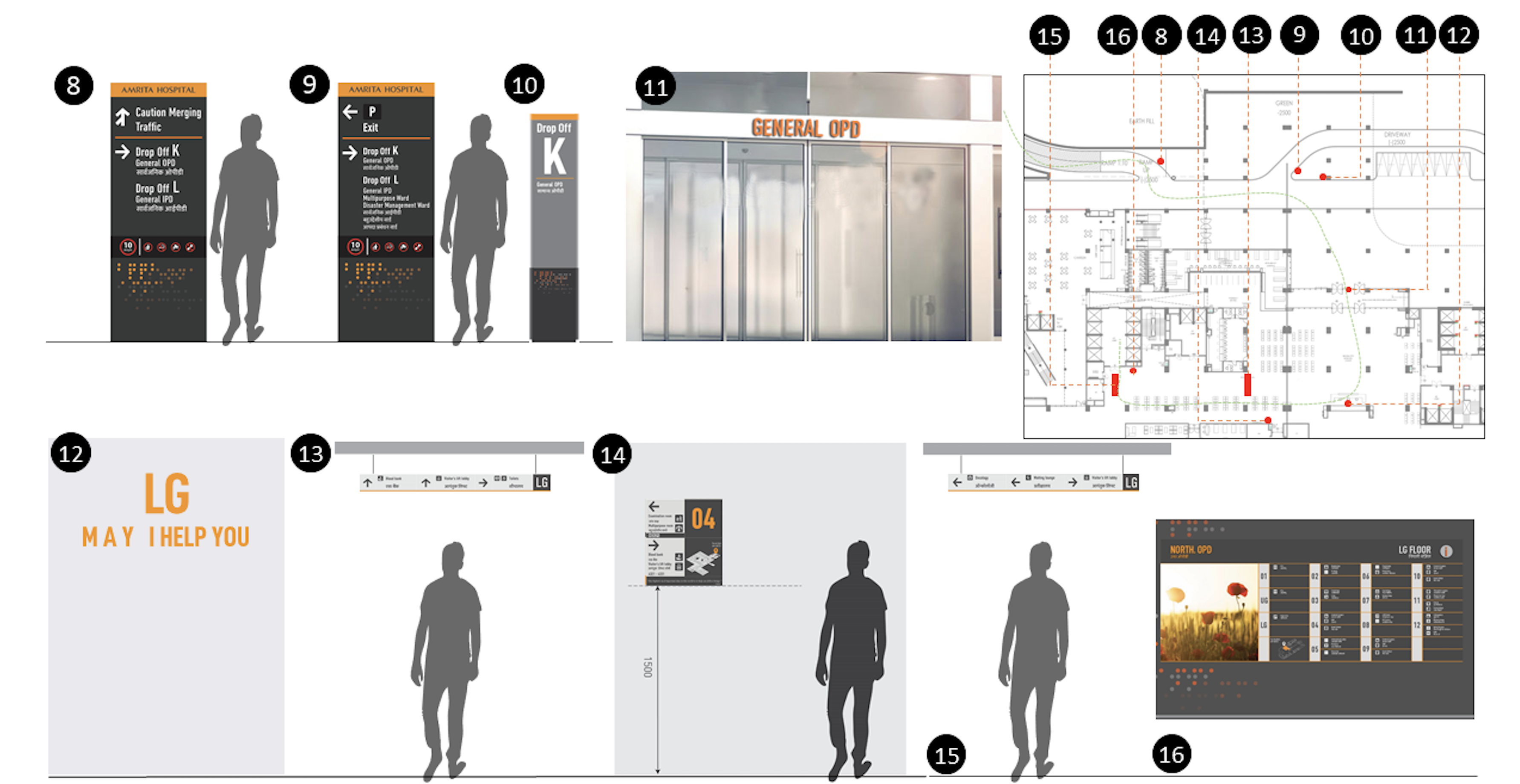
Journey Maps
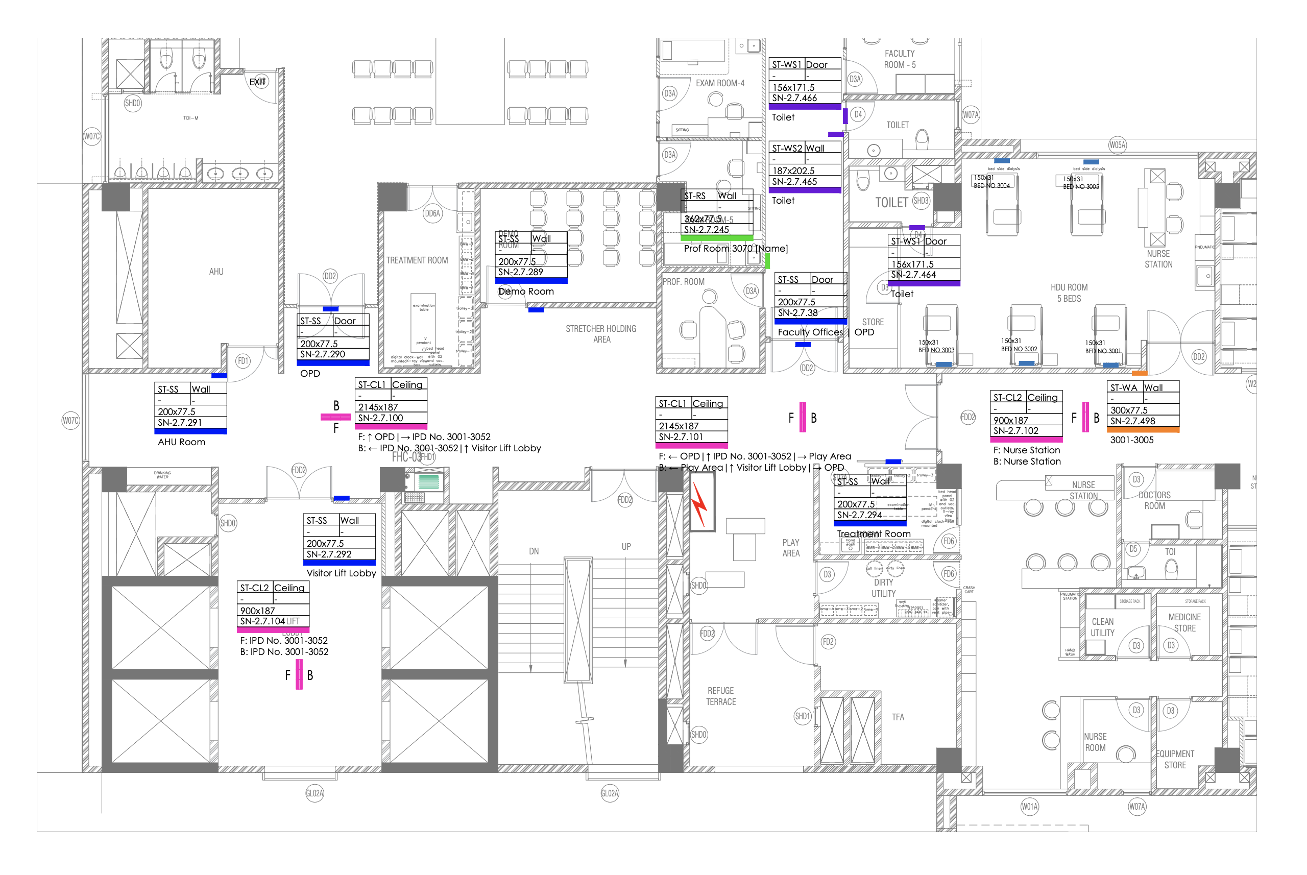
Journey maps track the path of a user from his entry point in the site to his destination point. These help establish the sequence of information presented to the user and identify critical decision-making points along the path.
Sign Layouts: Iterative Evolution
Based on user flow paths (circulation patterns - vehicular/pedestrian, employee/visitor, office staff/service staff etc), sign layouts were planned on all levels of the building and site. The process was iteratively repeated based on feedback from stakeholders - clients, architects, vendors and traffic/other consultants.