Context
This section provides information about VersionAbsolute. Feel free to skip ahead if you are already familiar with their work. To know more, please visit versionabsolute.com.
The following project was undertaken at VersionAbsolute Design Studio, a full service wayfinding and sign design consultancy based out of its two studios in India and Hong Kong. It is in the business of creating engaging user experiences for spaces and places. Its work is helping users make sense of the surrounding and navigate complexity while creating memorable experiences.
Project Brief
Description
Wayfinding for DNR Altitude, a premium 8,00,000 sqft commercial office and retail in Bengaluru.
Client
DNR Corporation
My role
Developing signage design, information strategy, graphics, wayfinding layouts, product illustrations and 3D visualizations based on initial concept and wayfinding strategy
Objectives
- To develop and design an extensive wayfinding system for users (employees, visitors, service staff)
- To develop a branding strategy for developer and development
- To develop a tenant branding strategy for large commercial space tenants
- To develop a shopfront branding strategy for amenity food-and-beverage (F&B) tenants
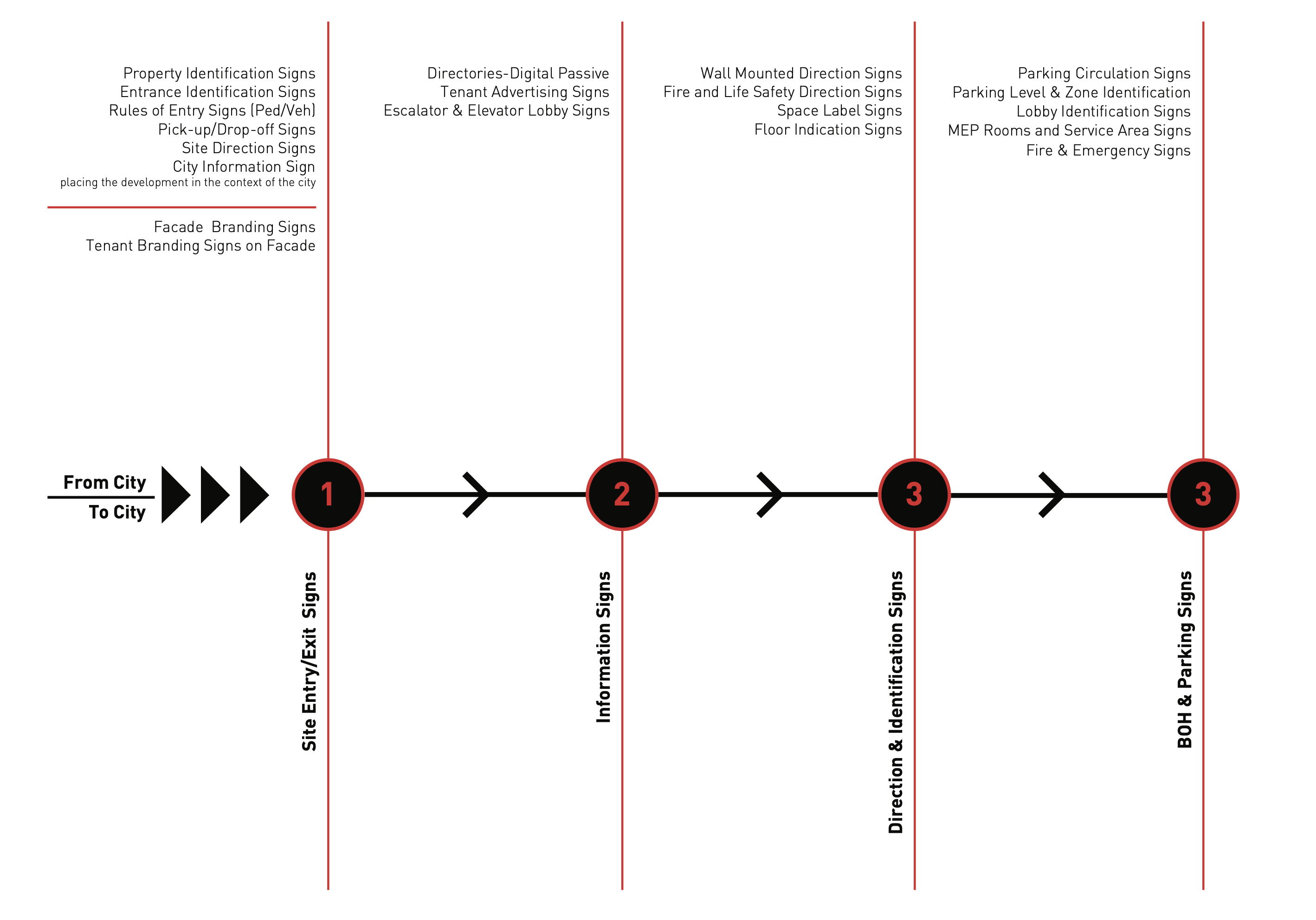
Information Sequence
Developing an information sequence to guide visitors to and from the site, its amenities and out in a sequential, systematic way.
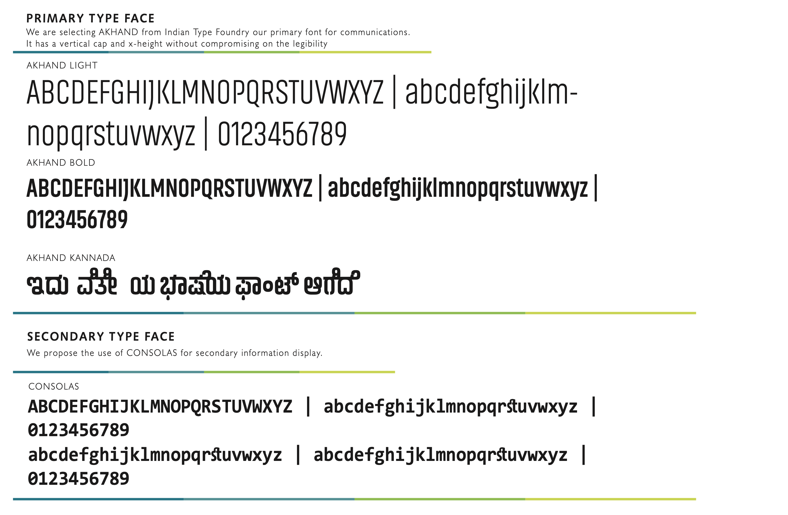
Typeface Strategy
Typeface was chosen from the INDIAN TYPE FOUNDRY catalogue of fonts as this Indian typeface family caters to all the Indian languages. This ensures that stylistically, information in dual languages look the same. This typeface also matches the developer’s typeface.
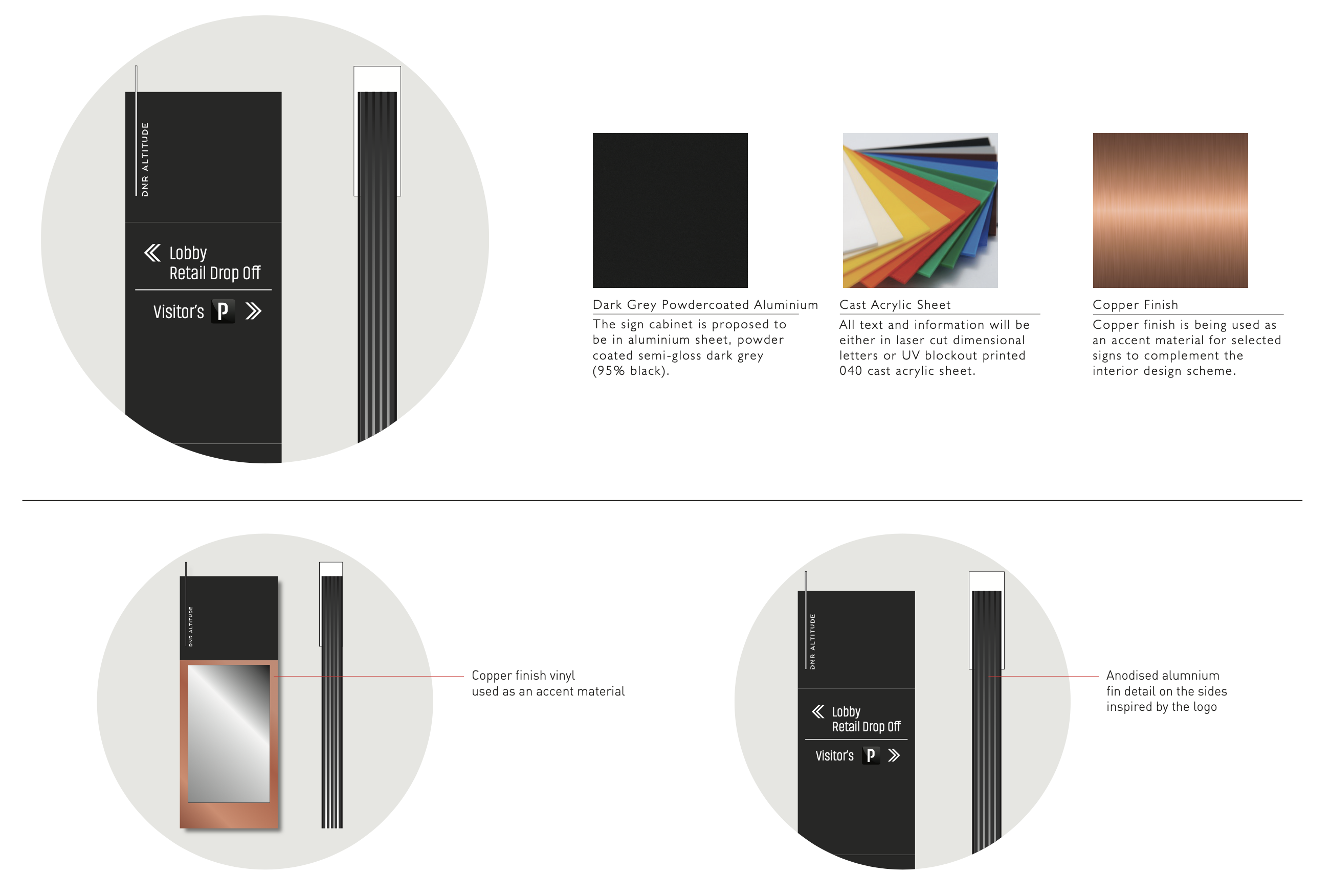
Material and Logo Adaptation
Looking at the architecture and the nature of use which is primarily commercial, we propose a monochromatic colour response with a brushed copper finish accent. The signs in the building interior and in the amenity area incorporate material changes to respond to the architecture.
Sign Family - Branding
Developing an extensive scheme of branding signs on the facade, shopfront and landscape level. The developer’s logo is on the building facade while the development name logo is at the entrances.
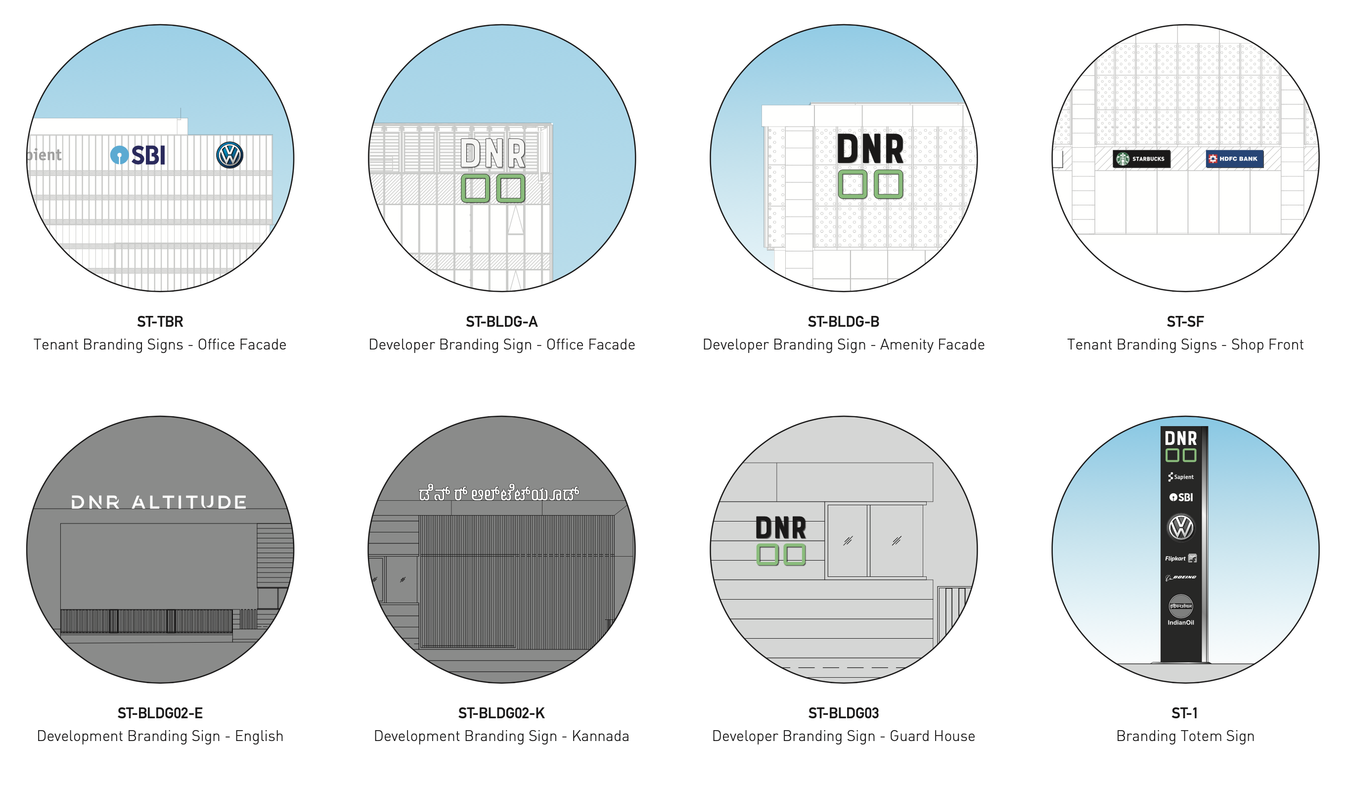
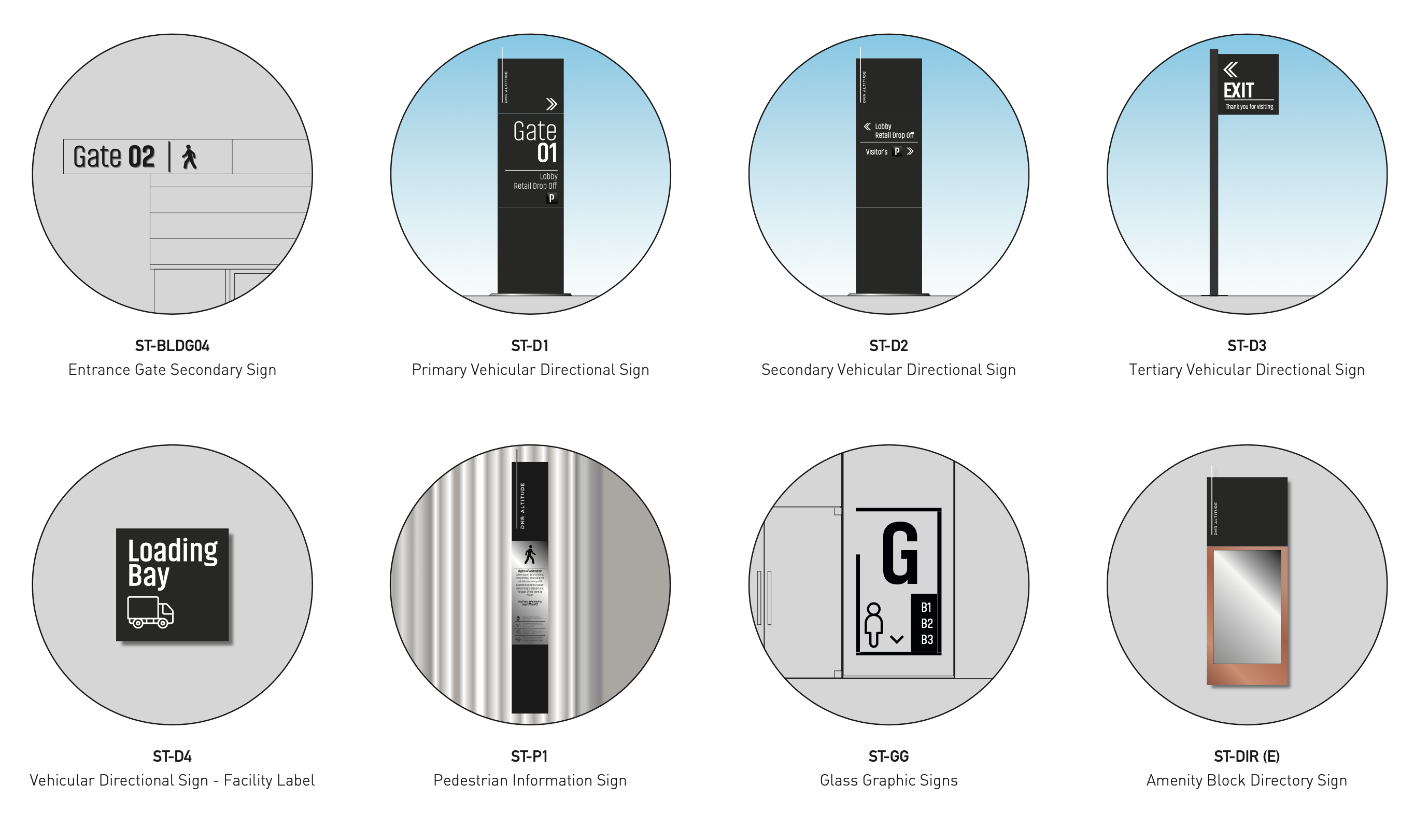
Sign Family - Site & Exterior
Developing the sign family for site & exterior signs from the site entrance identification, site circulation and outdoor facility label signs. These signs will direct the vehicular and pedestrian traffic to their respective destinations.
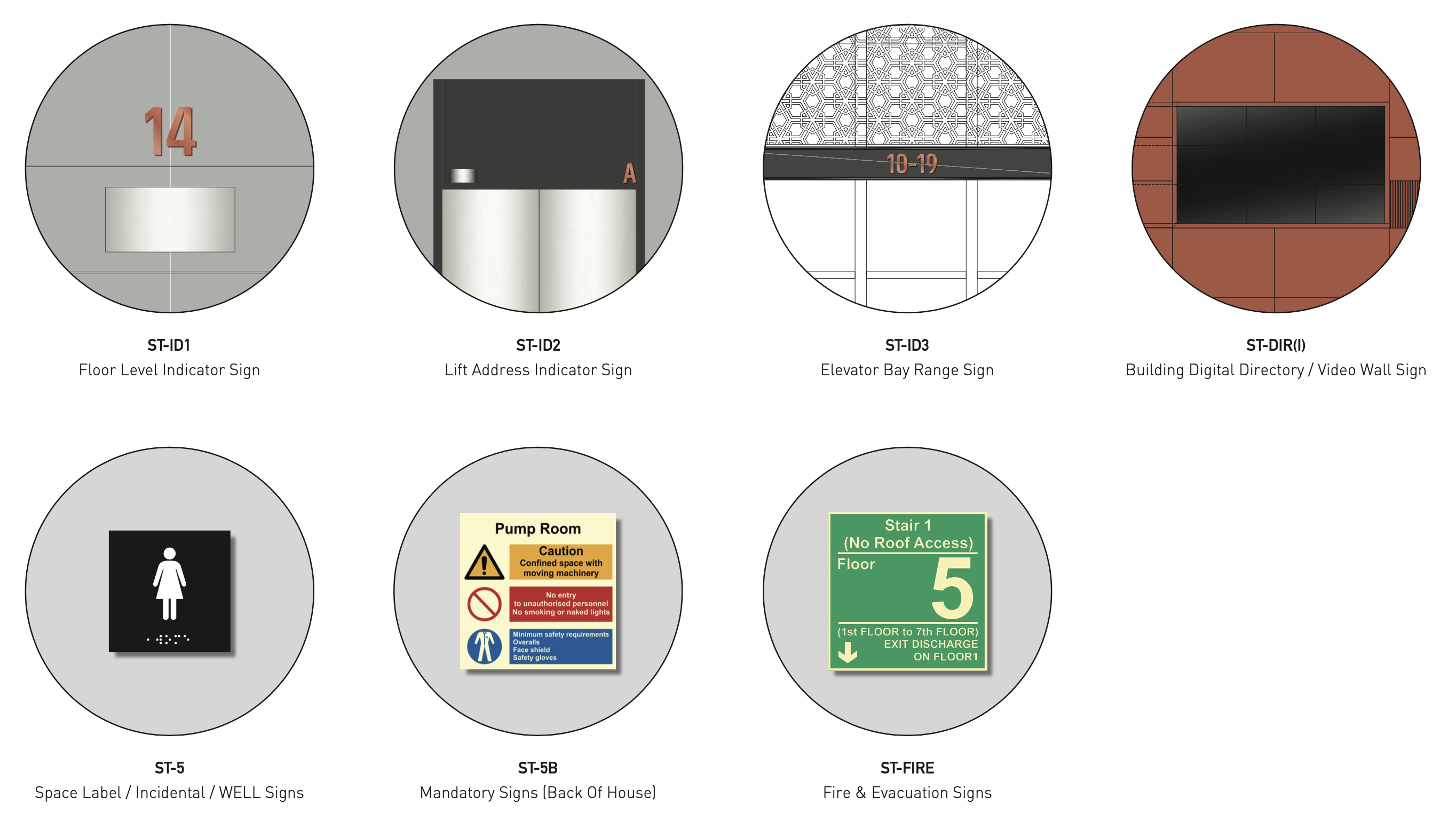
Sign Family - Interior
Developing the sign family for all interior signs - room identification signs, braille signs, elevator lobby signs, mandatory back-of-house signs and fire signs. These signs will help the user navigate while inside the building.
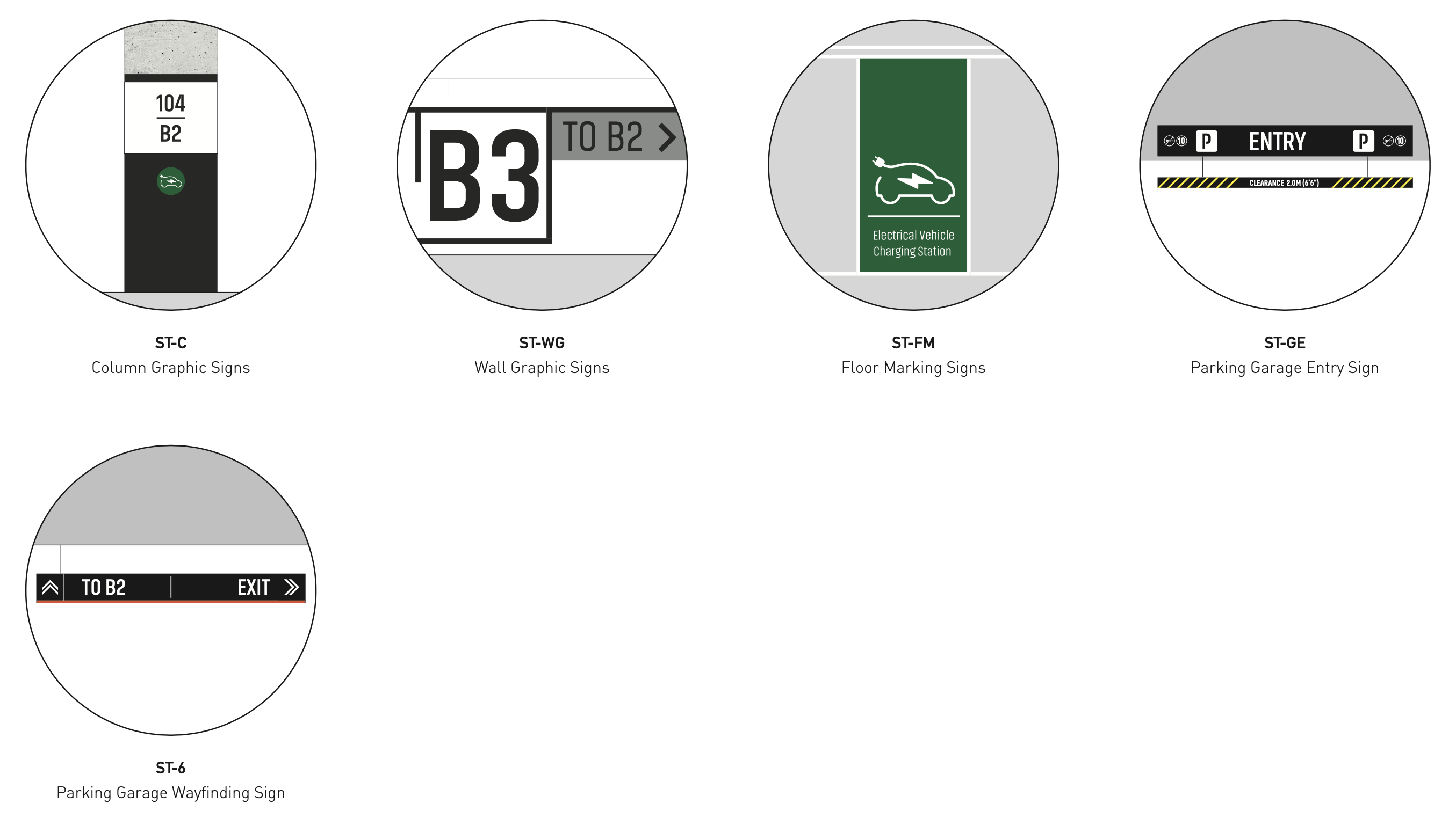
Sign Family - Parking Garage
Developing the sign family for the basement: these include all the signs in the parking areas and the ramps leading up to the basement.
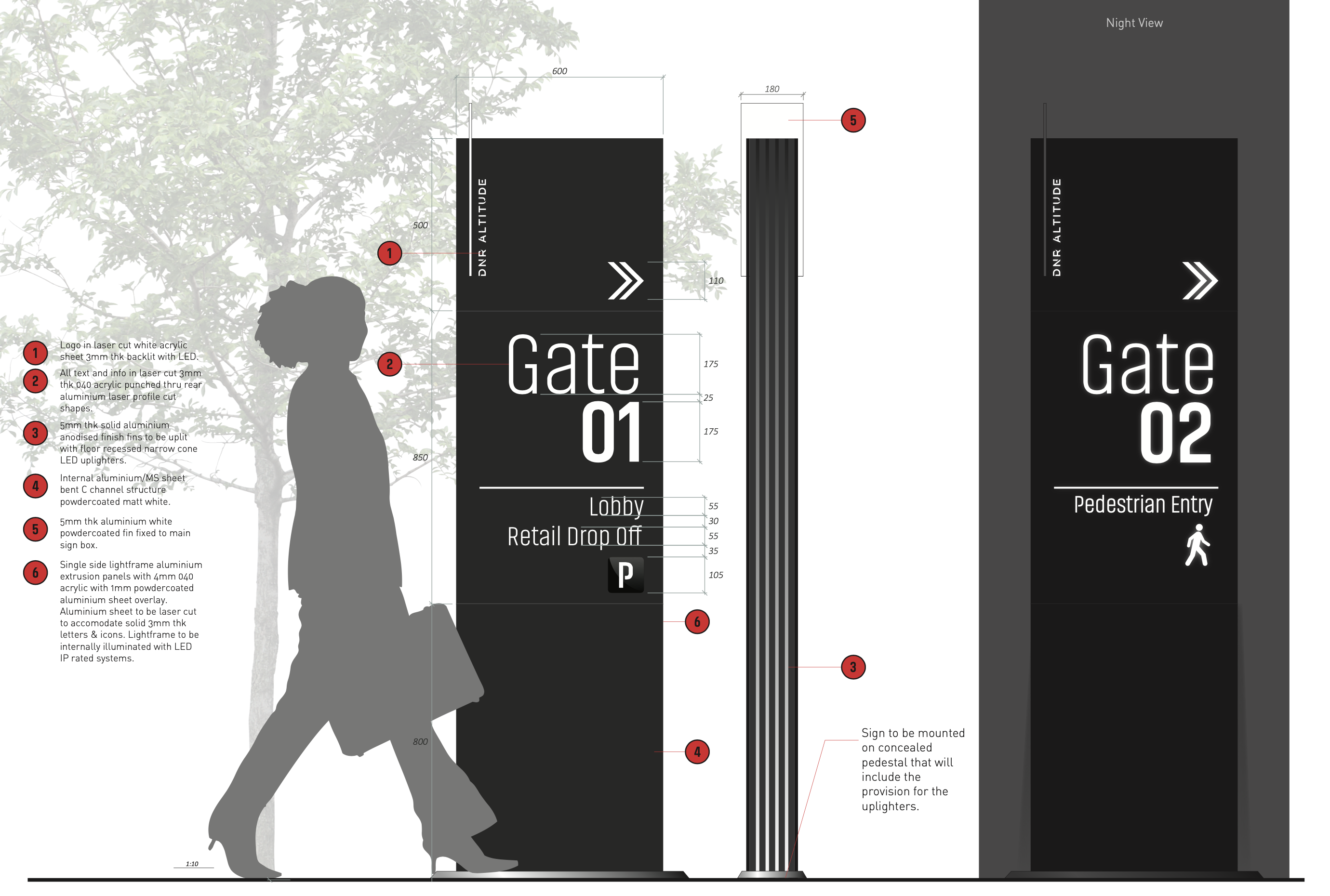
Product Design: External Signs
The design of the signage products takes into account a diverse set of factors including information design, legibility, appropriate level of illumination, usability and development branding.
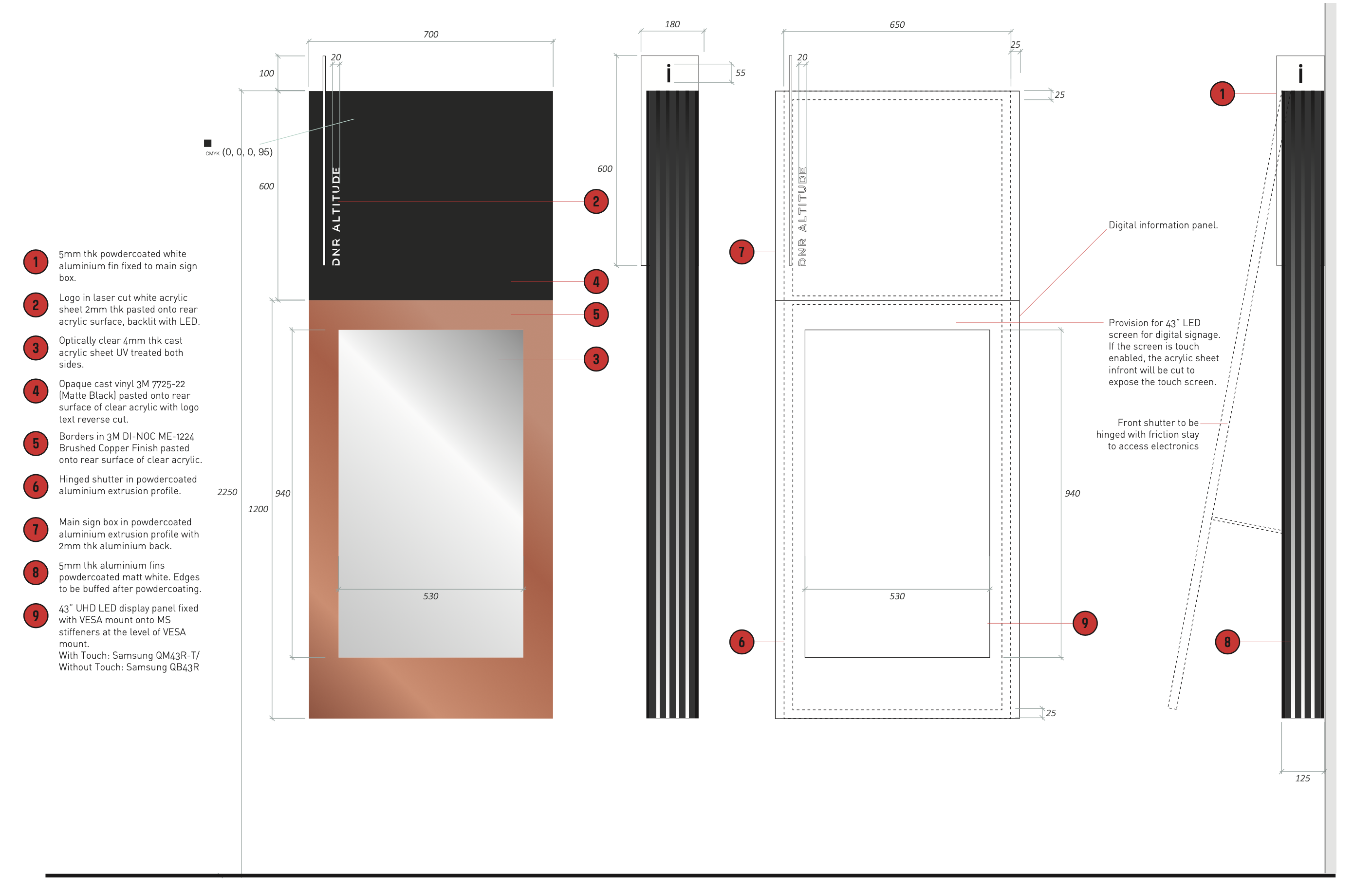
Product Design: Digital Signs
The design of interactive digital signages takes into account a diverse set of factors including integration with the digital display panel, illumination and data point requirements and various other usability factors.
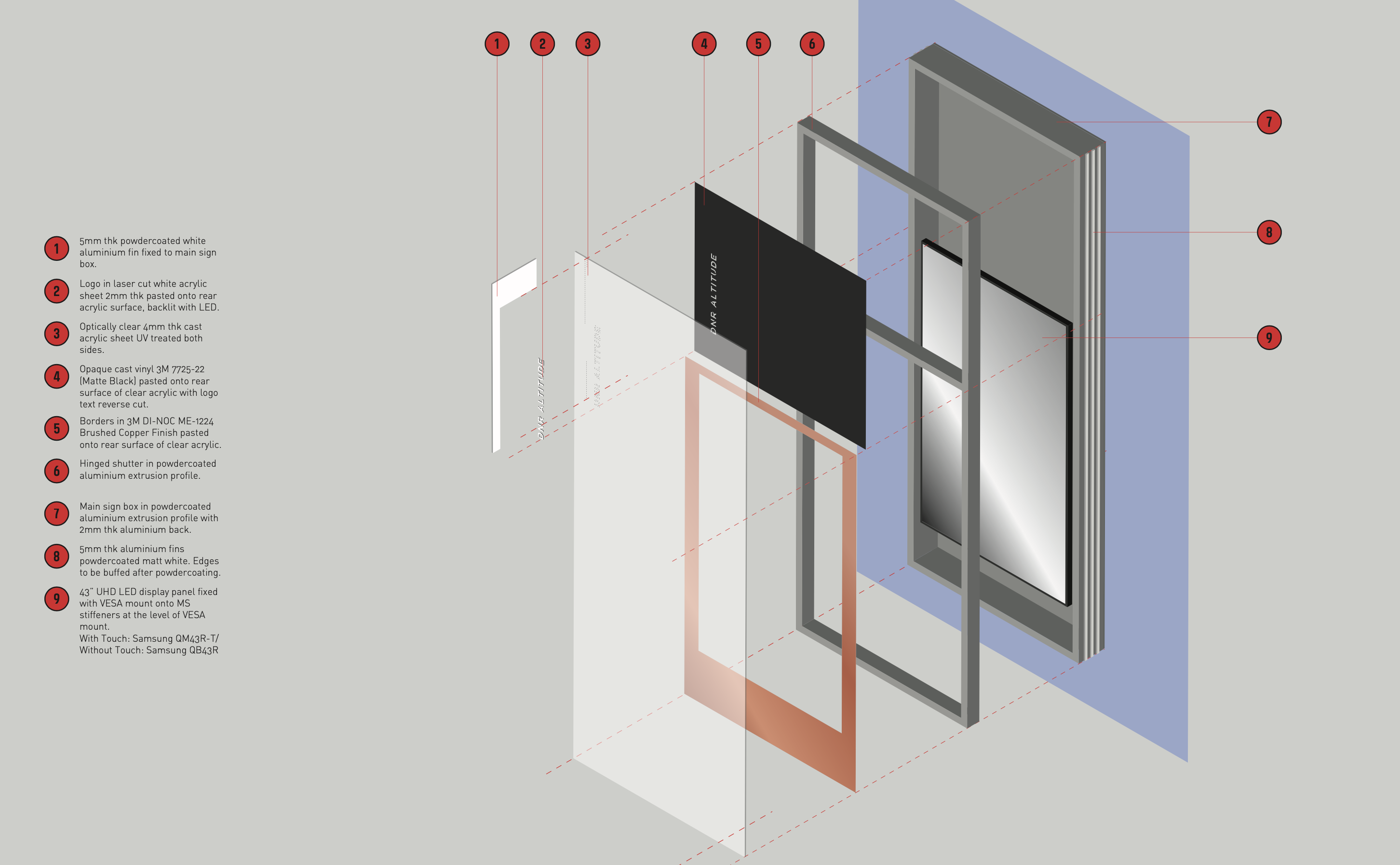
Technical Illustrations
The technical illustrations of the signage product depict the design of the sign or construction sequence in an easy-to-understand 3D visual.
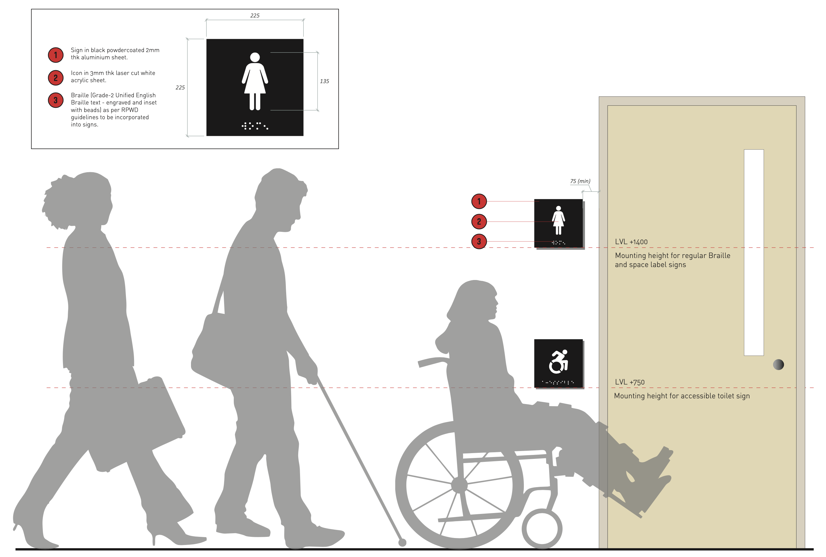
Accessibility
The design of the signs takes into account various accessibility factors for abled people as well as PwD (people with disabilities) including those with visual impairments, physical or intellectual disabilities.
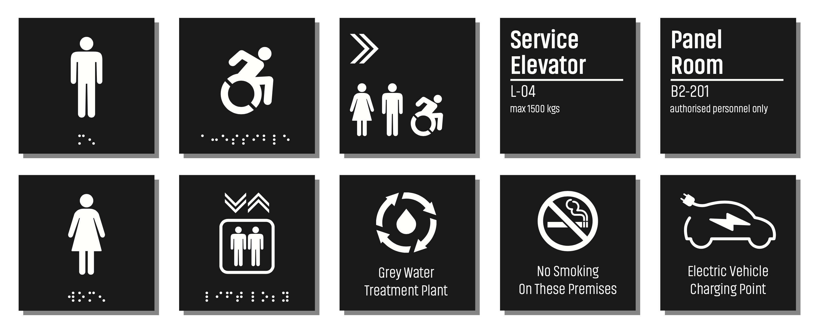
Sign Artworks: Iconography
An extensive system of icons has been developed to be used in the signs. These icons can reinforce the textual/Braille content wherever necessary or can be used independently when universally understood; and help establish the visual language of the entire signage system.
Sign Layouts: Iterative Evolution
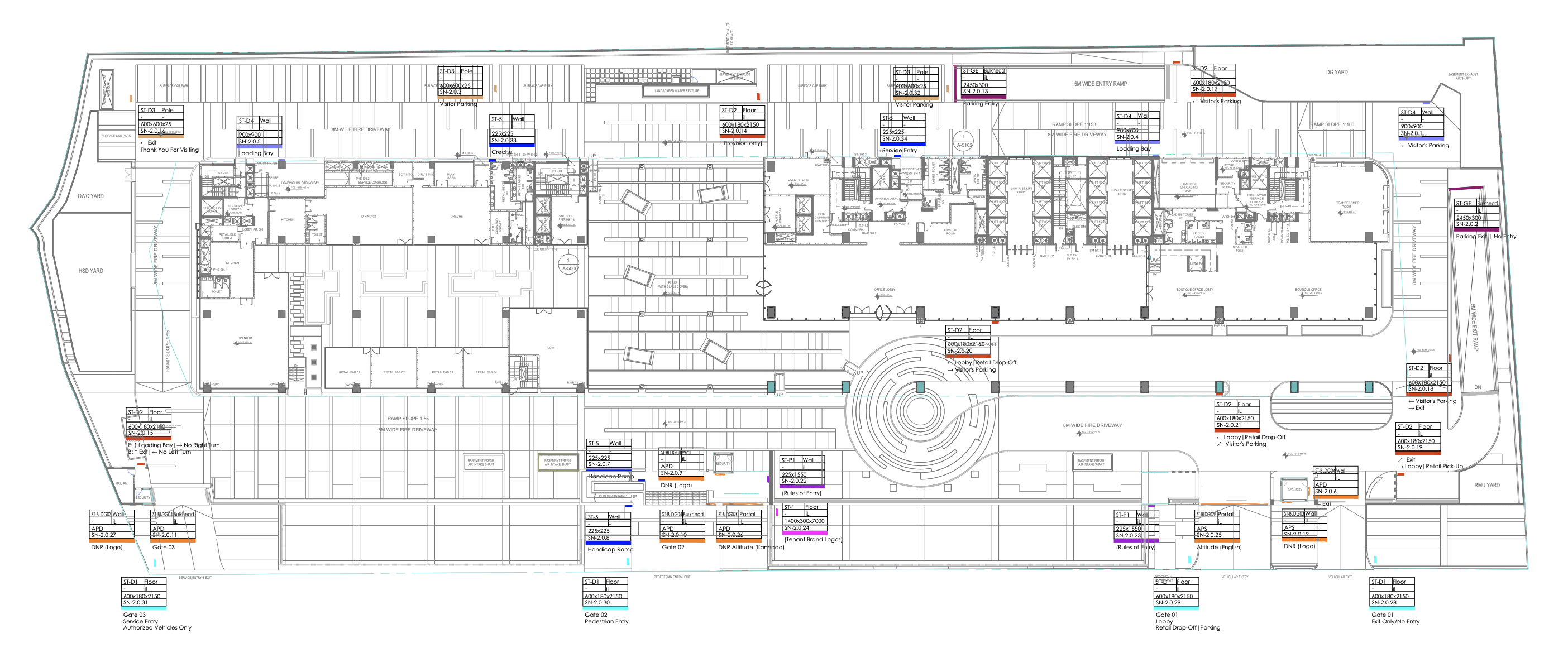
Based on user flow paths (circulation patterns - vehicular/pedestrian, employee/visitor, office staff/service staff etc), sign layouts were planned on all levels of the building and site. The process was iteratively repeated based on feedback from stakeholders - clients, architects, vendors and traffic/other consultants.