Background & Hypothesis
Synaptic is a B2B data intelligence SaaS platform that private investment firms use to discover, evaluate, and track promising startups. VC firms make up the majority of Synaptic's customer base.
Looking at Synaptic usage patterns, we noticed that it was heavily used by junior and mid-level employees at VC firms, viz. Analysts, Senior Associates, and VPs of Data Teams. Partners (the senior-most employees at VC firms) were not frequent users of our web app, only logging in once a month and mostly to consume dashboards built by junior employees.
This was a problem for us because Partners are the key decision-makers at VC firms. Analysts and Associates were getting their value from Synaptic, but the top-level leaders were only seeing value through an indirect way. And such a setup poses a significant risk to retention.
Our main objective with this project then became to increase engagement for Partner-level users. The hypothesis was that this would help in demonstrating Synaptic's value at senior-level positions within VC firms, thereby making a strong case for Synaptic and increasing customer retention.
Problem Description
Partners at VC firms rarely work continuously from a desk; they're always attending meetings with new or portfolio companies, meeting with GPs, attending conferences and board meetings etc. Improving engagement on the web app would hardly have made a difference. So the goal, instead, was to build a mobile app that acted as a companion to the web app and catered primarily to the Partner persona and their specific usage patterns.
We gathered evidence from multiple sources: Partner interviews, Junior-level interviews, existing usage patterns, feedback from CS/Sales teams, data on previously churned customers, and research published online.
Then we narrowed down on our primary use cases for the mobile app based on our idealized persona:
- Partners want to quickly look up companies
- Partners want to go through a structured overview of any company
- Partners want a feed of daily activity/news about companies they follow (funding, metric movement, featured news etc.)
Solution
We took this opportunity to make a fresh new design system for Synaptic's products, since the existing one wasn't built keeping in mind a mobile app. We designed the new one first for the mobile app, and extended it later for the web app. A full description of the design system is however beyond the scope of this case study.
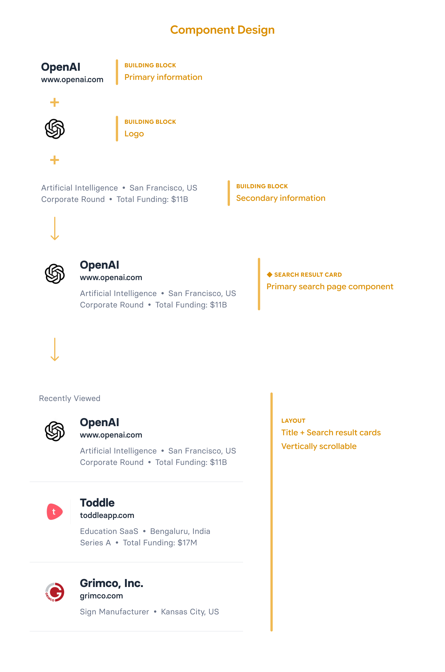
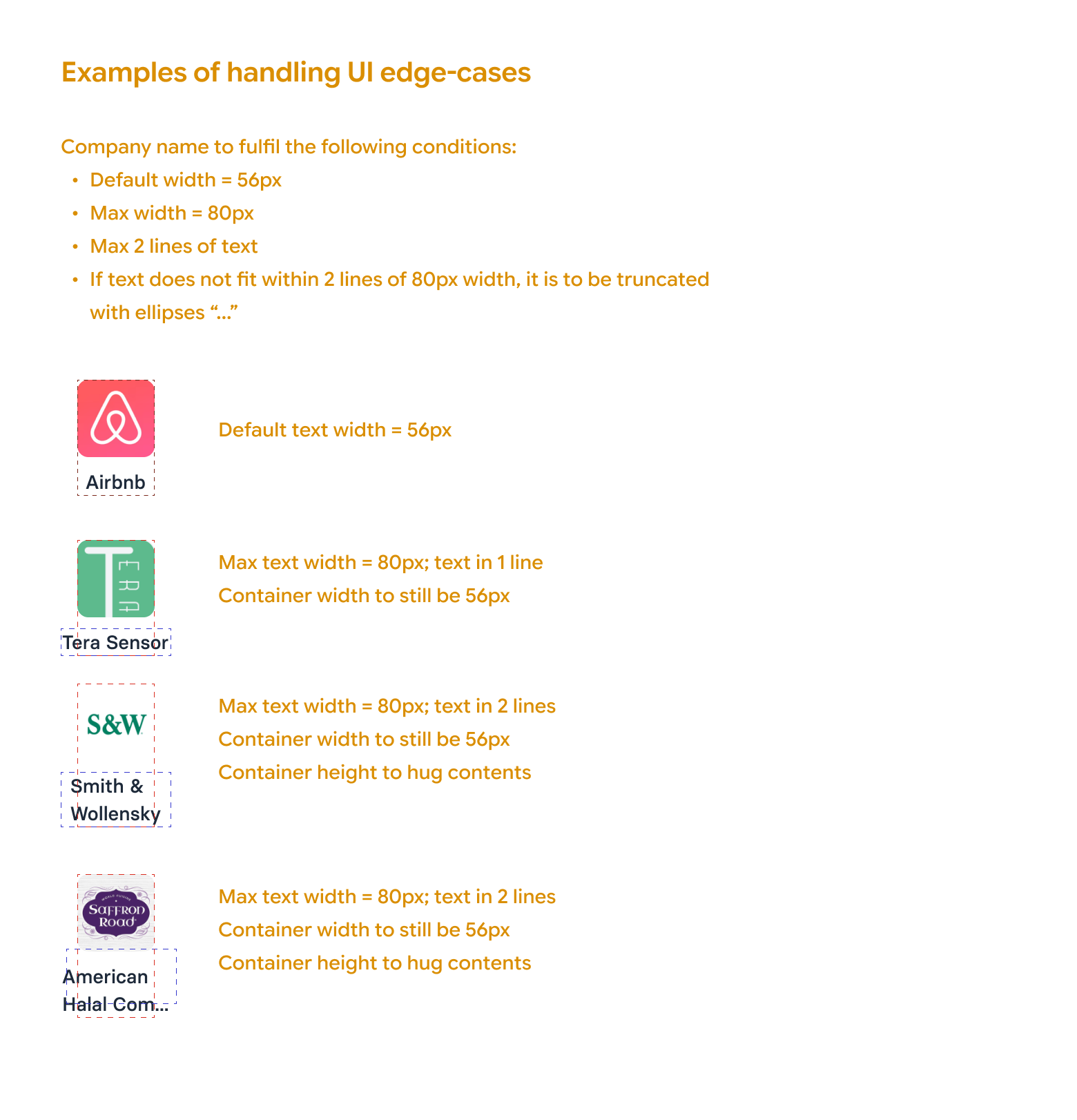
Once we had the foundations of our design system in place: the principles, the colours, the typography, the icons, and the spacing, we set out to make the functional components. A few simple examples of the structure and composition for components involved in the search page is shown below.
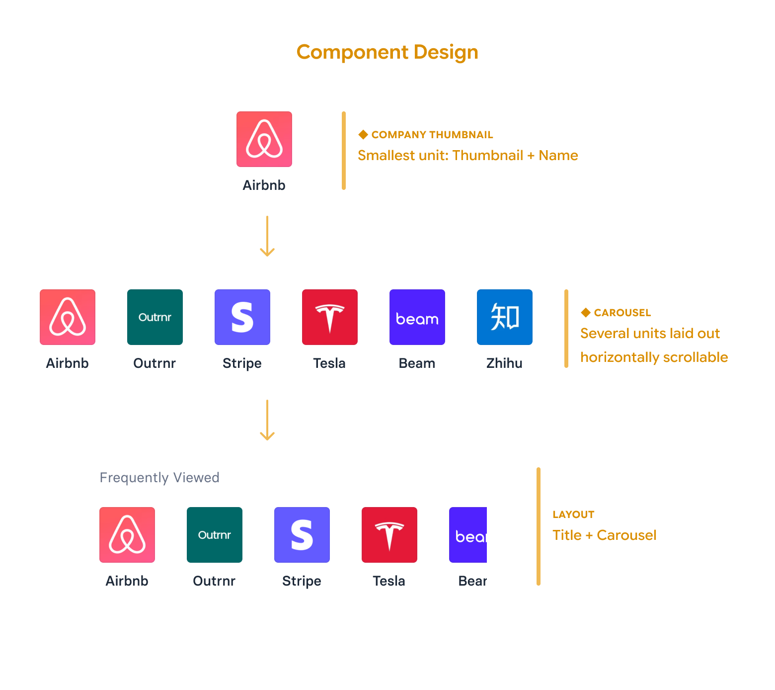
Search Page
The search page was designed with a very simple use case in mind. The user wants to look up a company they came to know about somewhere (online or offline). The search worked for both company names and websites—the two primary identifiers of a company.
The search result item was designed keeping in mind how a user uniquely distinguishes between companies:
- Name + Domain: Primary identifiers as mentioned above. Together they provide a unique way to distinguish one company from another
- Logo: A logo enables rapid visual recognition. For users who are already familiar with a given company, it often serves as the fastest cue for memory recall, letting them identify the company with just a cursory glance at the logo.
- Metadata (Industry/Sector, HQ Location, Funding Stage, Funding Amount): Secondary information points that help give more context about the company. Frequently it helps users distinguish between similarly named companies or companies that don't have logos.
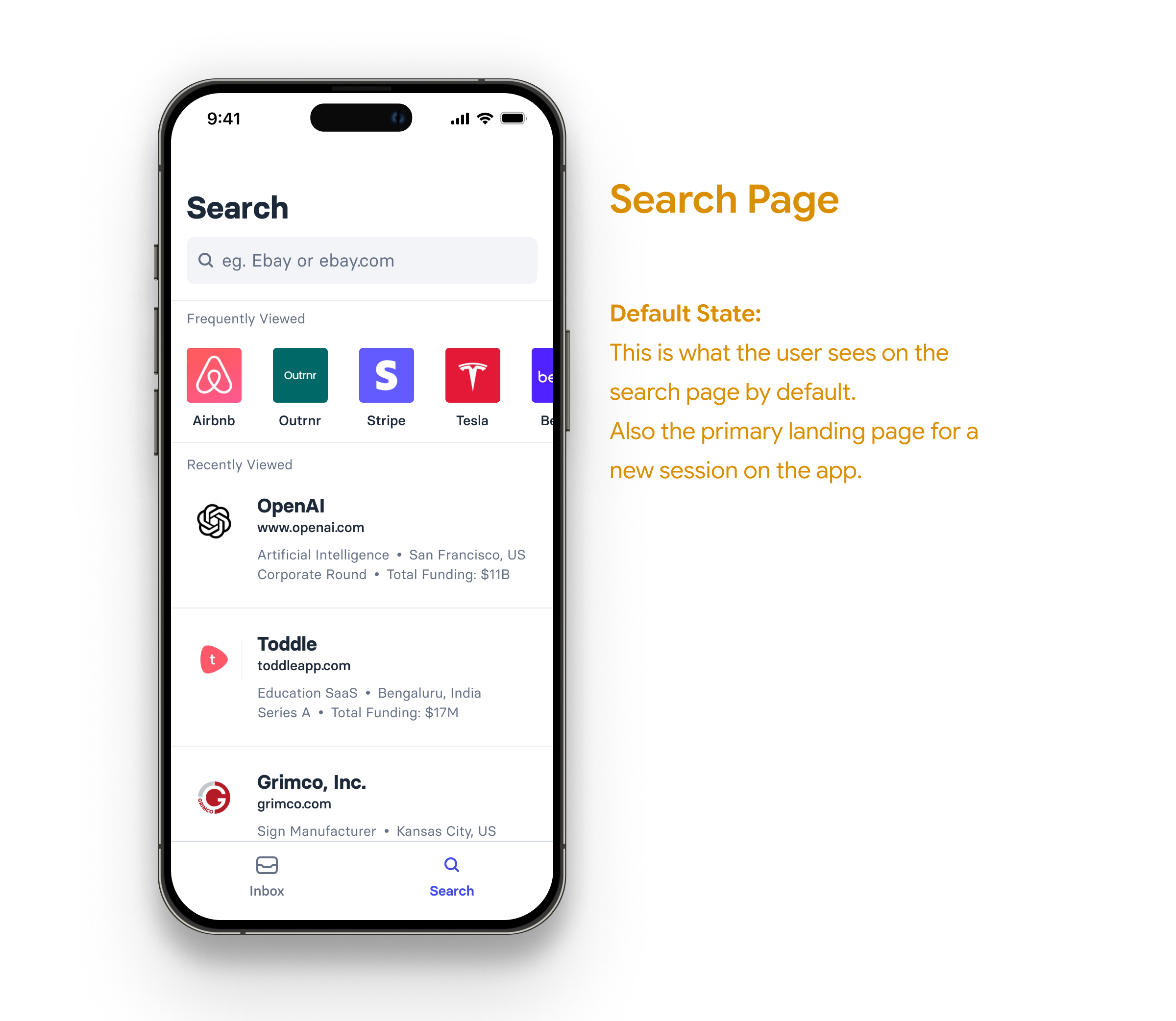
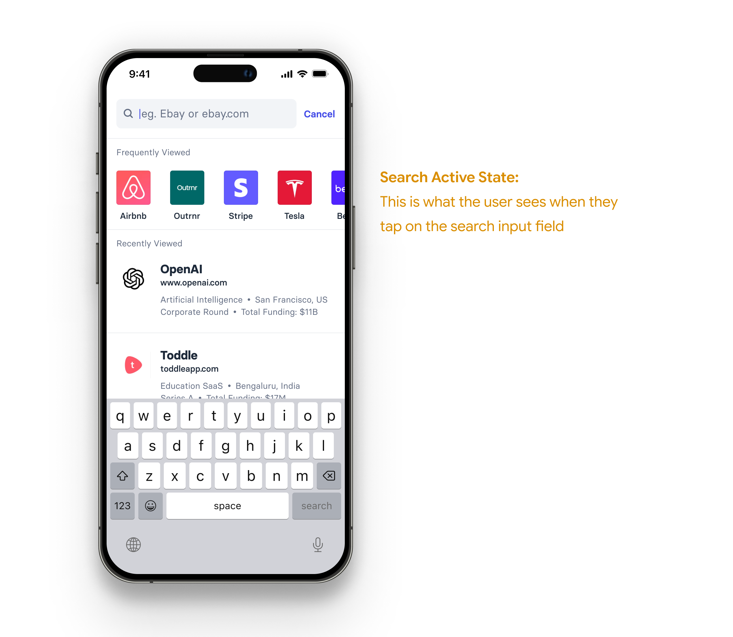
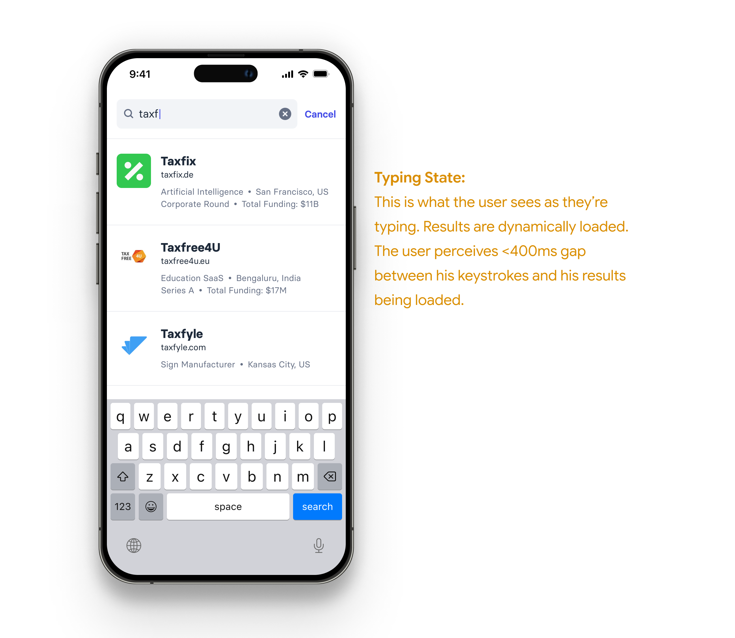
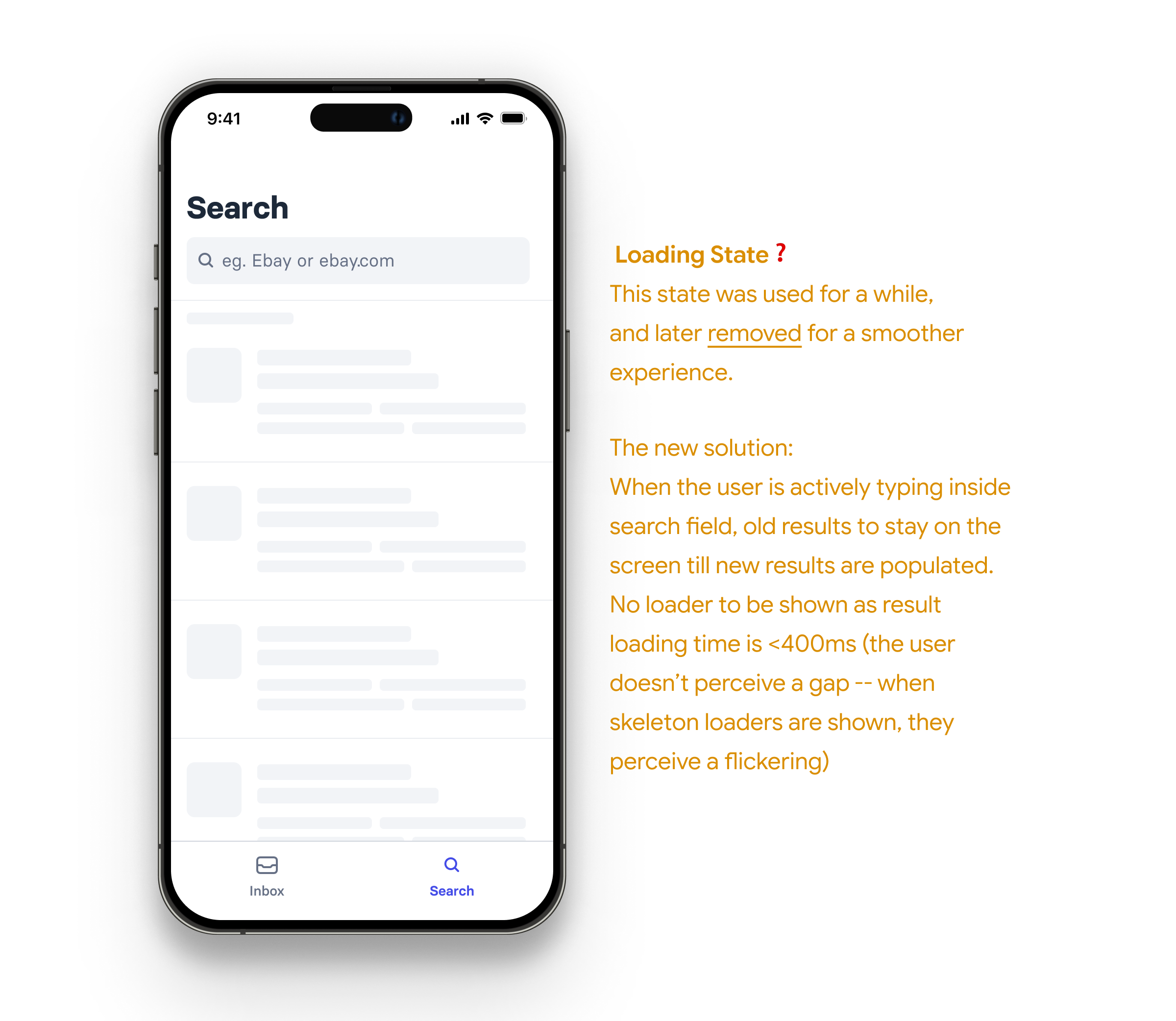
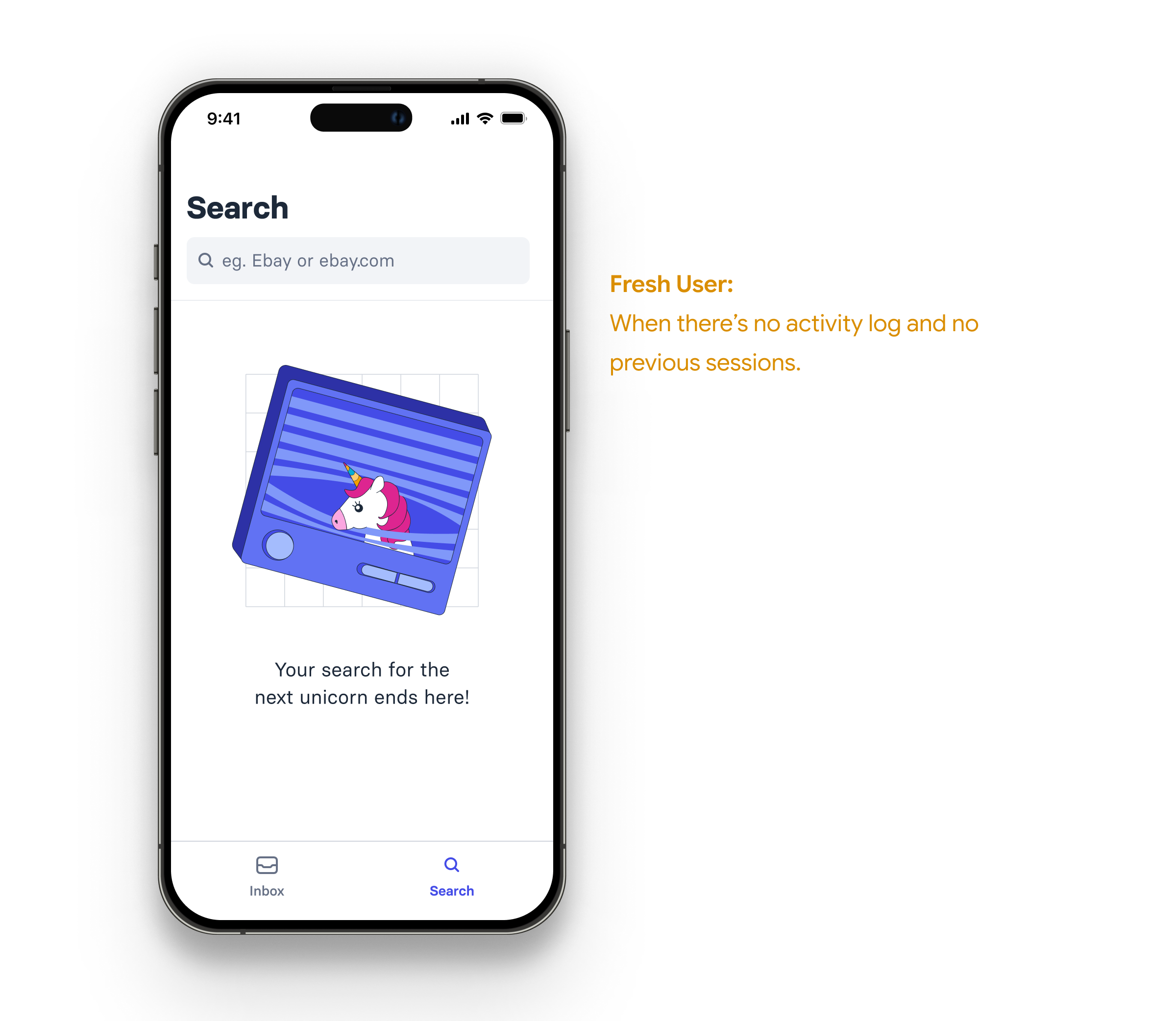
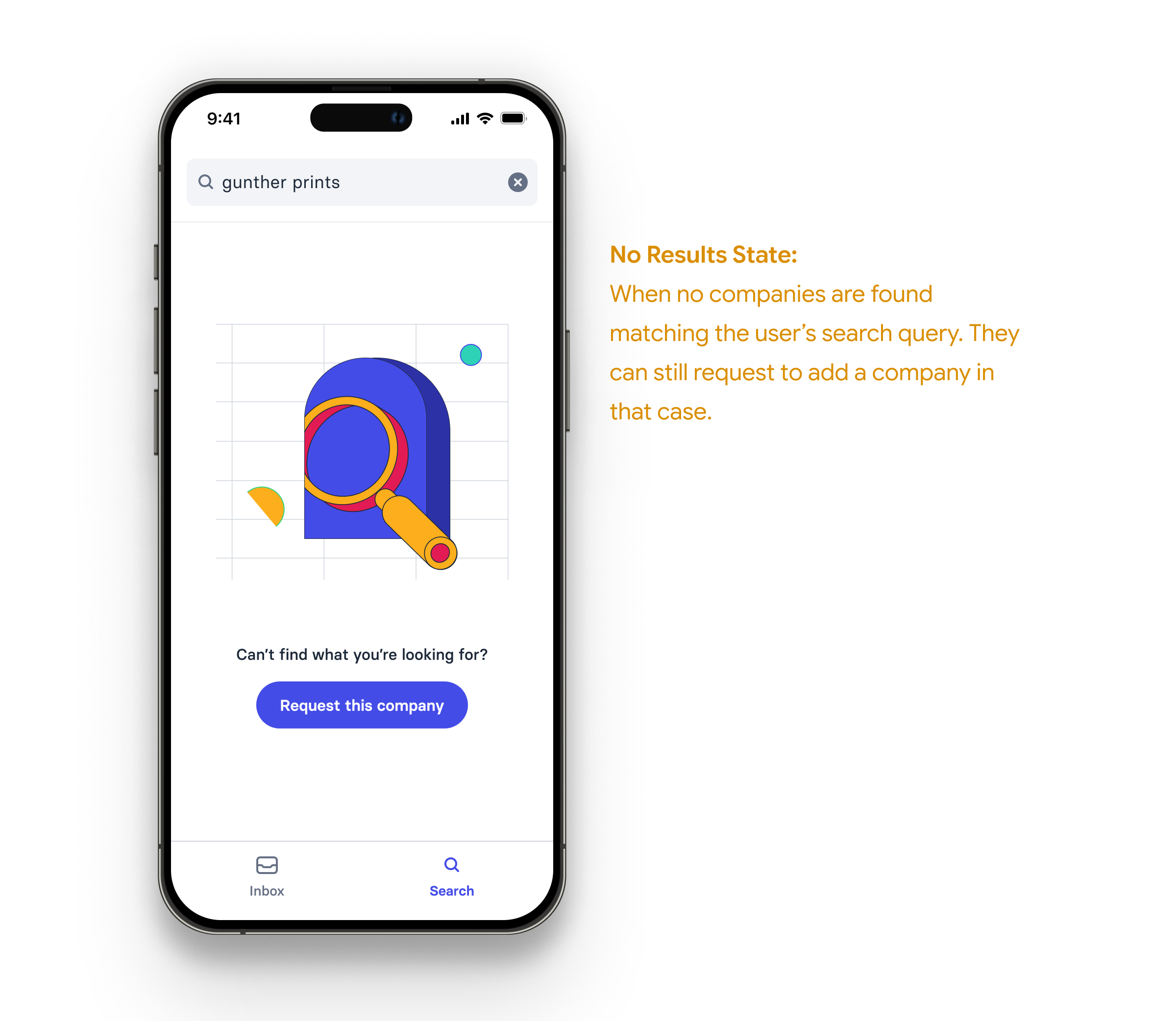
Tapping on any search result opens up the corresponding company page.
Company Page
This is the page the user arrives on when they want to look at a particular company. The information architecture of this page took several iterations. We took many learnings from the preexisting web app but experimented a lot with information presentation. Some factors included:
- Company details: Funding stage, public vs private etc.
- Density of Information: richly populated / sparsely populated / little to no information
- Frequency of Visit: frequently visited / recently visited / general case / first time visit
- Level of Interest/Involvement: Following vs Not Following, Portfolio company or not
- CRM: Present vs Absent in CRM
- Meetings: No meetings vs Past meeting vs Upcoming meeting
The above is by no means supposed to be an exhaustive list. A lot more factors were considered.
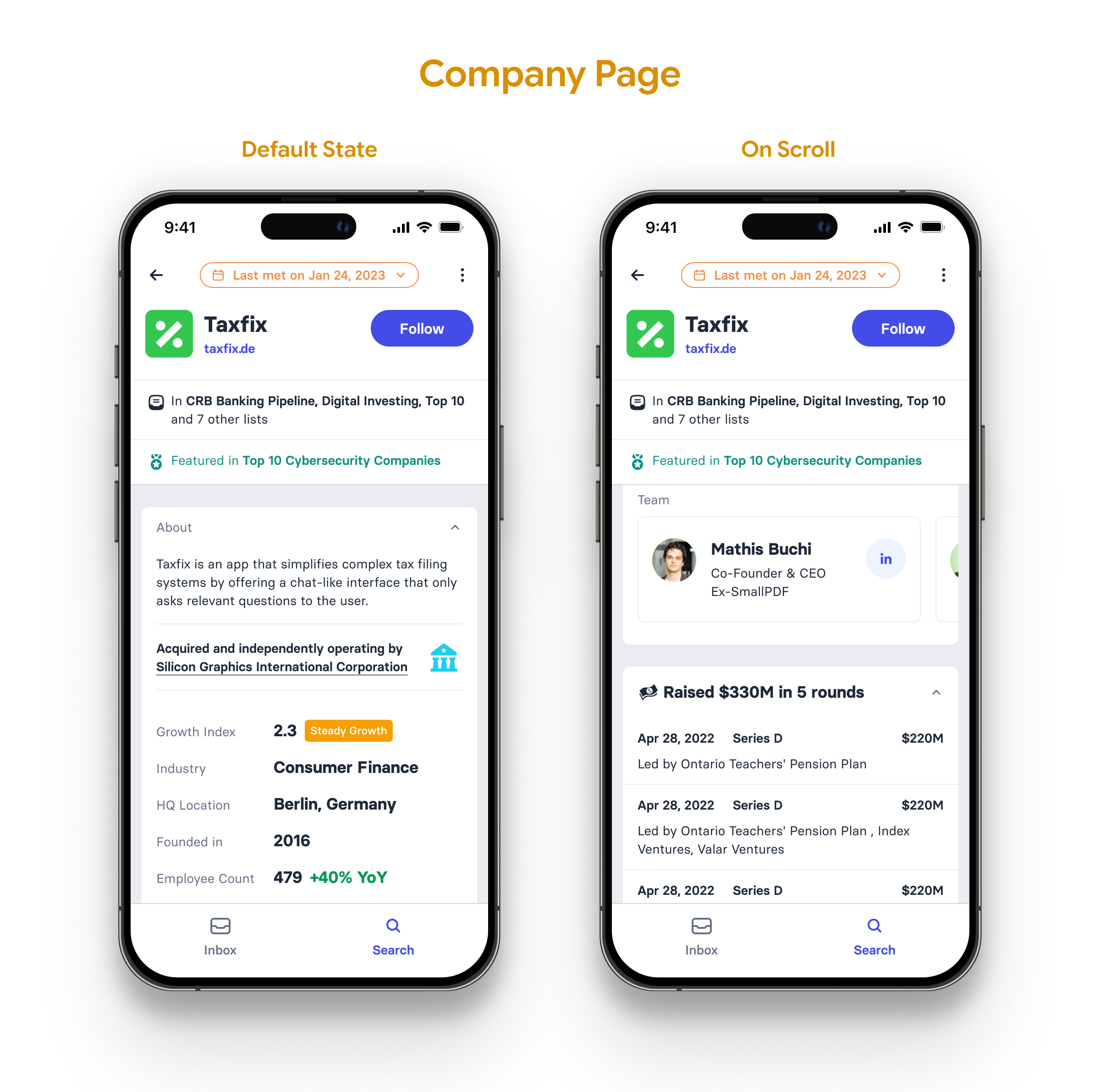
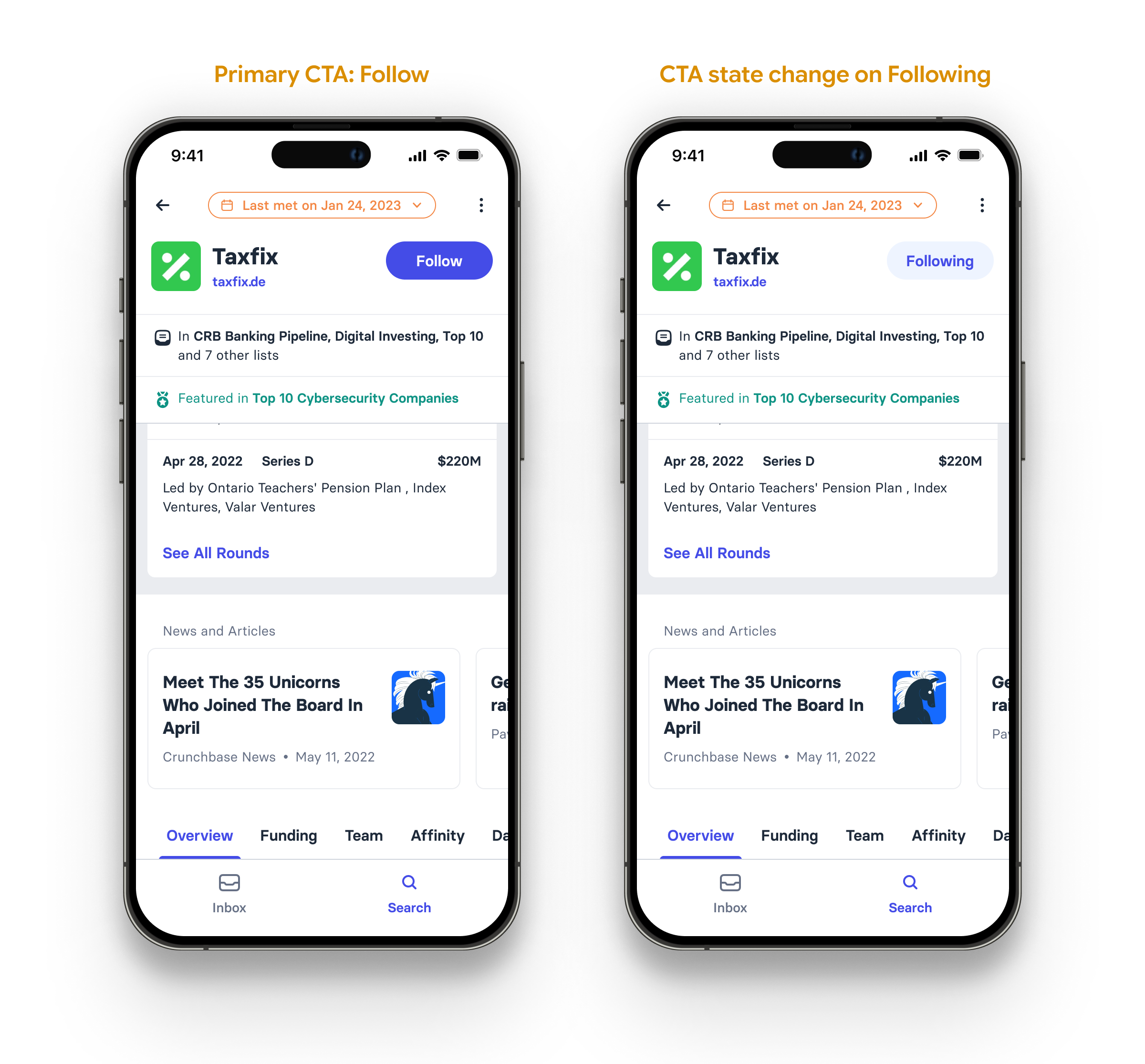
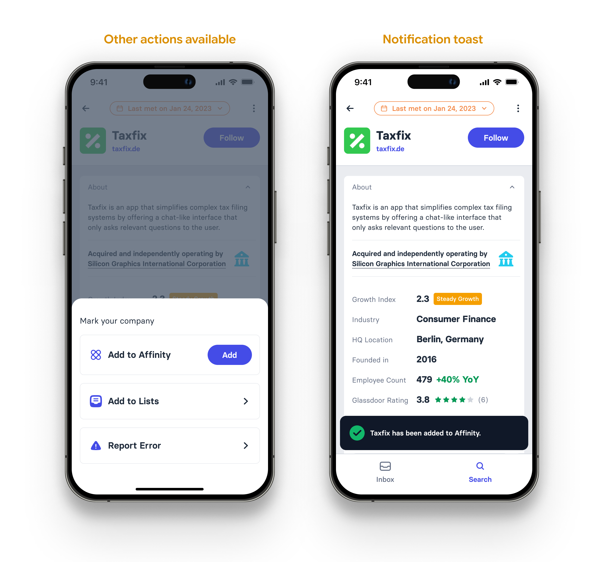
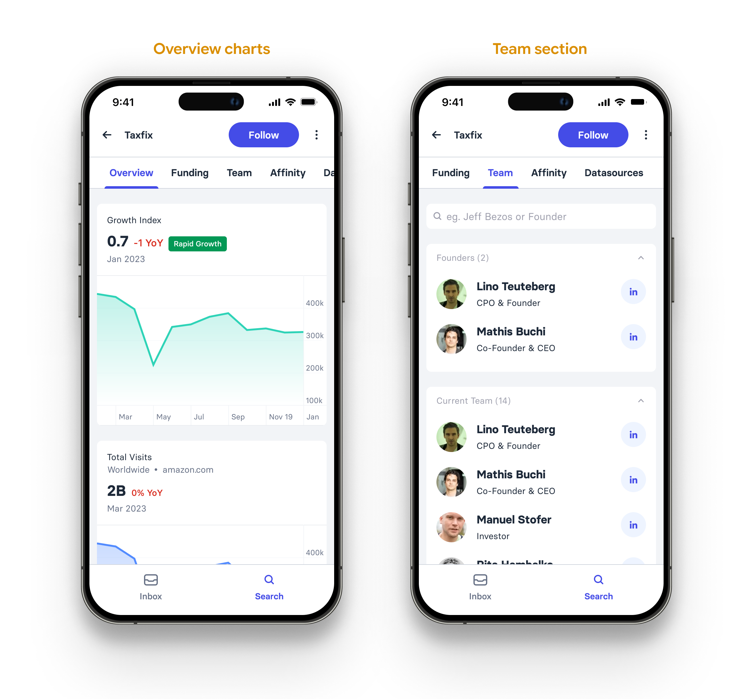
The summary, overview, team, funding/financials, and CRM sections let the user get a rough sense of the company, its metrics, its financial status and its position in the pipeline.
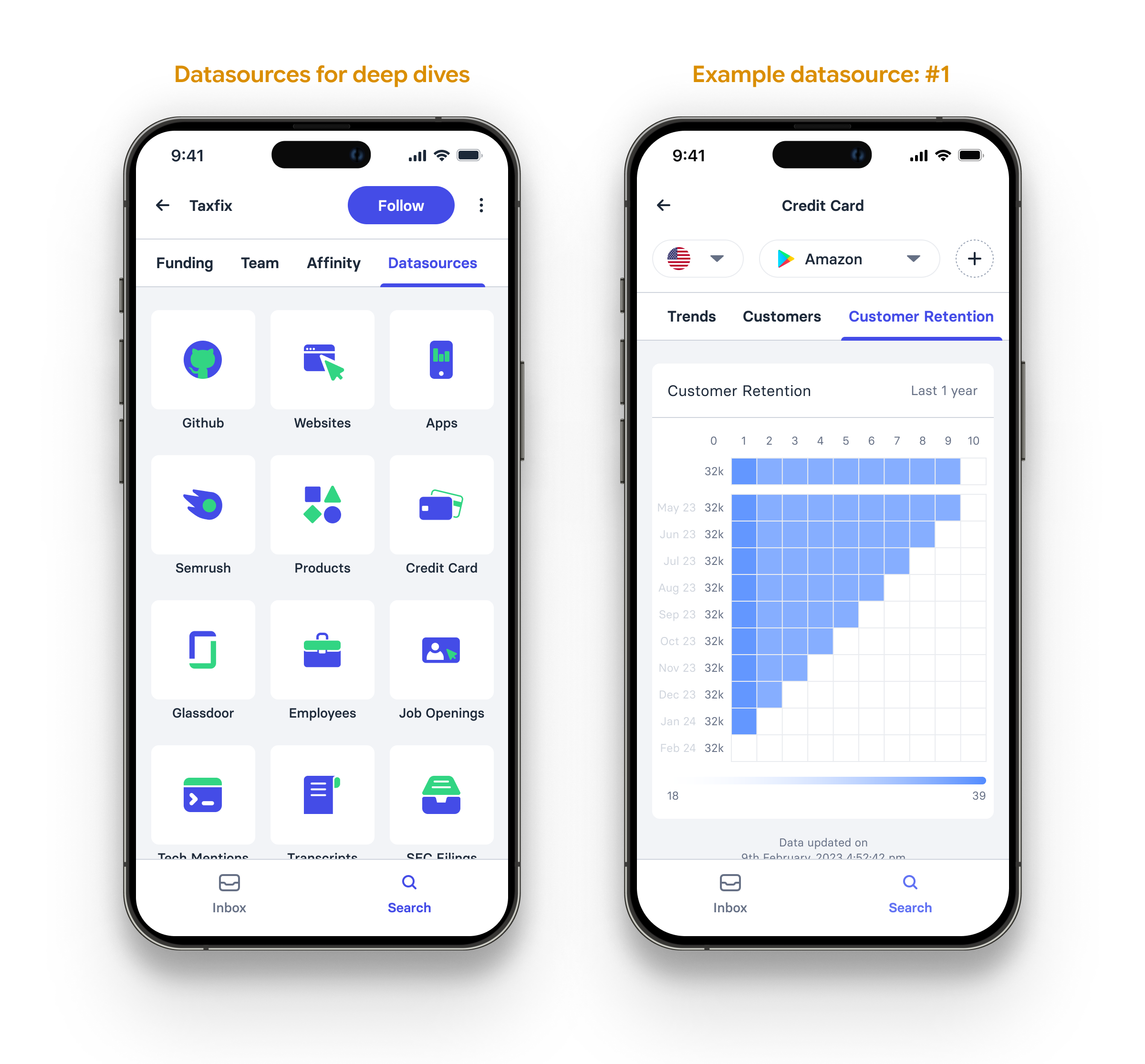
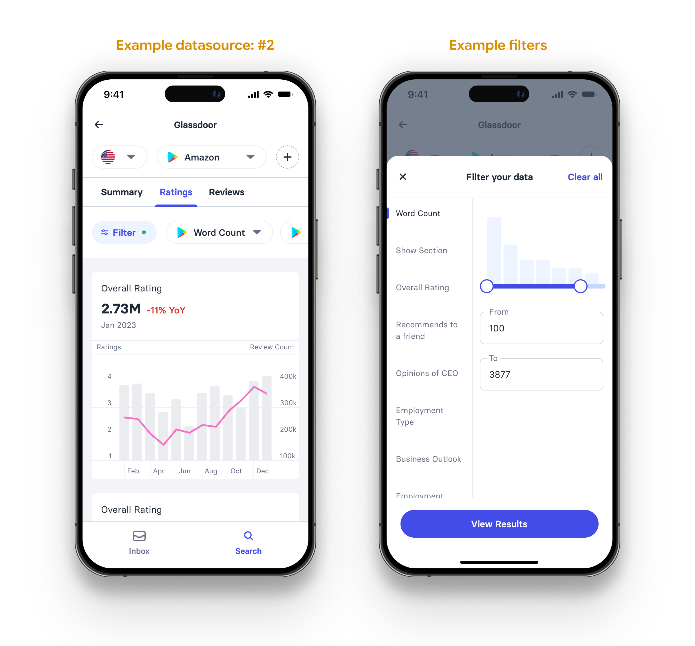
For a deeper dive into various aspects of a company for example—employee reviews, product reviews, website traffic share etc., users could use the datasources tab to access individual data sources. These offered a lot more metrics, the ability to view granular data, and the functionality to aggregate and apply filters as the user saw fit.
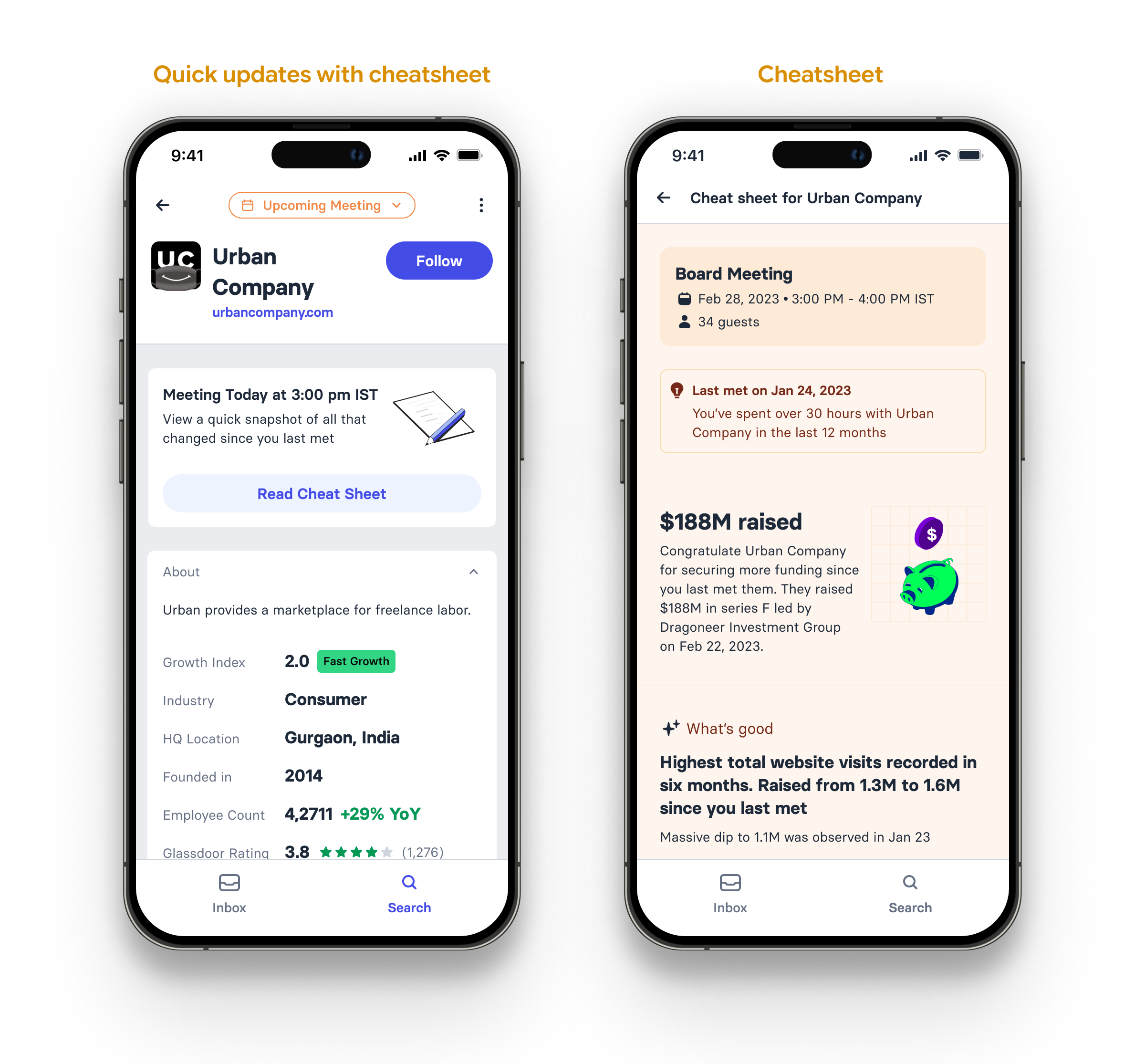
There were many updates to the company page in subsequent iterations too. For example, in cases where the partner had upcoming meetings with any company, a 'cheat sheet' lets them get all the relevant information about the company and its recent track record in a very concise format.
Inbox
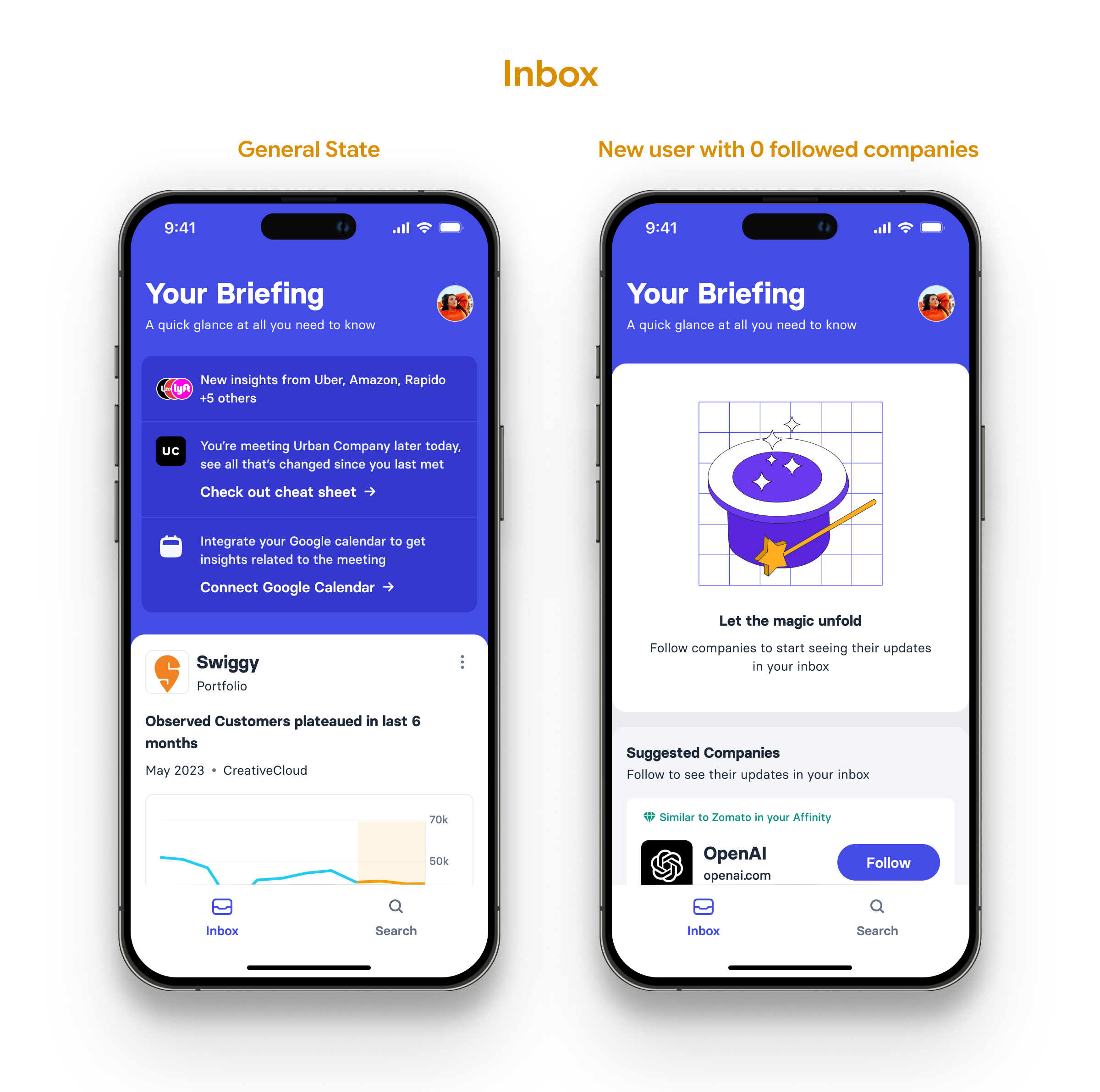
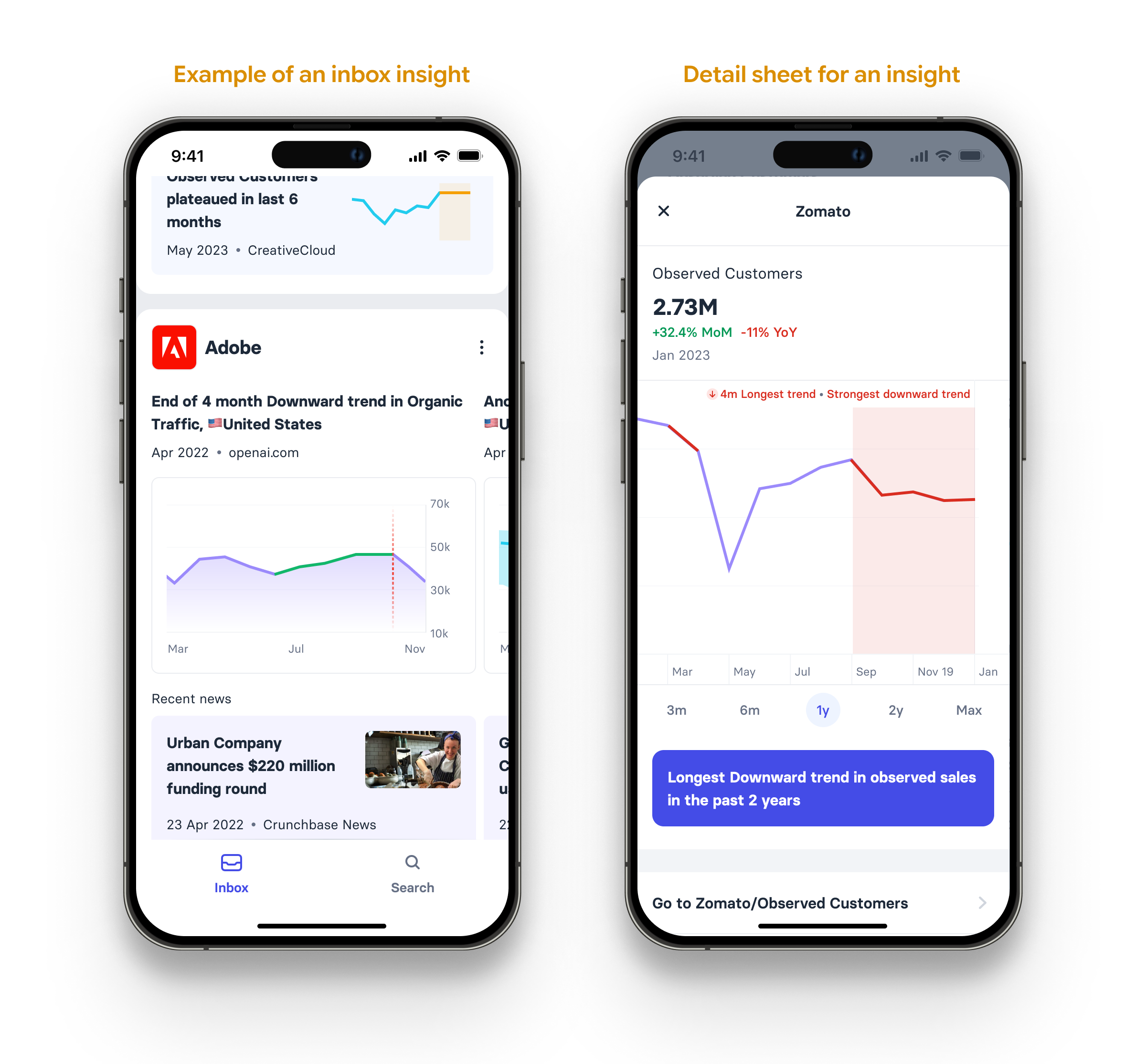
The inbox gives the user a daily/weekly/monthly digest of the companies they are interested in. The fundamental unit of the inbox is an 'insight', i.e. a recent high-information signal about a company interpreted by Synaptic. This could be something very simple like a funding round announcement, a senior team member exit, or merger/acquisition news. Or it could be something complex like an unexpected metric movement—like a sudden rise in web traffic, an unusual drop in employee ratings etc.
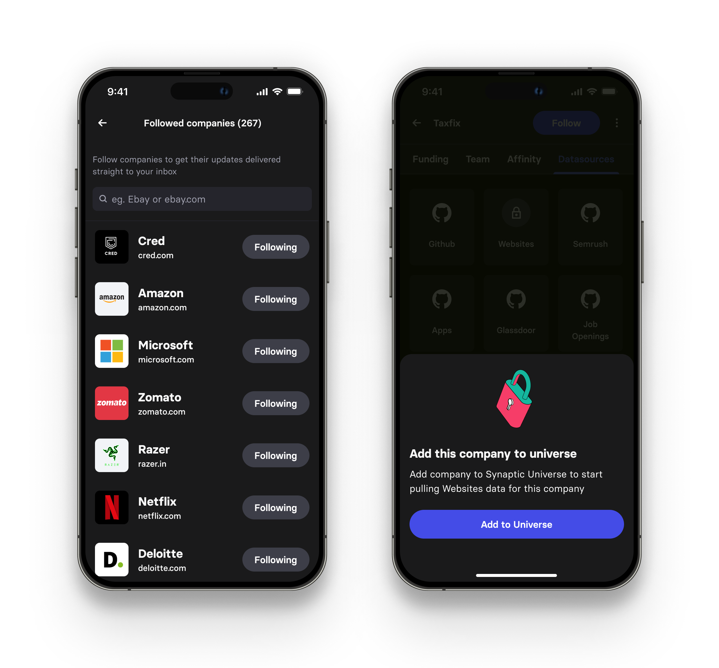
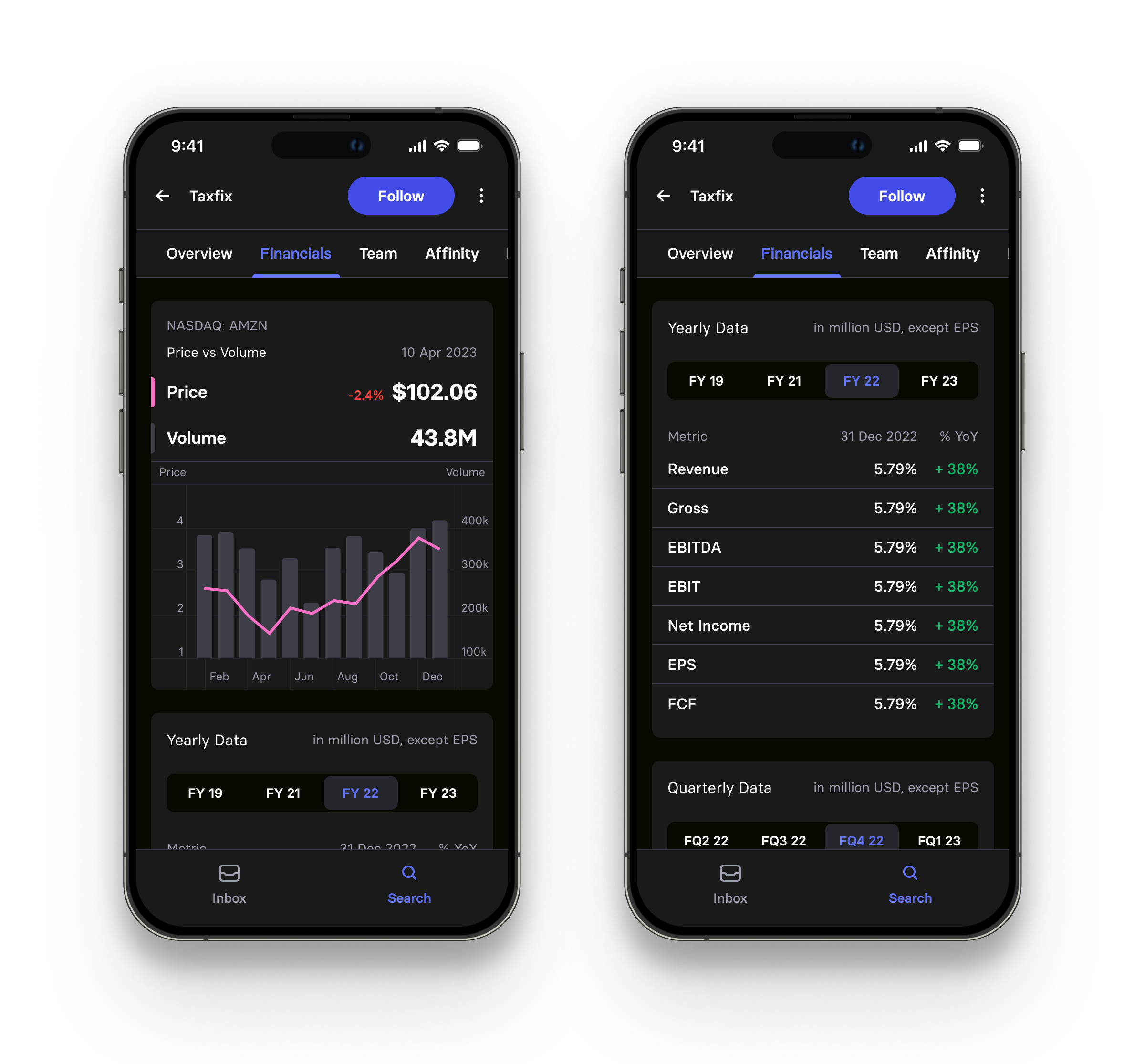
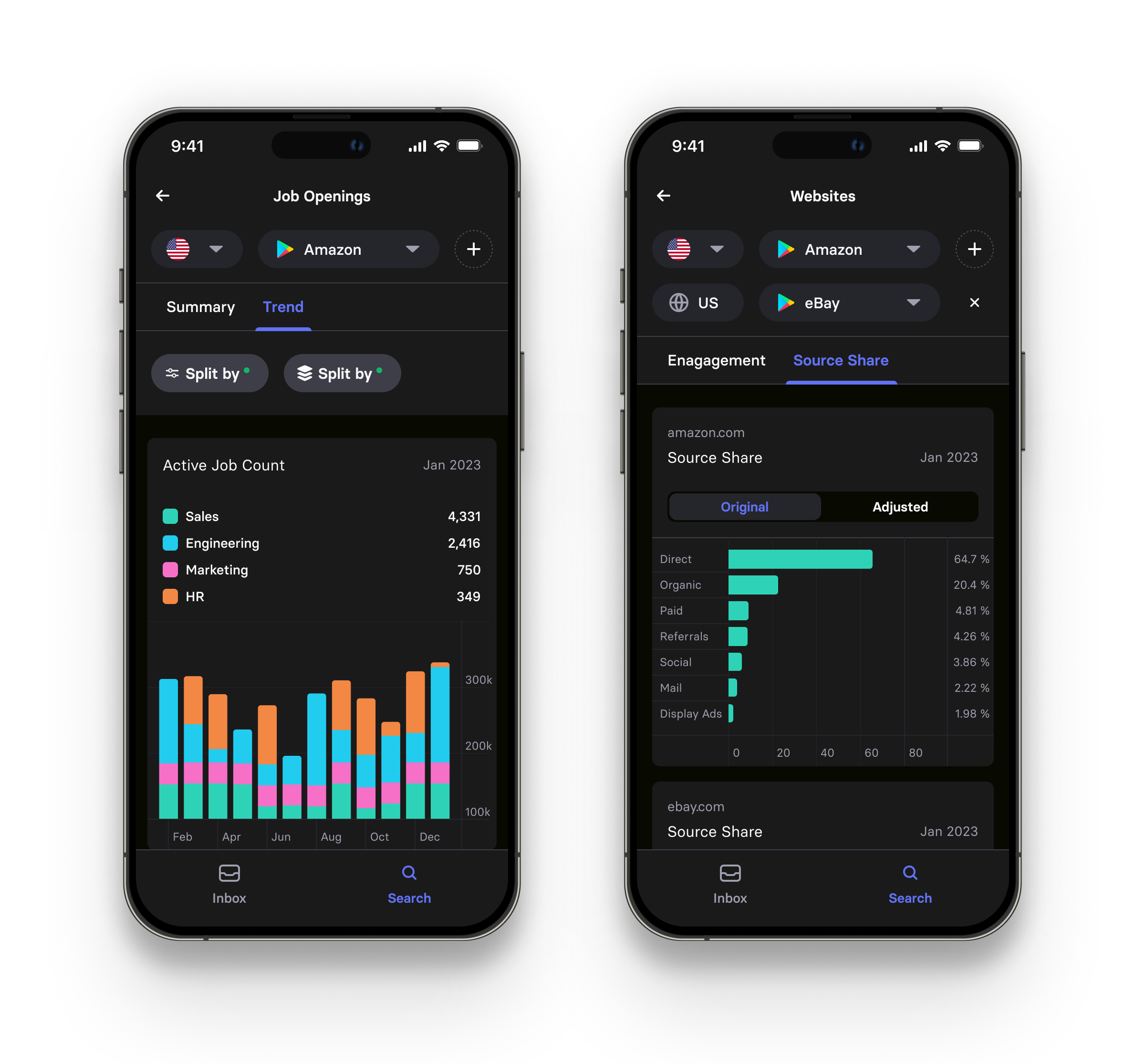
Also, since the design system was made for both light and dark modes, all these screens existed in both modes too. A few example screenshots are shown below.
Outcomes
Adoption: 80%+ of all Synaptic web app users who fit our Partner-or-equivalent roles adopted the mobile app within 6 months of release. If we consider all users of the Synaptic web app across levels extending beyond our target profile, we get a 30% adoption rate. The app is available on both the App Store and the Play Store. (A Synaptic subscription is needed to use this app)
Engagement: Following the initial user acquisition, engagement stayed consistently high throughout. The app had a stable ~200 Monthly Active Users.
Open-Source Contribution: Based on our charting component, we released a free mobile charts UI kit on Figma community, which currently has 6700+ users. Link to the UI kit.
Retention: The main hypothesis was that increasing app engagement for Partner-level users would make retention rates go up. While we achieved increased engagement for our target users, directly attributing positive cases of retention to the release of a mobile app is a hard-to-prove claim. Unlike in cases of customer churn, when a customer does renew, they don't usually point out all the things that pushed them to this decision. We therefore considered active usage on the mobile app by the target users as the closest available proxy. Otherwise, the mobile app's impact on retention was not directly measured.