The existing company screener relied on highly specific custom-built filter components for each dataset. Every time we onboarded a new data source, we had to design a fresh set of filters depending on context. This had implications on product timelines and user behaviour. I designed a simple framework for the screener from the ground up, including composable primitives for filters and columns. This new design greatly improved the usability, scalability and raw power of the company screener. Additionally, owing to the simplified framework, I was able to design a natural language query system on top of it, dramatically improving ease-of-use.
"…By the way the new screener functionality is extremely powerful
i'd say the 2.0 version is 10x the previous one
both in how easy it is to build logic and quality of data…"— VP @ Top-tier VC Firm
The Problem
Synaptic maintains a database of companies that VCs might be interested in. These primarily include startups across stages operating in high-growth spaces like Consumer Tech, Enterprise Tech, AI, Crypto, and so on.
The core feature powering Synaptic's sourcing tool is the Company Screener. The screener lets users apply filters on company attributes (founding year, headcount, industry, HQ location, growth rate, alternative metrics, etc.) to get a resultant list of companies. Some of these filters are from a predefined set (e.g. HQ Location), some are numeric (e.g. Headcount, Website Visits), and some are open-ended (keyword search on descriptions).
A significant problem users face in the process of sourcing companies is applying their criteria via filters. Since their criteria might be based on any aspect of a company, no matter how specific, users generally demand more and more types of filters.
But this comes with several tradeoffs:
- Finding the right field/metric for the criteria they have in mind (Headcount might be termed number of employees, website visits might be termed total traffic etc.) becomes harder the more fields you have.
- The arrangement of all available filters and applied filters on the UI starts looking and feeling convoluted the more complicated the user's query gets.
The existing screener had a collapsible filter panel where the user could see available filters and applied filters in a single view. The filter panel was composed of filter groups in different categories; each group in turn was composed of several smaller filters each of a different type with dropdown menus, checkboxes, radio boxes etc.
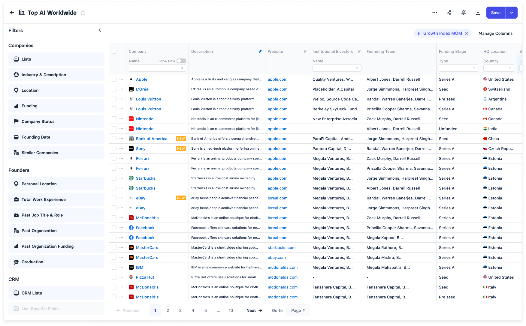
Figure 1: Representative image of the existing company screener [Source: Author]
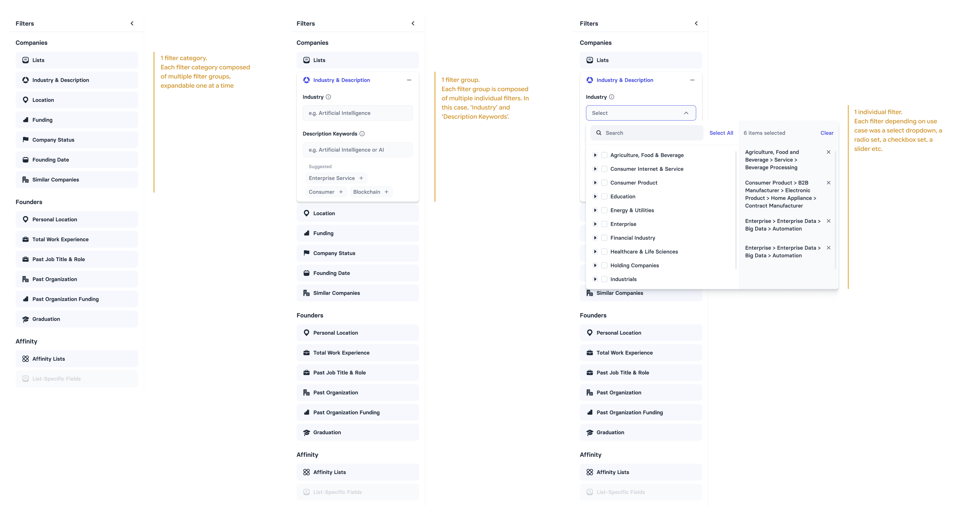
Figure 2: Nested arrangement of the filters [Source: Author]
This nested arrangement made it easy to categorize and customize filters as per the specific field. However this arrangement ended up having a lot of small knobs and dials which added a lot of cognitive load both for the user and the designer. Every time we onboarded a new dataset, we had to figure out how to design a filter for it.
Moreover, some filters were accessible via the filter panel and some via column headers.
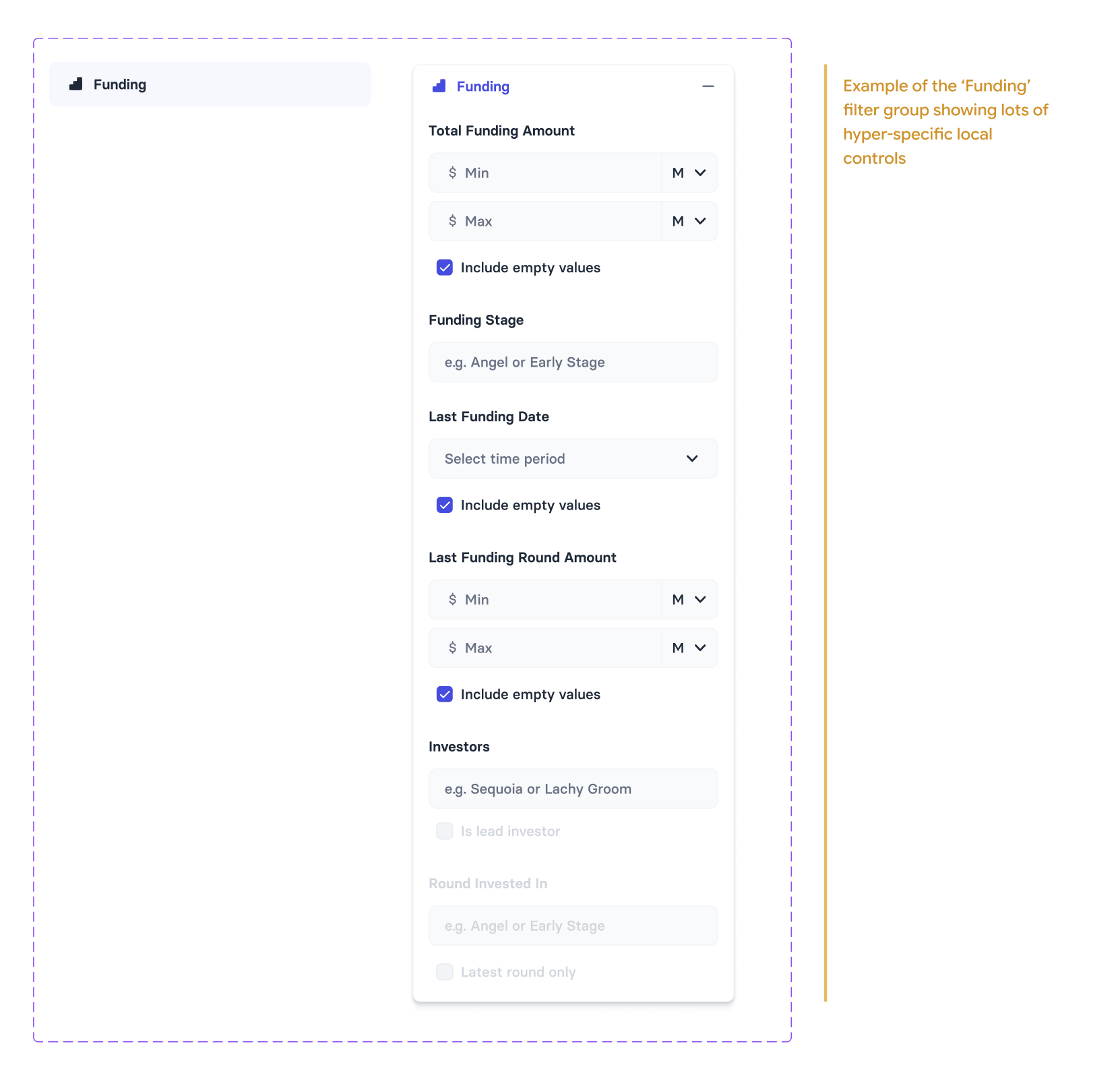
Figure 3: Filter group showing local decision-making [Source: Author]
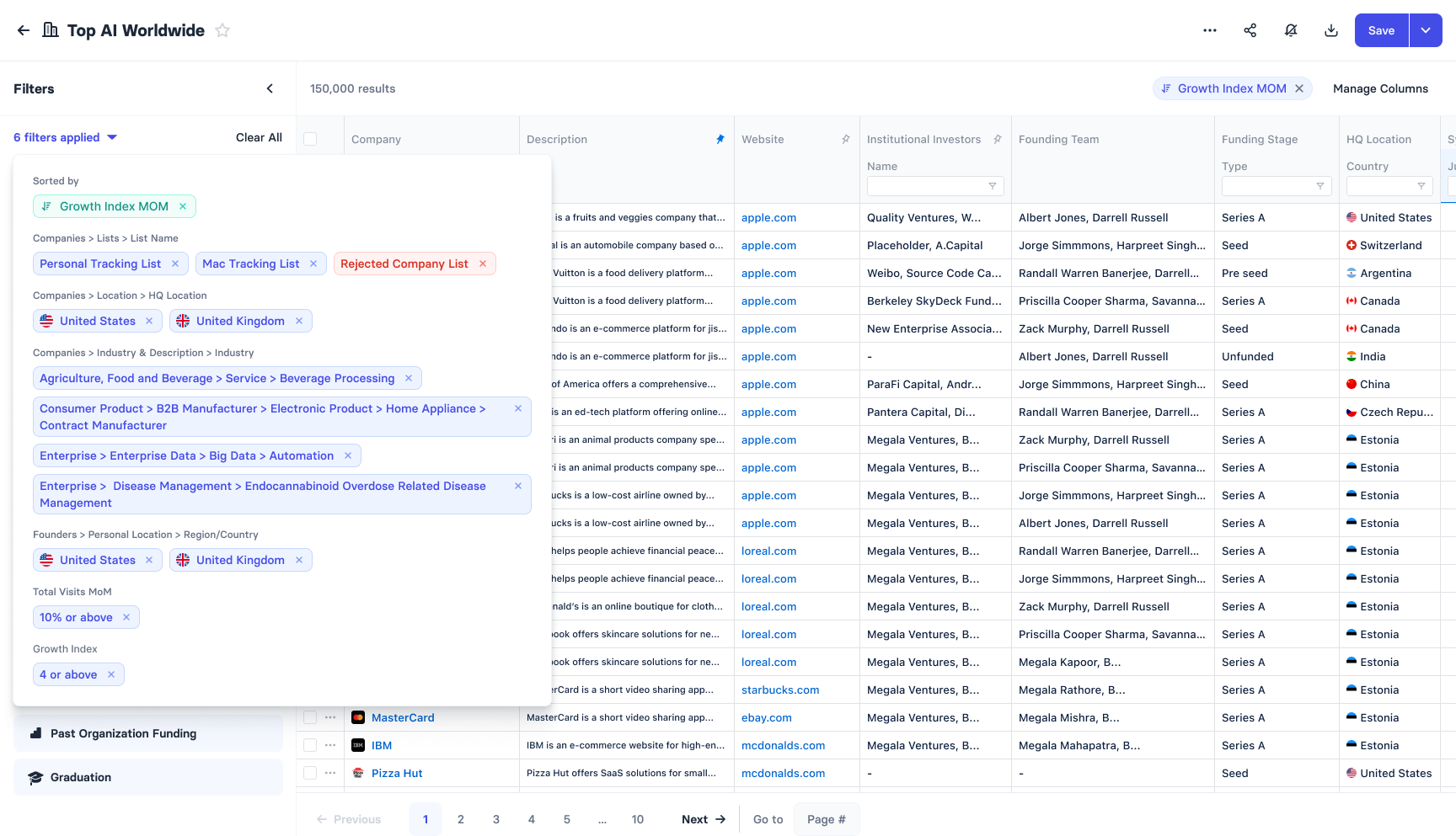
Figure 4: Dropdown showing compact notation for applied filters
In short the entire screener arrangement was complicated, unpredictable, inconsistent, ad-hoc and unscalable. We frequently got complaints from users who thought they'd set up a particular criteria but in reality had set up a marginally different criteria with no way of knowing it without digging into the details.
All these were major problems we set out to solve.
Research
I looked at a whole host of other tools that let the user build tables or dashboards from large sets of data by applying filters. These were primarily BI tools: Mixpanel, Looker, Tableau, Google Data Studio and such.
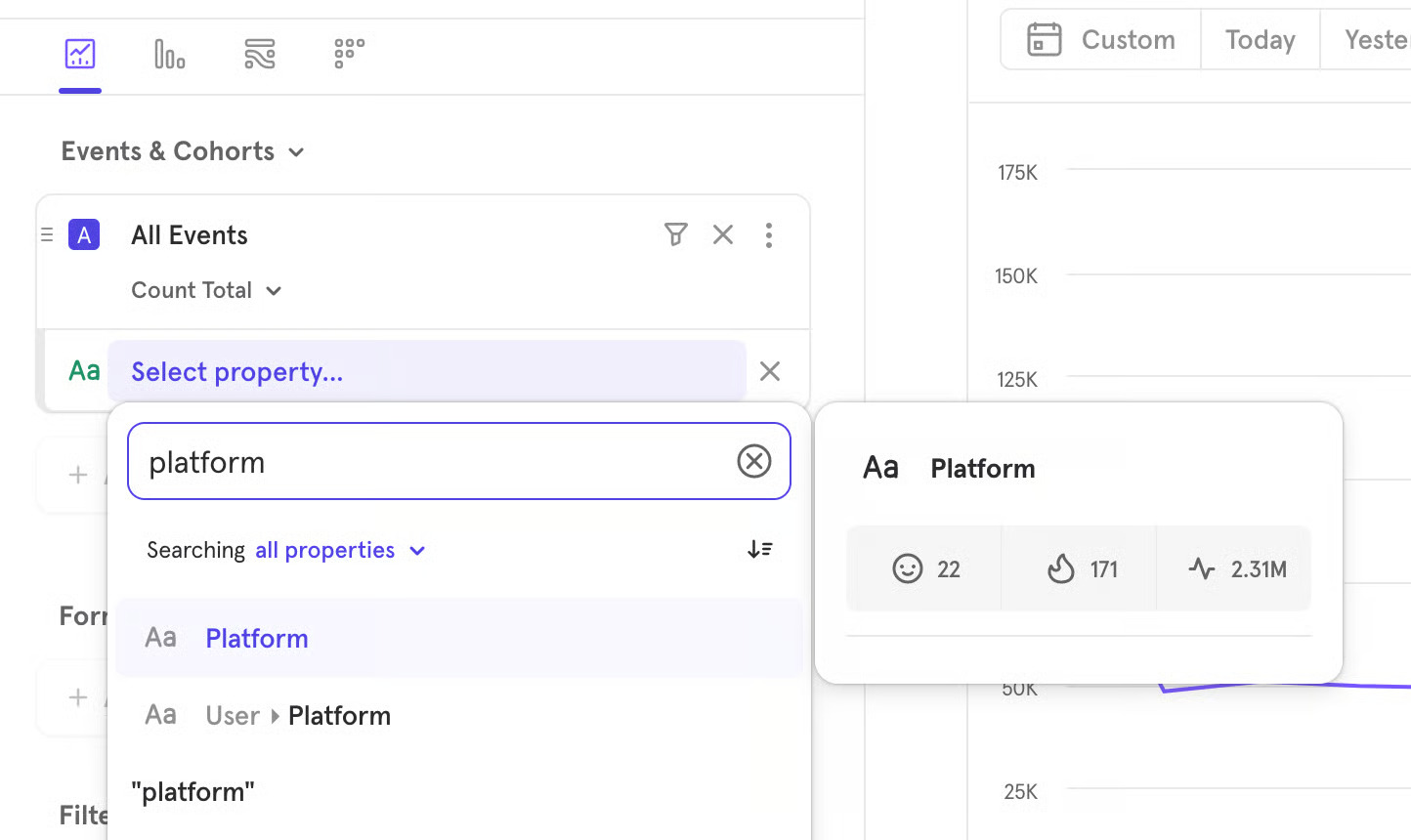
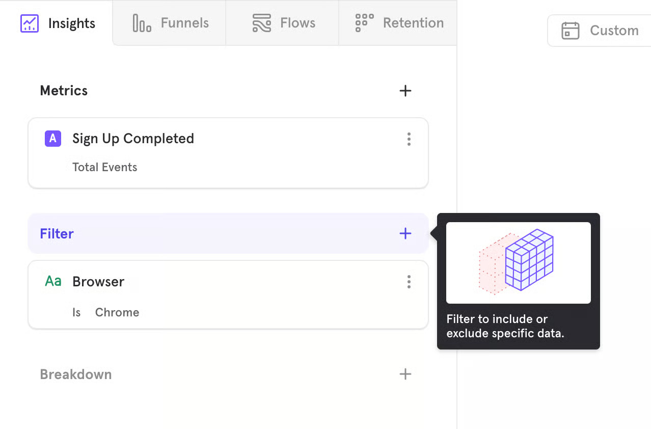
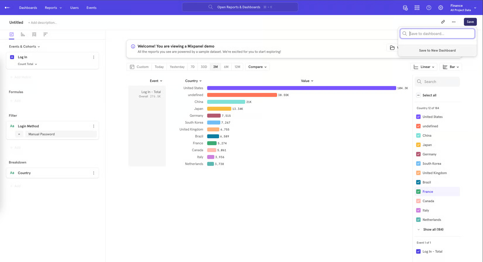
Figure 5 (a, b, c): Examples of a Mixpanel dashboard showing filters and other controls [Source: Mixpanel]
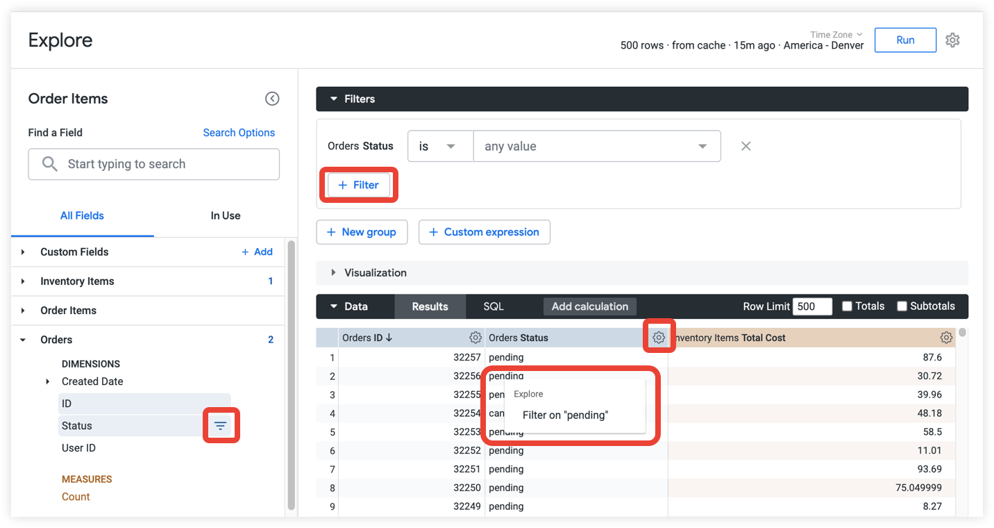
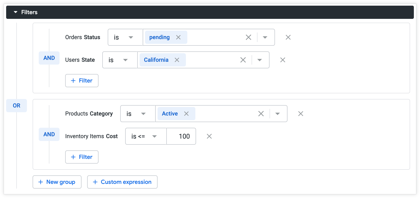
Figure 6 (a, b): Examples of Looker Studio dashboards and filters [Source: Looker Studio]
My research led me to developing a simple framework for building UI components for data tools. I figured if I solve the most valuable component of the screener filters: a single filter component, we wouldn't run into these problems again and again.
The goal: to design a single filter component that would work for any data type, any field and any metric; and could be combined with other filters in whatever way the user wanted.
Early Attempts
My early attempts at designing a screener from scratch took me through several iterations of complete overhauls of the existing screener. These approaches would've involved setting up a separate UI tool on the back-end for supporting the screener, called the 'widget builder'. It also involved redefining the way data is stored, processed and how API calls were made.
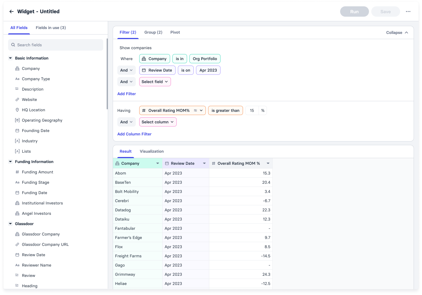
Figure 7: Representative example of the widget builder [Source: Author]
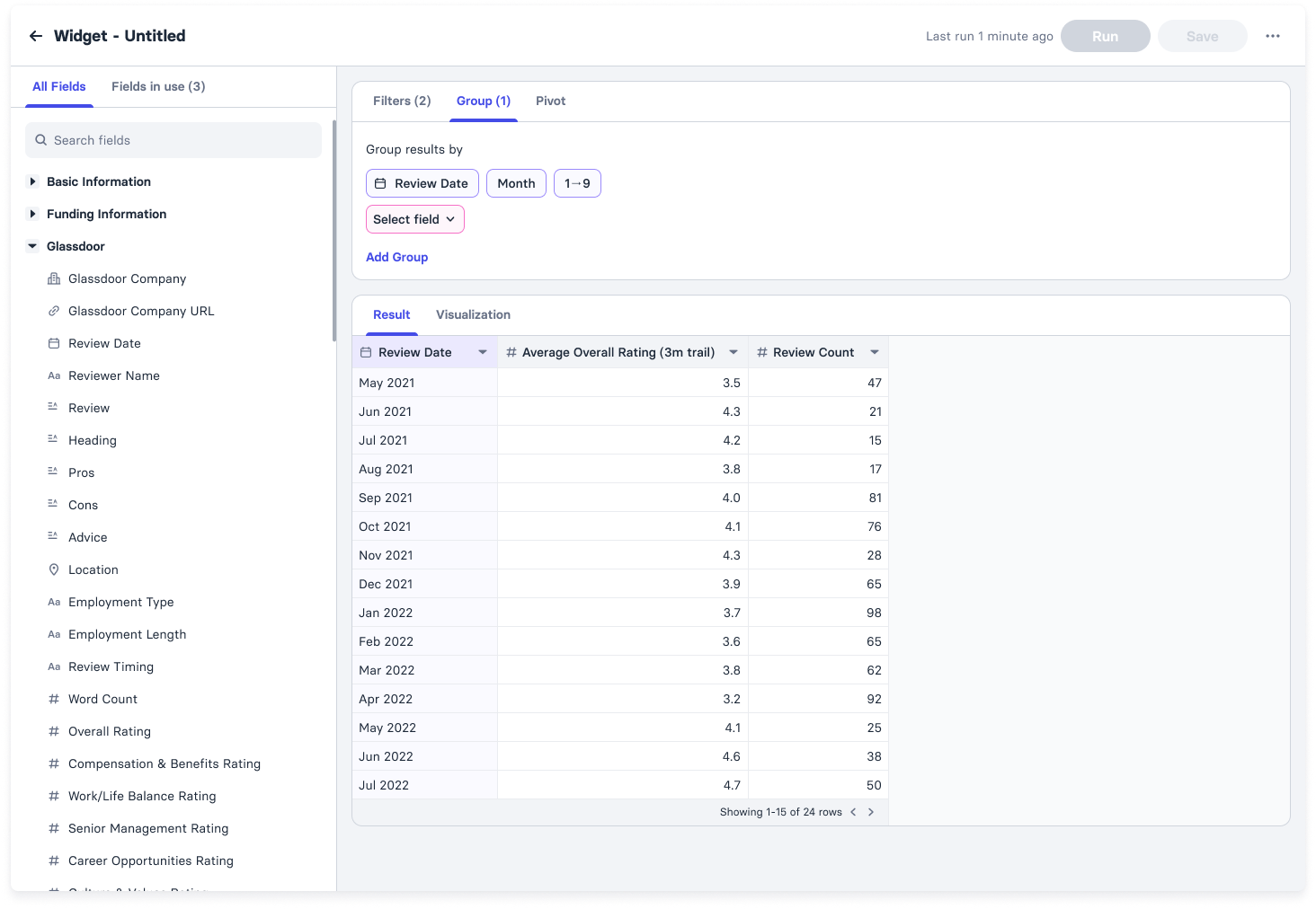
Figure 8: Representative example of the widget builder [Source: Author]
This was an over-ambitious engineering-heavy approach with no incremental rewards in between. Building it and testing it was estimated to take upwards of 6+ months at the very least. Putting it in front of the user after that timeline, for uncertain reward, would be foolhardy.
We needed an approach that got us the benefits of the simplified structure without taking up so much development time.
The Solution
Part 1
I narrowed down onto the most essential parts the user needed. First, I needed to lock down the primitives for composable filters and columns.
The following figure shows the structure I came up with.
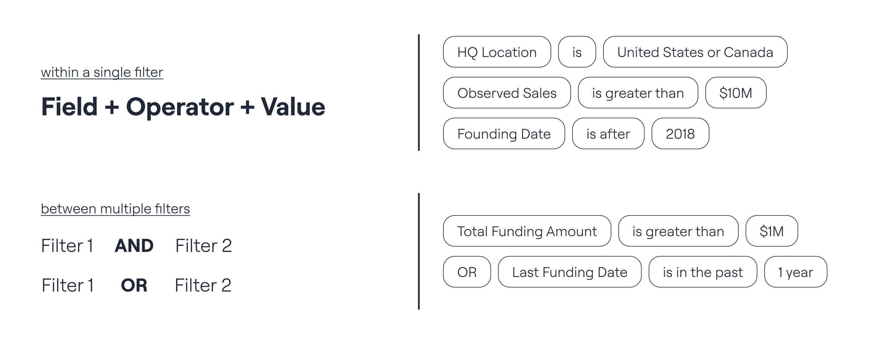
Figure 9: Uniform structure for filters [Source: Author]
Each filter group was composed of fixed pieces whose values depended on datatype. These could also be granularly controlled depending on other fields available from the same dataset.
Additionally, any filter could be combined with any other with an 'AND' or 'OR' connector. A bunch of filters could also be nested together as a group.
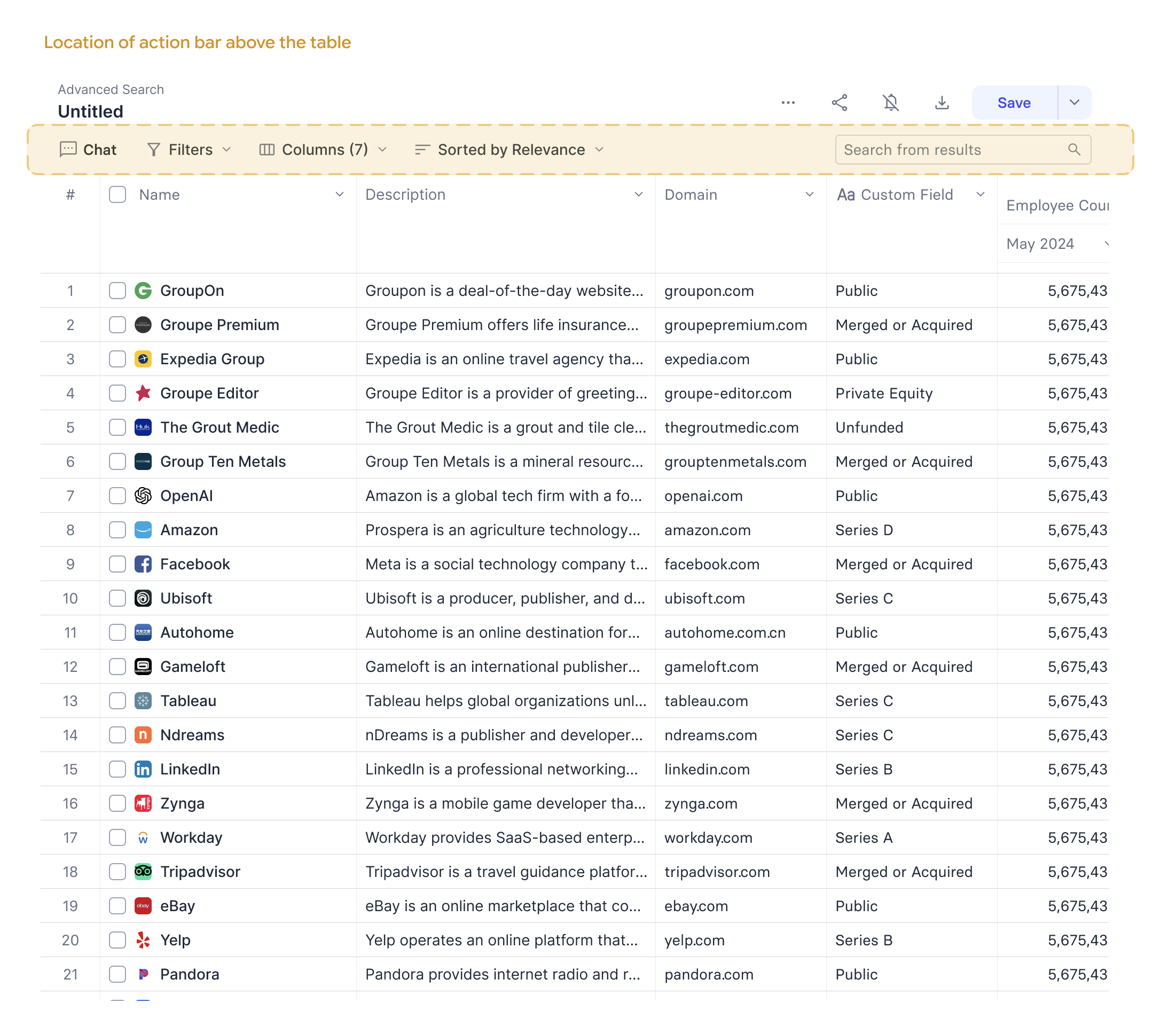
Figure 10: Representative layout of the redesigned screener [Source: Author]
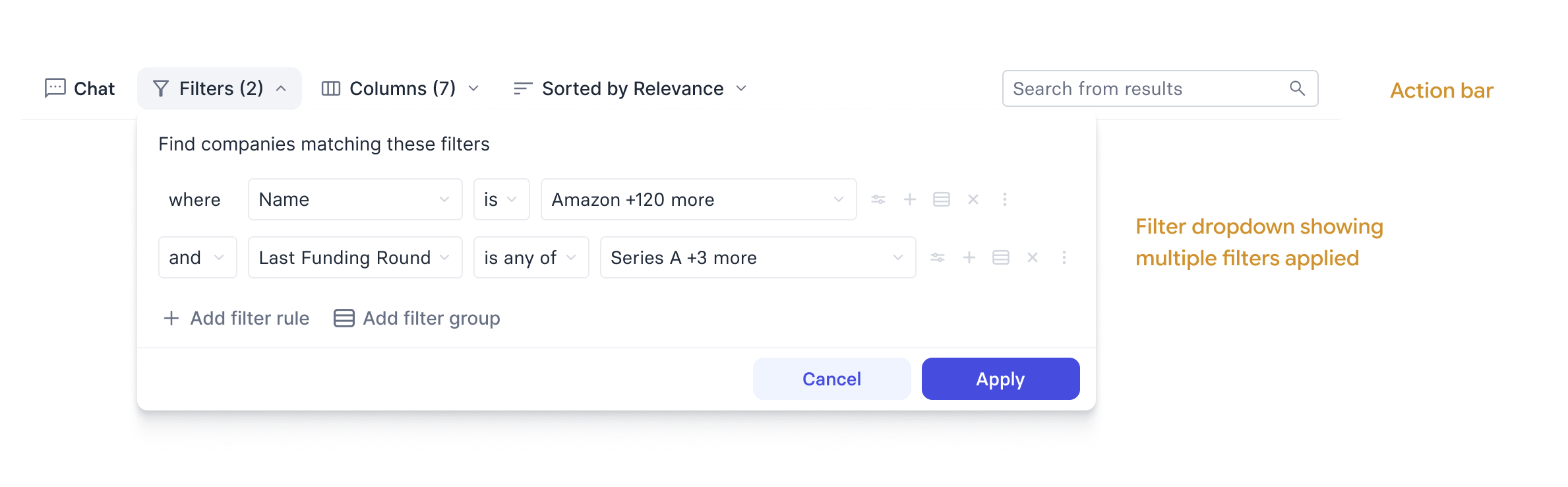
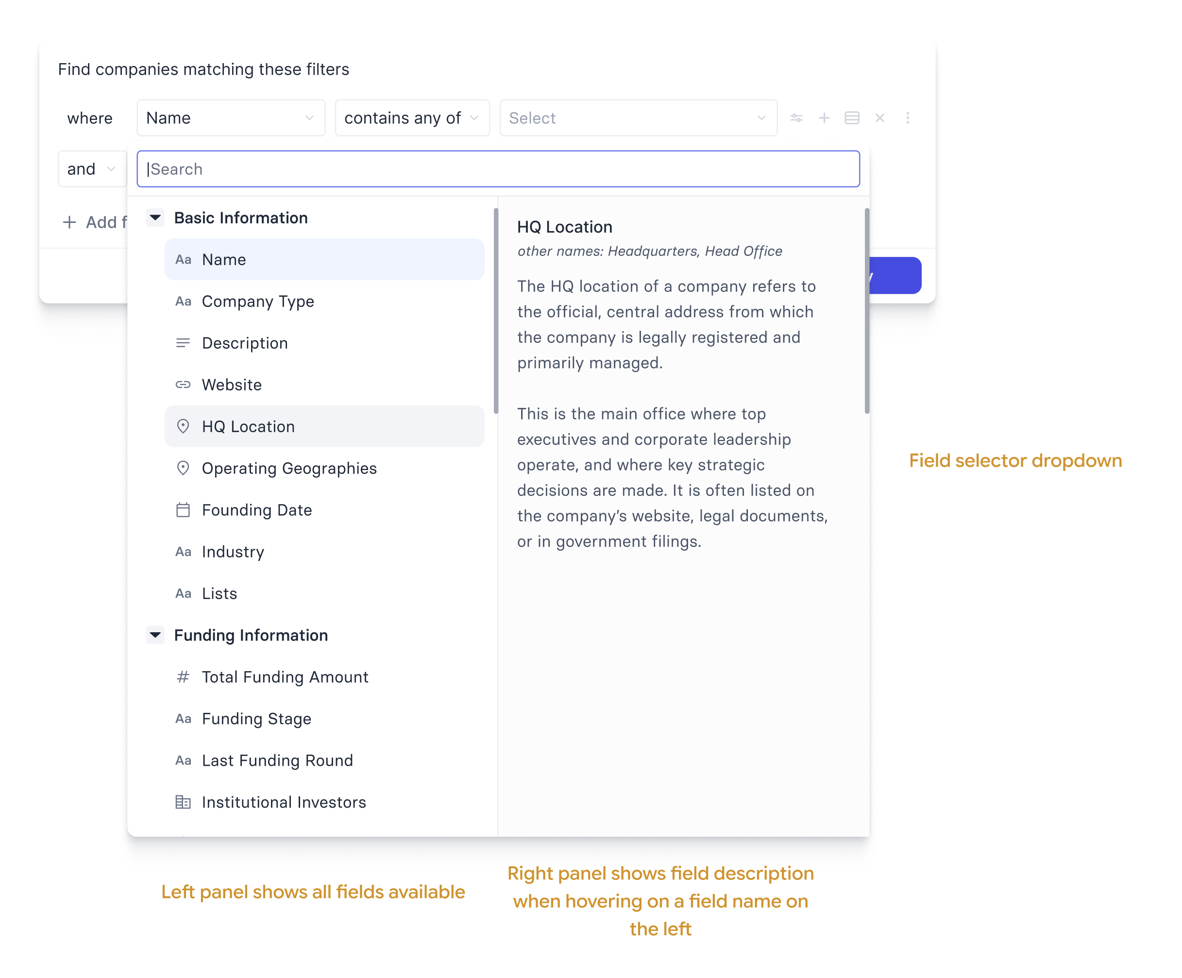
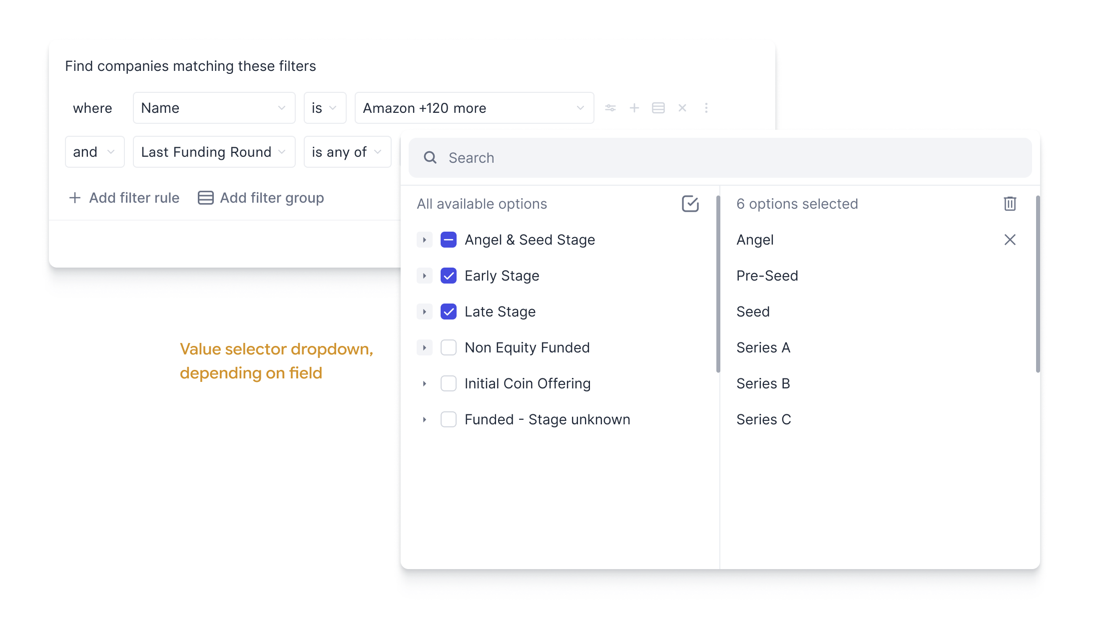
Figure 11 (a, b, c): The filters dropdown, the field selector dropdown and the value selector dropdown [Source: Author]
The UI component for the field selector dropdown was designed so as to be able to communicate the category/datasource and definitions that the user needed to be able to make a relevant selection.
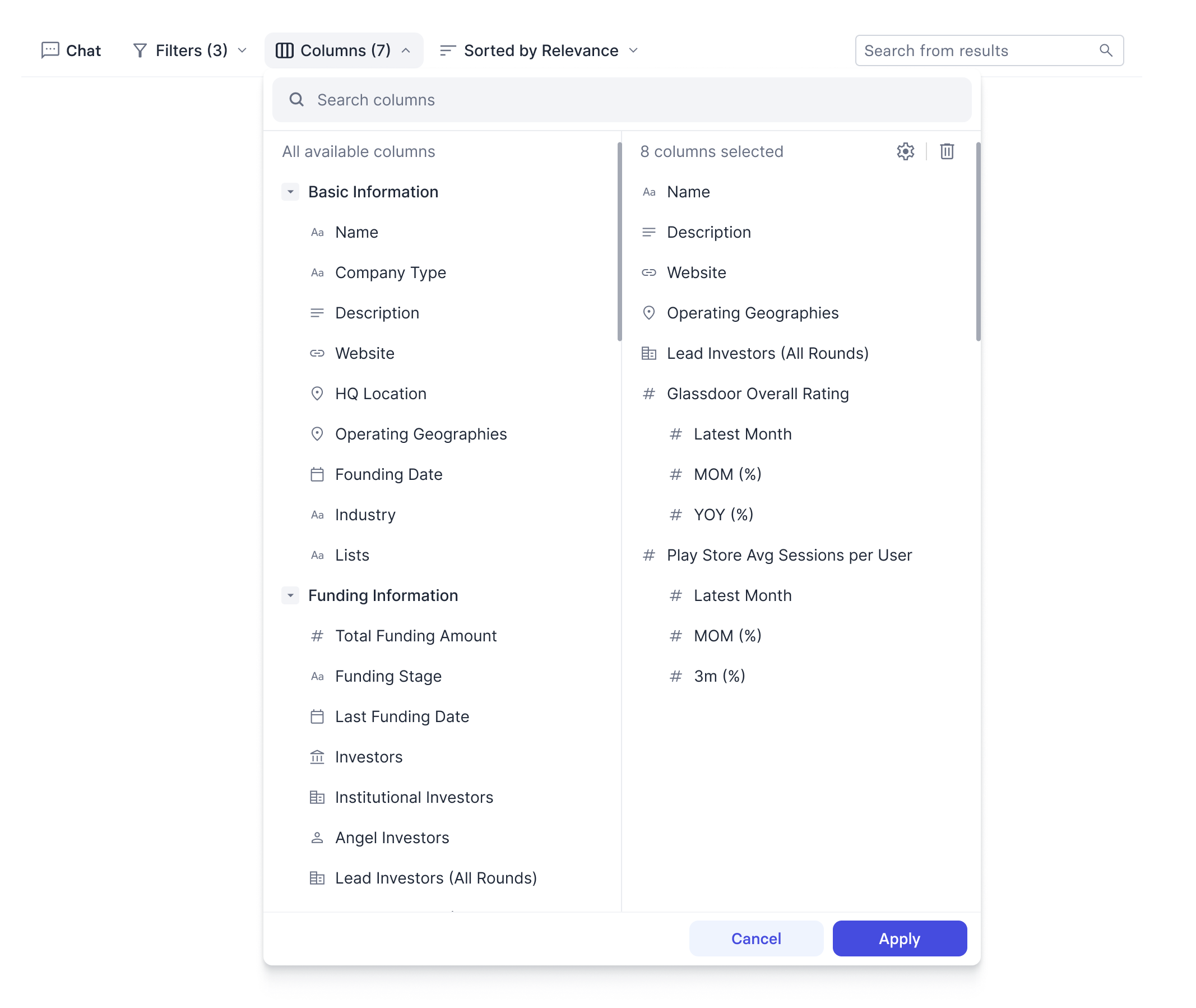
Figure 12: The column selector dropdown [Source: Author]
The column component was designed the same way. Users could add whatever columns they wanted to see, customized in whatever way they preferred, and save their preferences for future use. Unlike before, there was no dissonance between the filter panel and the column headers.
Since I was the product owner for this too, I had control over the approach we would follow. In order to prevent the failure modes of earlier approaches, we followed an extremely lean approach.
We would design a bare-bones screener with only one field in the filter and column as a proof-of-concept. This would help the entire team get a feel for whatever was being built, and more importantly, the proof of work would always be in front of us, ready to be used.
However, the entirety of work had been planned out beforehand. There was no critical decision-making pending and no design blockers we hadn't foreseen. In this way, we were able to quite rapidly make a new screener using the building blocks from the existing one and the newly designed components.
Thus, by 2 months in development time, we had achieved parity with the existing screener in terms of the number of filters and columns available. In terms of functionality, we were already so much further ahead.
But we weren't done yet.
Part 2
The design of the filters and columns was only one part of the solution. I'd known that users familiar with the older screener would refrain from using a new one since there was a bit of a learning curve attached.
But with recent advances in LLMs, I'd known that the chat interface offers a significantly larger upgrade in usability and functionality. Describing your criteria in natural language is most of the time far easier than using UI filters to construct it. And because the filters and columns were now built from a fixed, predictable structure, translating a natural language query into a set of filters and columns became a solvable problem. The chatbot's job would simply be to translate from NLQ to a fixed set of primitives the UI already used.
Therefore, I designed a chat interface for the new screener in a way that felt intuitive without being obstructive. I wanted users to be able to use it freely; without hampering someone who wanted purely to use the UI controls.
I looked at tools that offered such functionality at the time — starting from state-of-the-art general purpose LLM chatbots like ChatGPT, Claude etc. to more workflow tools like Cursor, Manus etc.
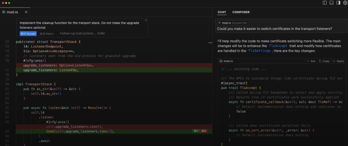
Figure 13: Cursor: The AI Coding Platform [Source: Apidog Blog]
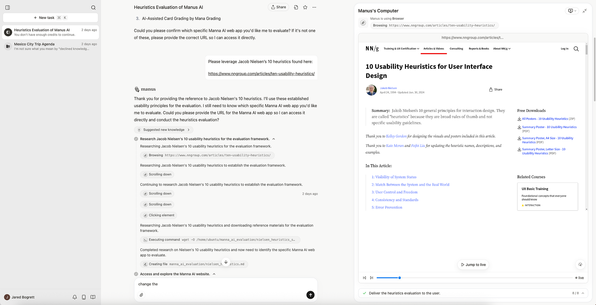
Figure 14: Manus AI: Autonomous AI Agent [Source: Manus]
My research gave me the learning I followed for the chat interface at the time: designing the chat interface as an assistant that works with you.
For a tool accessed through the web browser that users feel comfortable fiddling with and researching with, it makes sense to let the user do whatever action they want to. Applying a filter manually, adding or removing a column, excluding a company manually etc.
The chat interface is on the side (hidden from view if need be) but always keeping track of the user's actions. If at any point the user wants the assistant's help, they need only drop a message in their chat and the assistant picks up their work where they left off and continues from there.
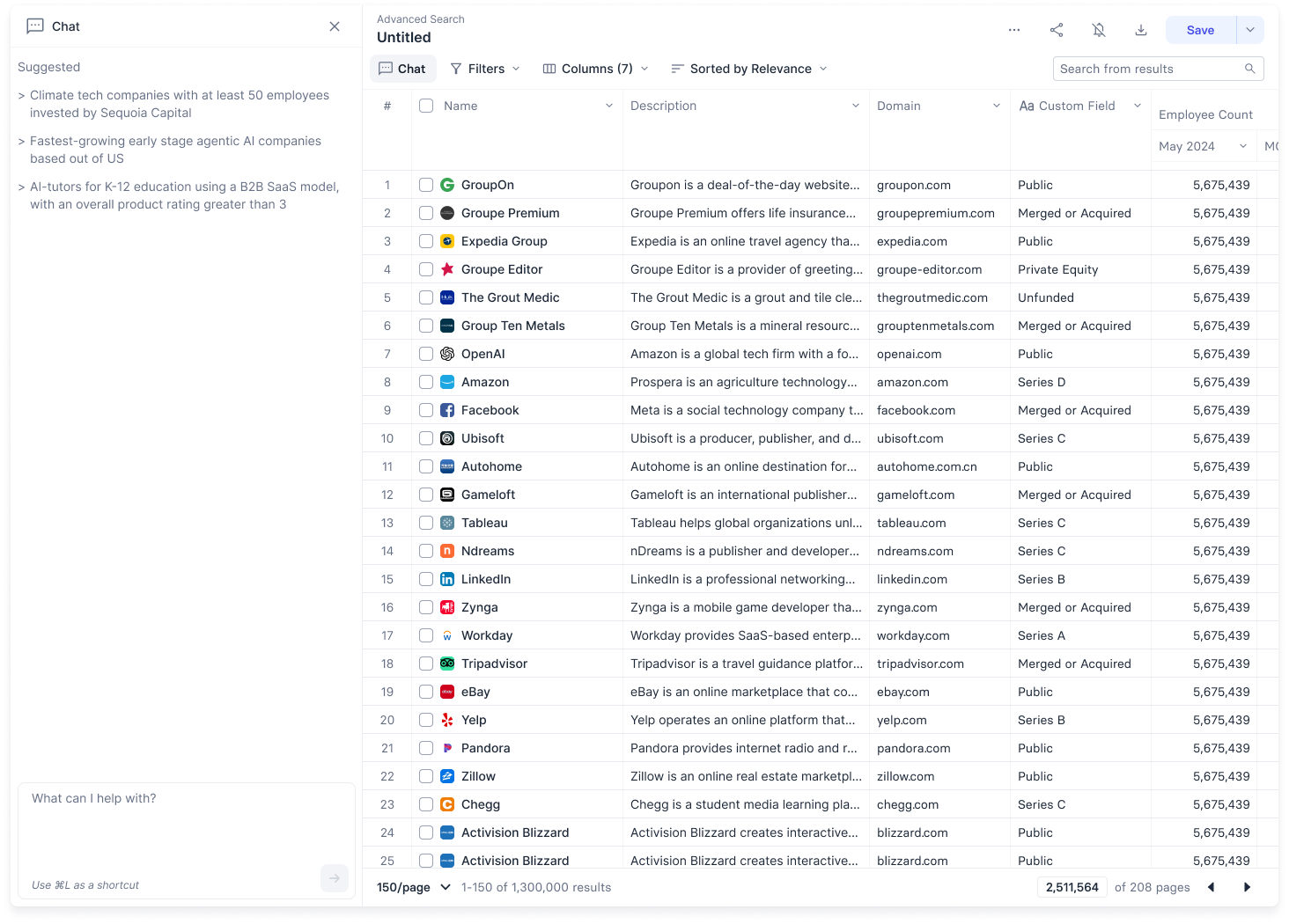
Figure 15: Representative screener layout with the chat panel open [Source: Author]
The UI is always active, so the user can see what the assistant is up to. Since the assistant builds its query out of the same basic filter components, the user can always see what criteria were set and flag if anything's incorrect, thus avoiding the mismatches from the previous screener.
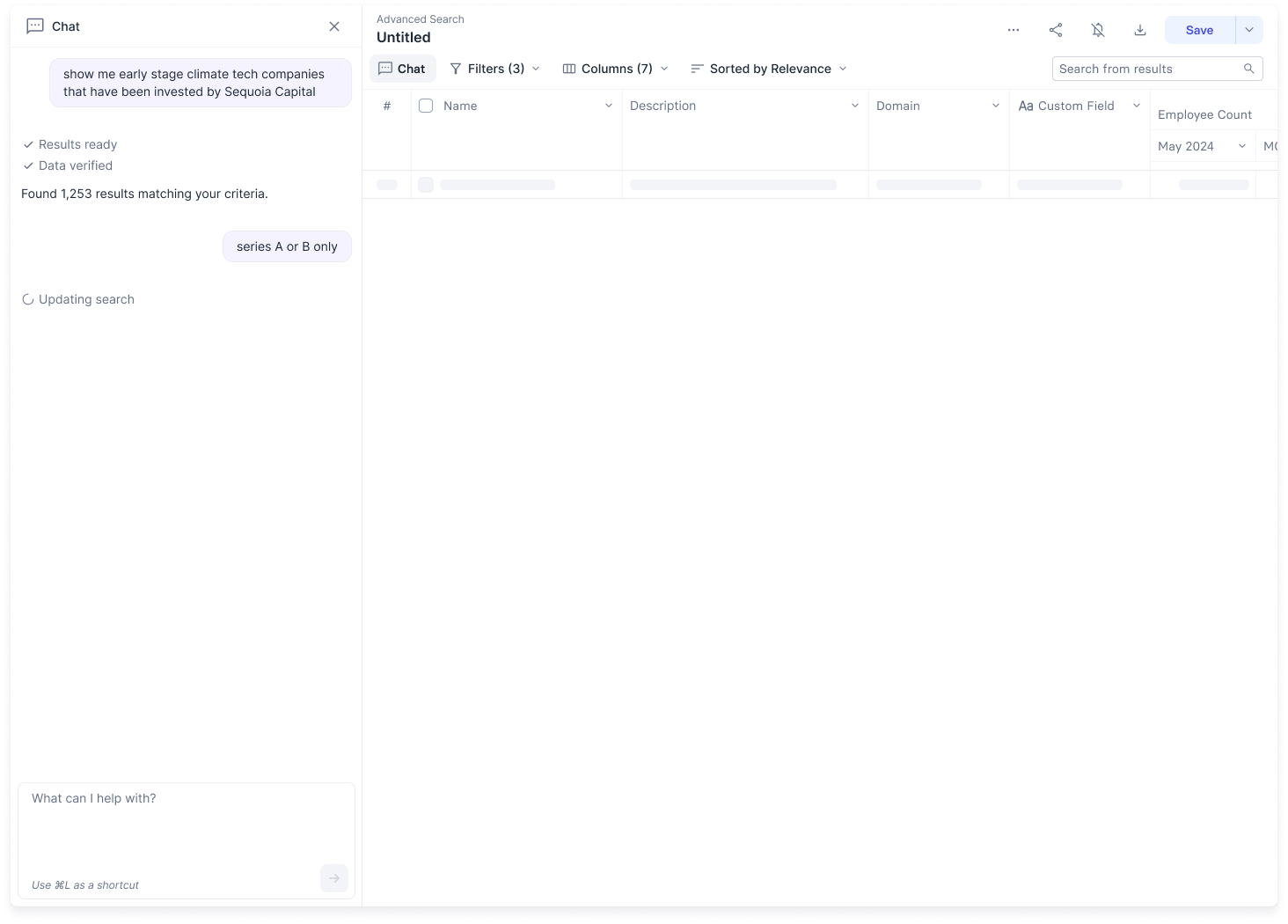
Figure 16: The screener loading state when the chat assistant is working on it [Source: Author]
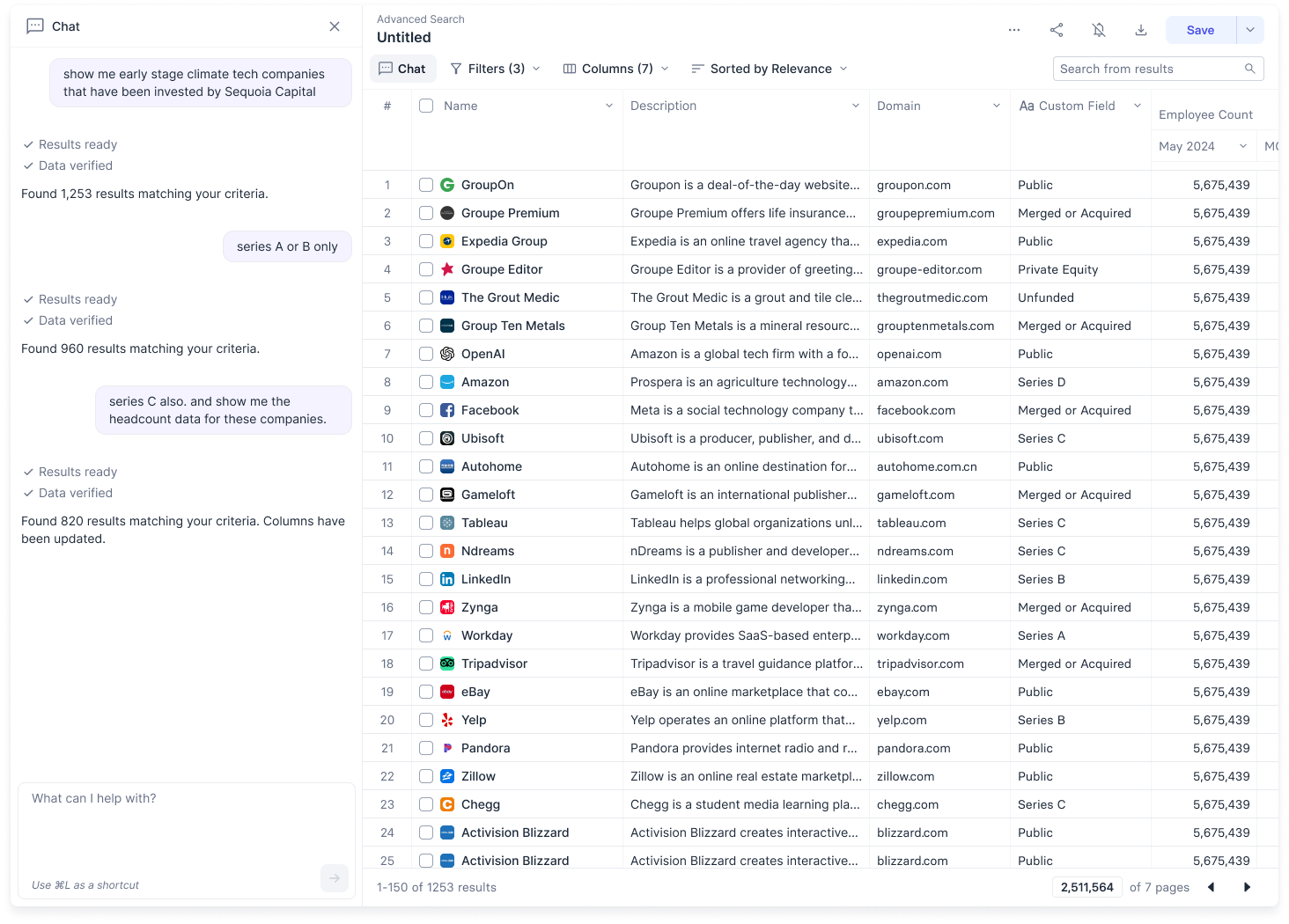
Figure 17: Representative screener chat [Source: Author]
For the first iteration, chat responses were limited but descriptive enough for the user to be able to understand possible actions and the outcomes of user demands. Further iterations improved the style, tone and range of responses.
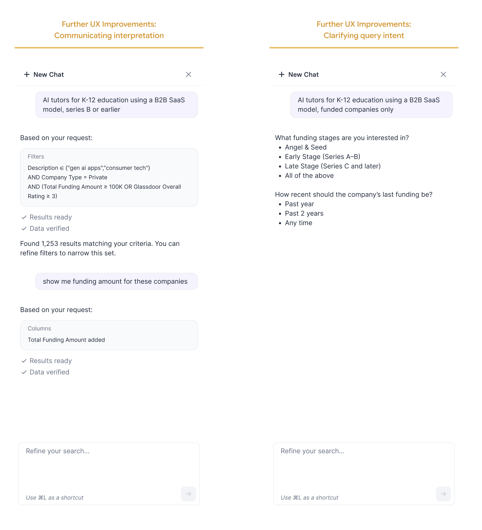
Figure 18: UX improvements in the screener chat [Source: Author]
Brief Technical Overview
Behind the scenes, the chat agent was not a single agent but a whole set of agents. To give a simplified picture, the overall flow looked like an orchestrator giving away the user query to relevant sub-agents, each responsible for a single filter or for setting columns; a consolidator agent in the end collected all the agent responses and passed them onto the required API call in the proper structure. In this way, we were able to achieve a lot of parallelization and separation-of-concerns and prevent context overload.
Analysts manually built a dataset consisting of NLQ and corresponding translated-queries covering a range of datasets, data types and query complexity. Prompts were finalized on this dataset using DSPy GEPA optimizer.
Outcomes
Adoption. 65% of all screeners made within 6 months of release were the redesigned kind. Users consistently preferred making and using the new screener over the old one.
Customer Feedback. Explicit feedback from a customer highlighting the 10x improvement over the existing screener.
Development Speed. Consequently, designing, developing and testing new data sources on the redesigned screener happened in the matter of 1-2 days; compared to ~1-2 weeks for the previous screener. Equivalent to ~7x improvement.
Usability. Typing in a typical natural language query to get a final result takes ~10 seconds. Manually setting up filters and columns to get results takes somewhere around ~2 minutes. Equivalent to ~10x improvement.
Functionality. The new screener offered a lot more complex functionality than the previous one, letting users achieve with a single screener what previously took multiple lists and screeners.
Additional Time Savings. Previously, the Customer Success team frequently manually set up screeners for users owing to the steep initial learning curve. Because of the improved usability and functionality, users were able to manually set up the new screeners very easily themselves. This cut down an estimated ~80 man.hours/week just for the CS team.