Context
This section provides information about Synaptic. Feel free to skip ahead if you are already familiar with their work. To know more, please visit synaptic.com
The following project was undertaken at Synaptic, an alternative data company that helps VCs and financial firms make smarter decisions. Synaptic’s primary offering is a subscription-based online research software, on which public and private companies can be compared across billions of metrics like website visits, app downloads etc.
Project Brief
This project involved the evaluation of the performance of the ‘Screener’ module: a multi-metric analytics module on Synaptic where users could compare thousands of companies across hundreds of metrics in a single table.
The objective of this exercise was to determine the root cause behind user complaints of slowness and lagging on this module and come up with solutions to address the problem.
This project was a design-driven exercise, completed without a written PRD (Product Requirements Document) or the involvement of a Product Manager. I was working on this project independently, but under the supervision and guidance of my manager, Mr. Vikrant Raj. My role was to dive deep into the problem, understand user complaints, research about identifying root causes and work closely with engineers to deliver the final intervention.
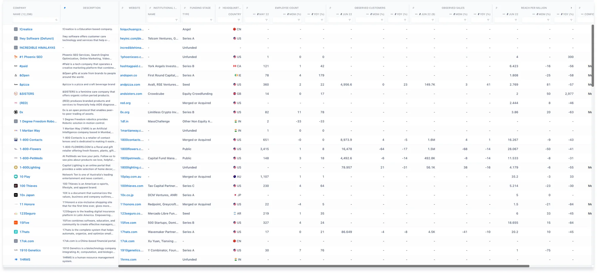
A screenshot of the existing screener table
Recognizing the problem
The first step in recognizing the problem was to look at direct user feedback.
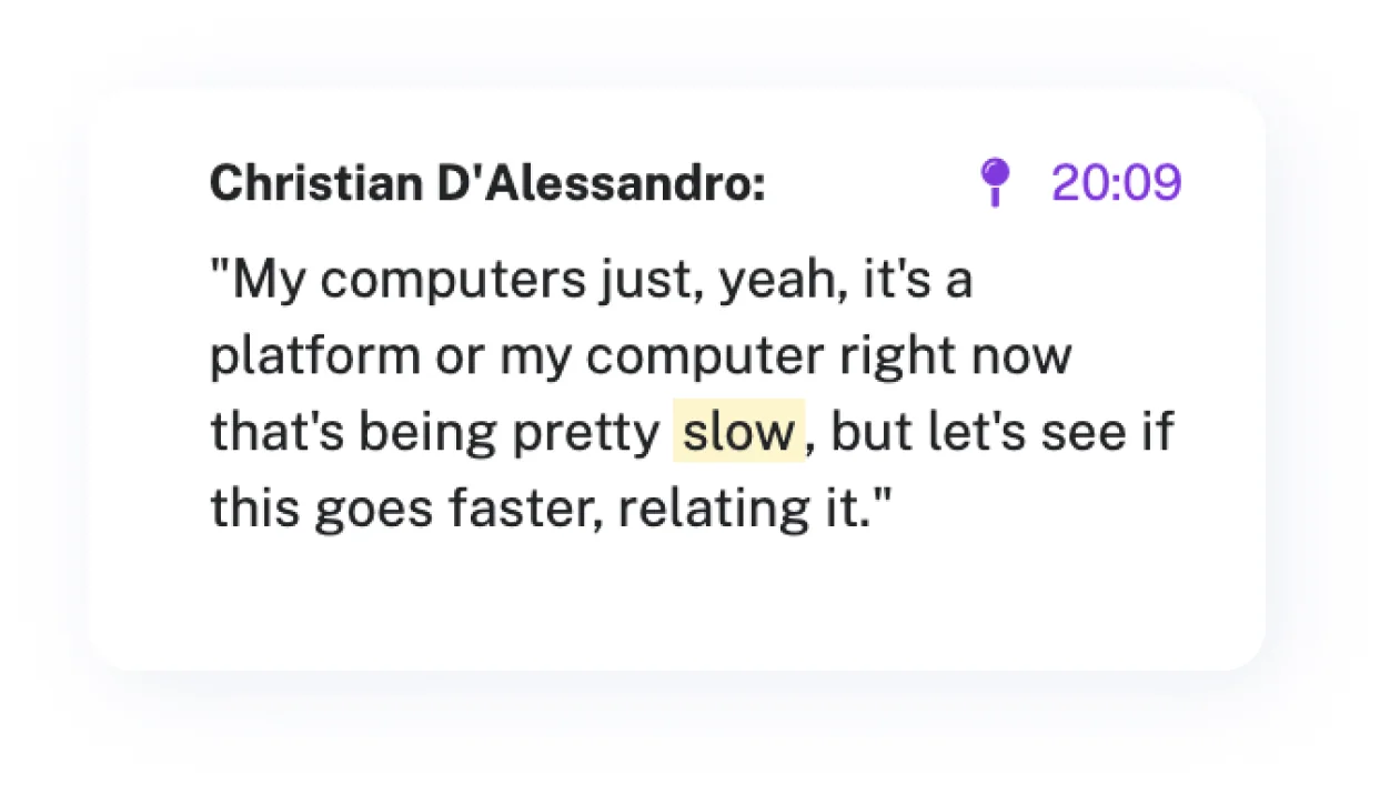
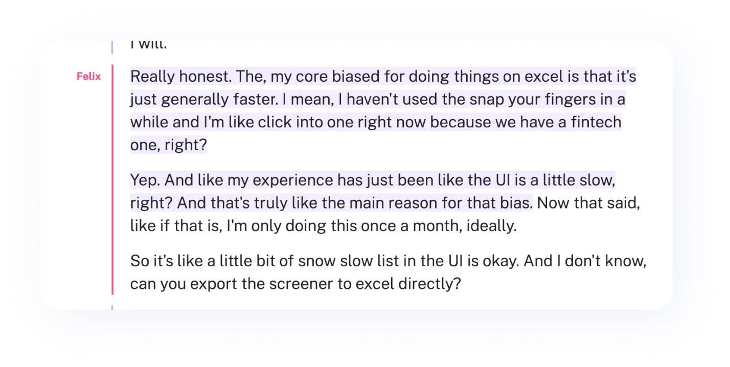
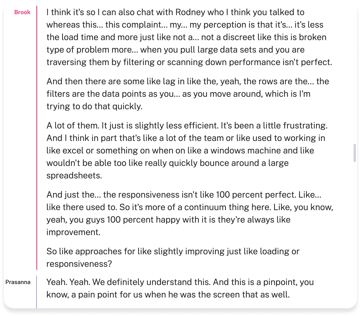
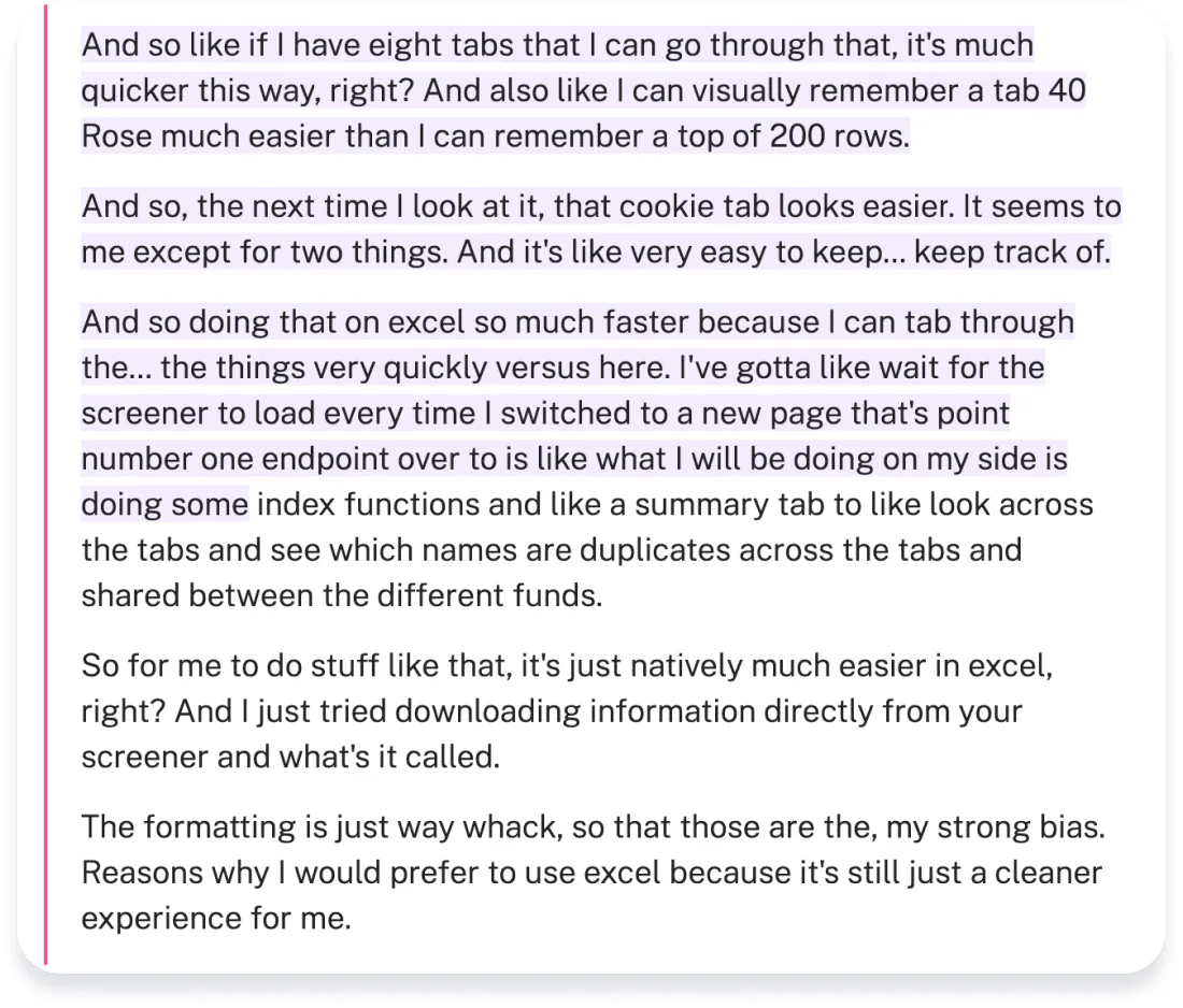
The details of these conversations have been deliberately omitted.
Looking at previously recorded calls of clients with our customer support team, we could identify a few patterns in their feedback. Most users highlighted the following issues:
- Lag and responsiveness
- Slow loading time
- Performance not being perfect
- Not able to easily traverse the screener
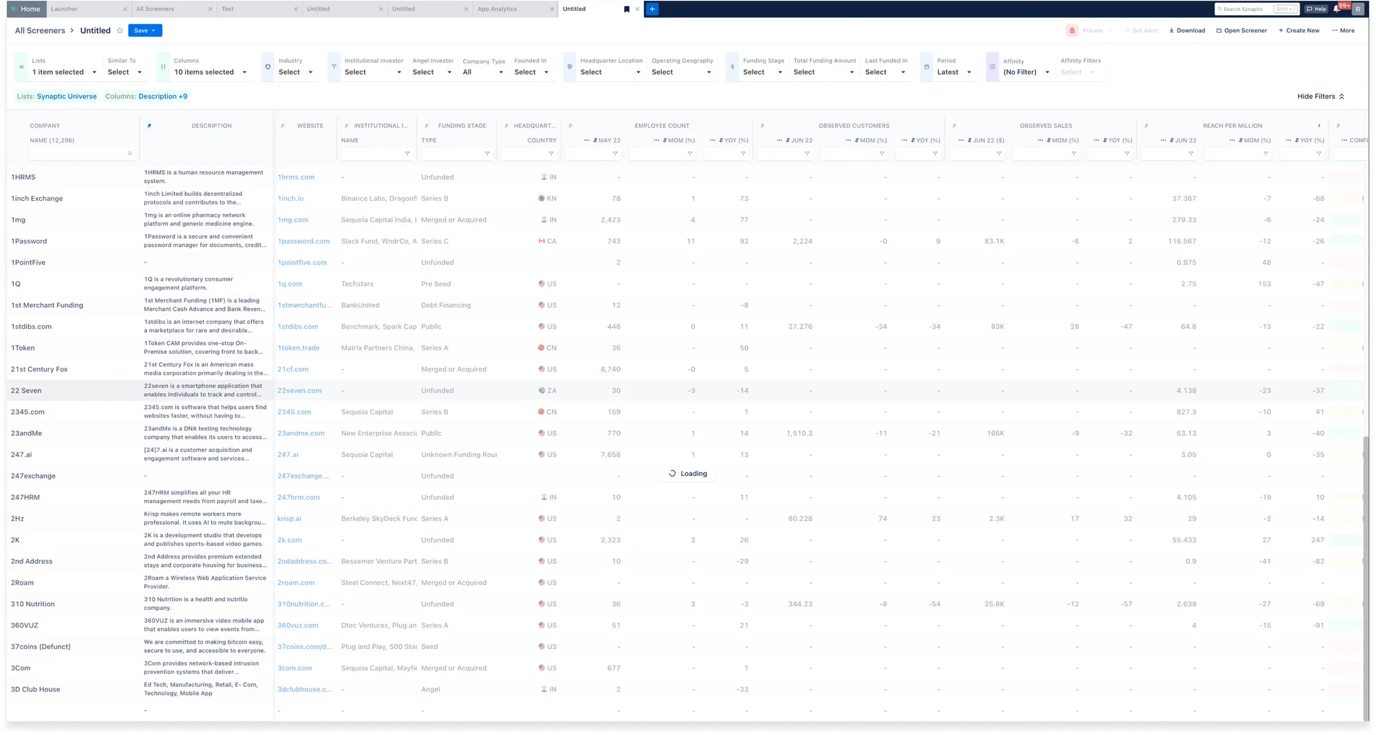
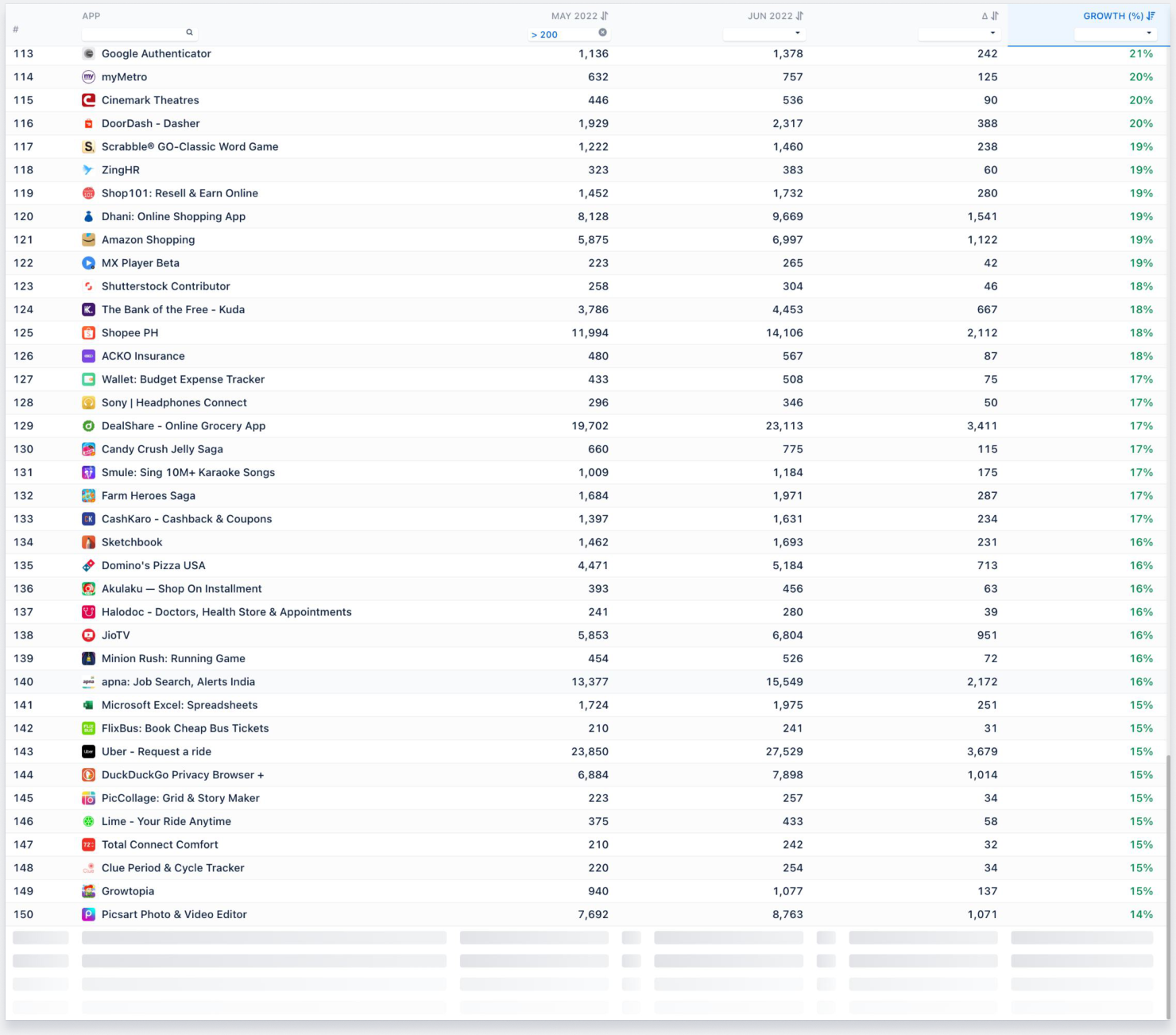
A screenshot of the existing screener table showing a blocked screen with a loading state
Estimating the scale of the problem
Looking at the feedback, we were able to estimate the severity of the situation. Based on a certain number of leads not converting and several other renewals being at stake, we calculated the scale of the problem to be $500,000.
Cost of not solving this problem = $500,000
Research into relevant heuristics
Because most user issues were around performance and laggy perception of an interface, we needed to have a thorough understanding of perceptual science and cognitive psychology.
We learnt about how different time scales are perceived by users, in Jakob Nielsen’s Usability Engineering (1993). A few heuristics from the book are as follows:
- 0.1 second: Direct manipulation. User in control
- 1 second: Seamless flow of thought. Feels like 2-way interaction
- 10 seconds: Limit of user attention. Feedback necessary
- >10 seconds: Breaks user flow.
We also studied various cognitive biases that influence how humans feel about any experience - and applied that to user experience.
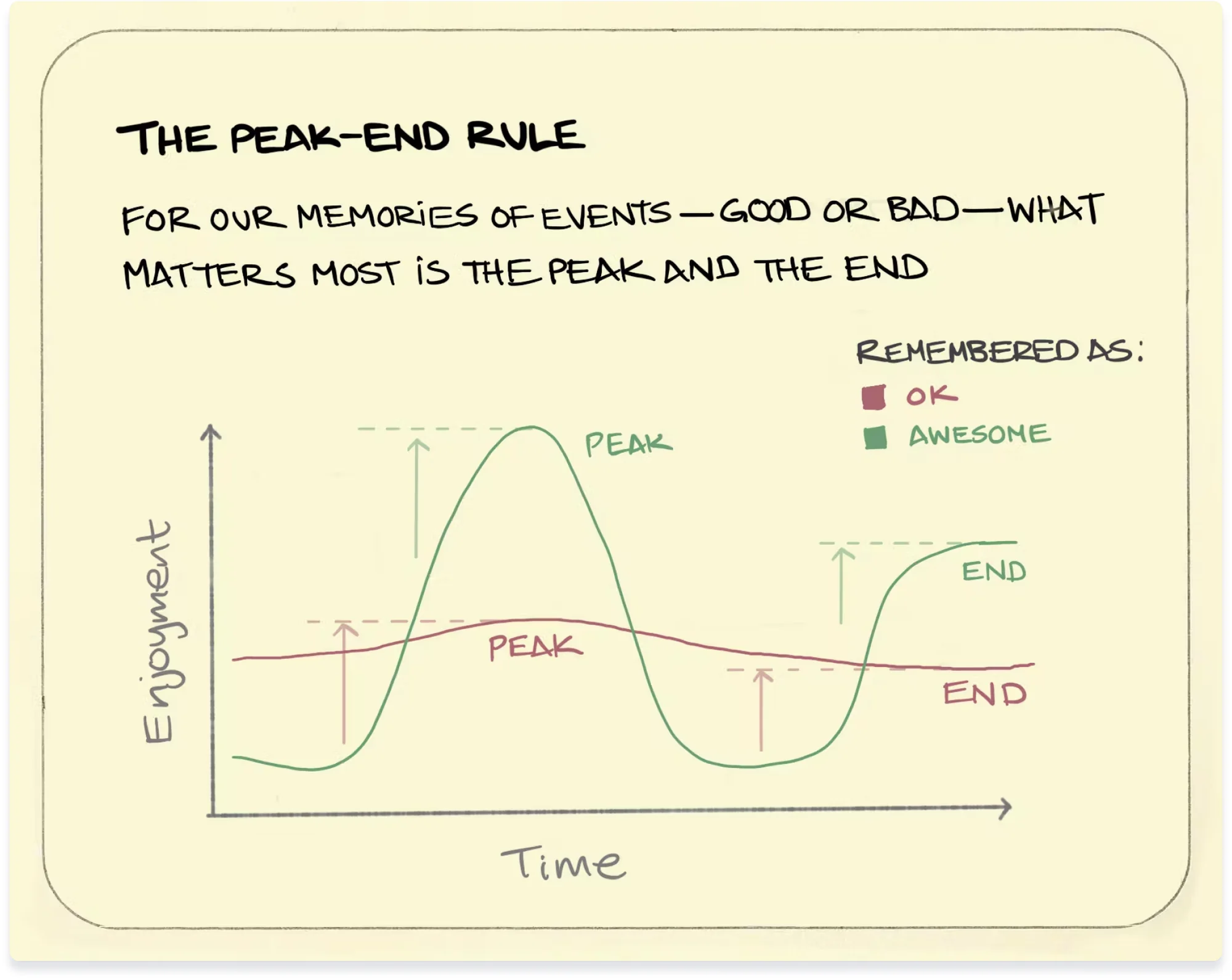
The peak–end rule is a psychological heuristic in which people judge an experience largely based on how they felt at its peak (i.e., its most intense point) and at its end, rather than based on the total sum or average of every moment of the experience. The effect occurs regardless of whether the experience is pleasant or unpleasant. This is closely related to duration neglect & extension neglect.
Deep Dive
Understanding Data Flow:
This involved roughly understanding how the flow of data actually worked on frontend and backend: how data was sent by the user, calculated/processed by the system, and sent back to the user for display. Most of this involved a lot of engineering technicality, however the main intention to have a rough idea in mind in order to come up with well-designed solutions that actually worked.
Analytics API > Columns API > Ranking API
More context has not been provided as the specific data flow is confidential.
Key Issues Identified (Design & Engineering)
Key issues were identified along both design and engineering lines.
- Screener doesn’t feel like a spreadsheet, viewing experience is mixed with working experience
- Once data is loaded, viewing experience should be smooth and seamless (load once, view as many times as possible)
- Scroll not smooth - generally feels rougher around the edges of loaded data
- Loading State appears again on scrolling upwards
Key Perception Issue: Loss of User Control
“A watched kettle never boils” - Proverb
Based on our research, we discovered that the root cause of the perceived slowness in performance was not necessarily an engineering or data processing issue - although those also did contribute.
The major problem was that the user was being forced to wait on the page for multiple times in a single session, which contributed to this annoyance and frustration with the interface. Having a blocked-out screen during the loading state made the user feel powerless and as we concluded from our heuristics, these loading times interrupted the users’ seamless flow of thought and broke their concentration.
Solutions
We came up with a series of design and engineering solutions that would improve user experience and avoid perceptual issues.
Improved Loading Experience
Loading state for bottom 4 rows; Allow user control; No double loading
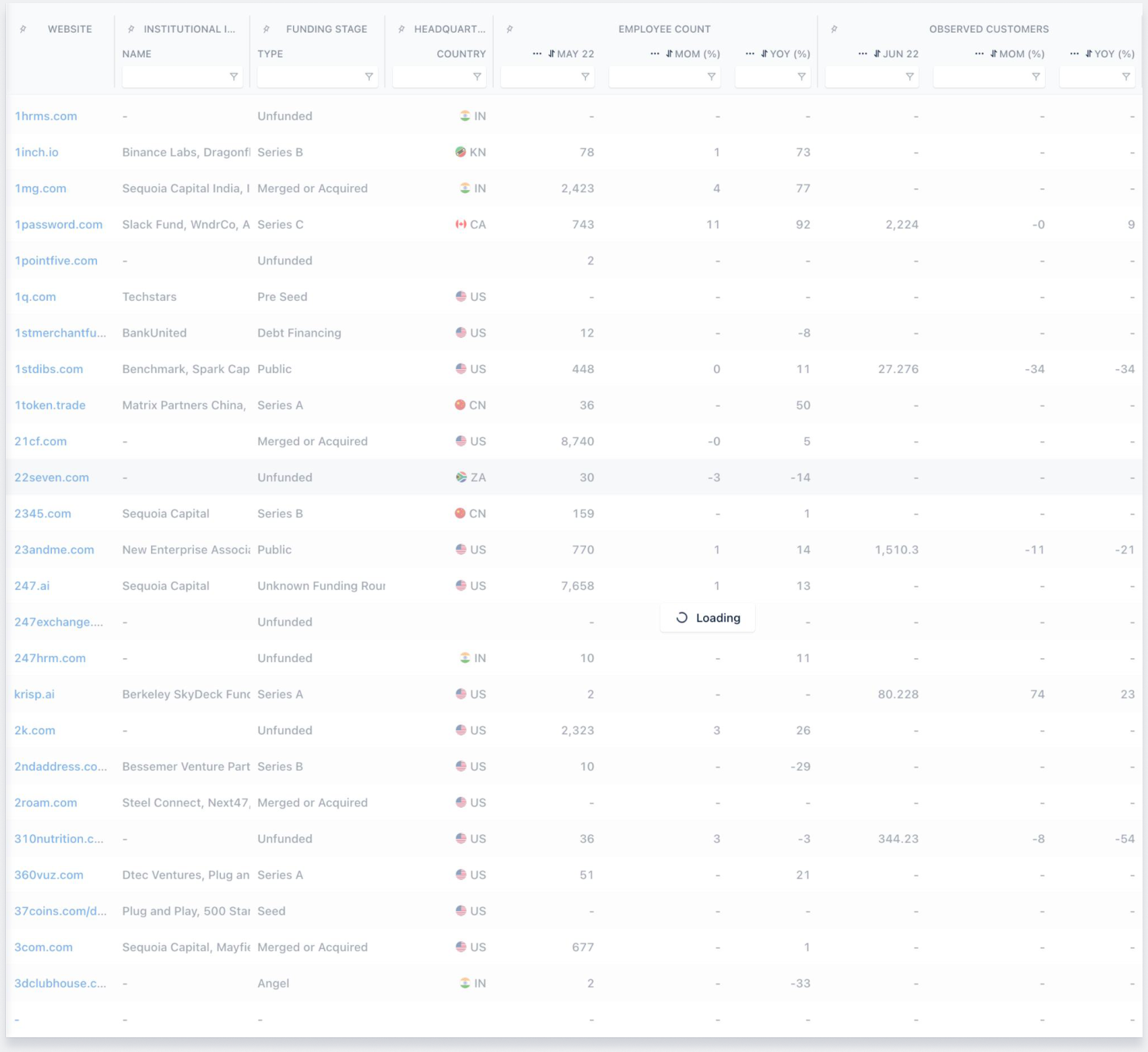
Current Situation
Proposed Solution
- On opening, screener to have a single loading state - Loading text to not appear and disappear repeatedly
- On scrolling, screener to have an analytics-like loading experience (row loading) for bottom 4 rows, rest of the screen to stay unblocked and interactive
- Loading state skeleton screen to match the structure of the actual table (columns & rows should align)
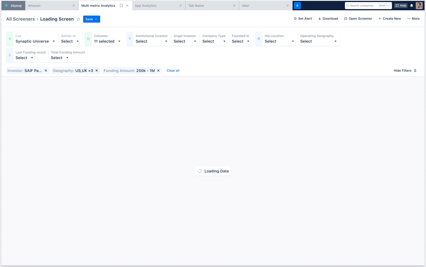
Loading screen on first load
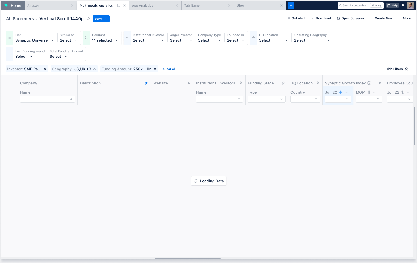
Loading screen on filter change
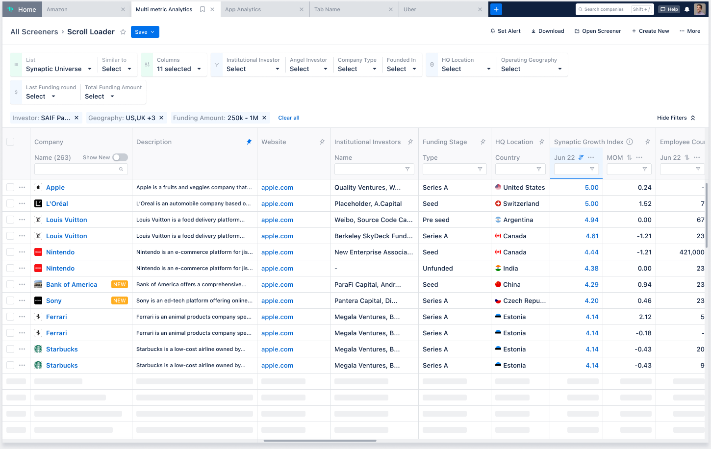
Loading screen on scroll
Visual/Micro-interaction changes: No hover during scroll
A laggy hover state for rows exacerbates the perceived slowdown; removing the row hover state during scrolling totally bypasses this issue
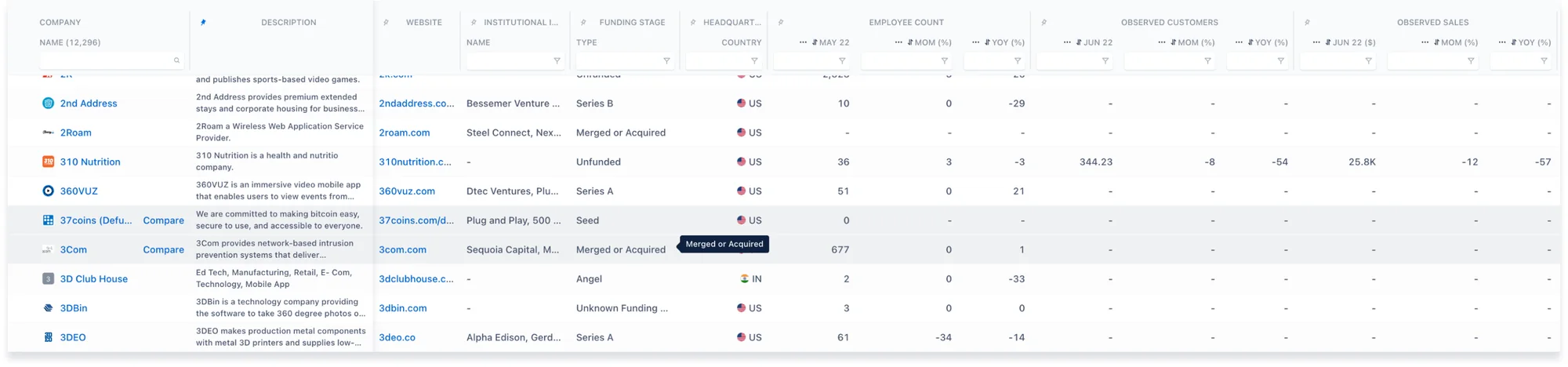
Current Situation
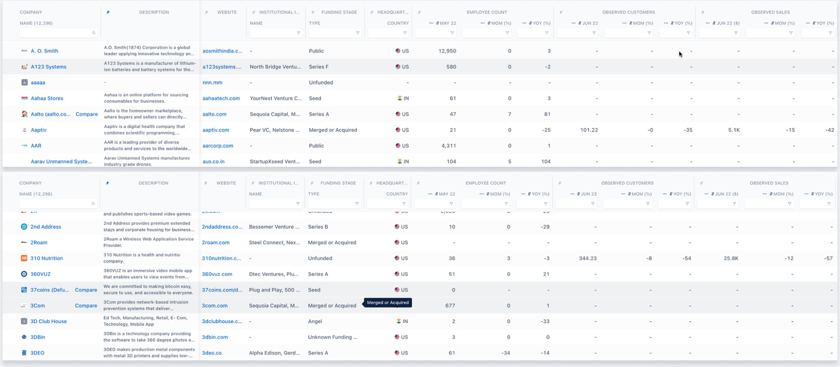
- A laggy hover state for rows exacerbates the perceived screener slowdown
- Proposed solution: No hover state when user starts scrolling, hover state to be activated again only on cursor movement (Reference: Airtable)
Visual changes: Row Styling
Banded rows add an extra jarring illusion thereby aggravating the perceived slowdown effect

Stepping Feet Illusion
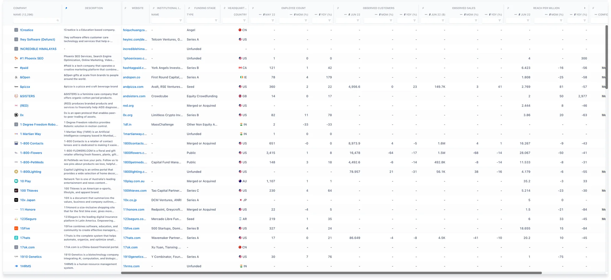
Current Situation
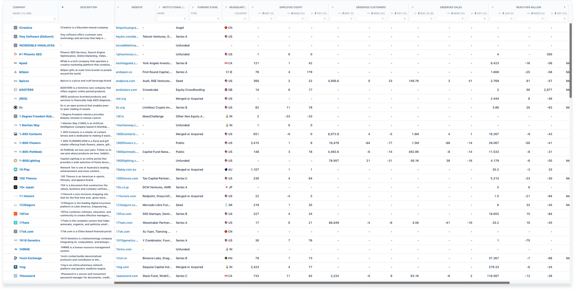
Proposed Solution
Header Row

- Visual styling changes
- Headquarter Location renamed to ‘HQ Location’
Content Rows

Row height = 33 px
- Row height reduced to 33px to increase information density
- Alternate row banding removed
- Darker borders provided for rows
Padding
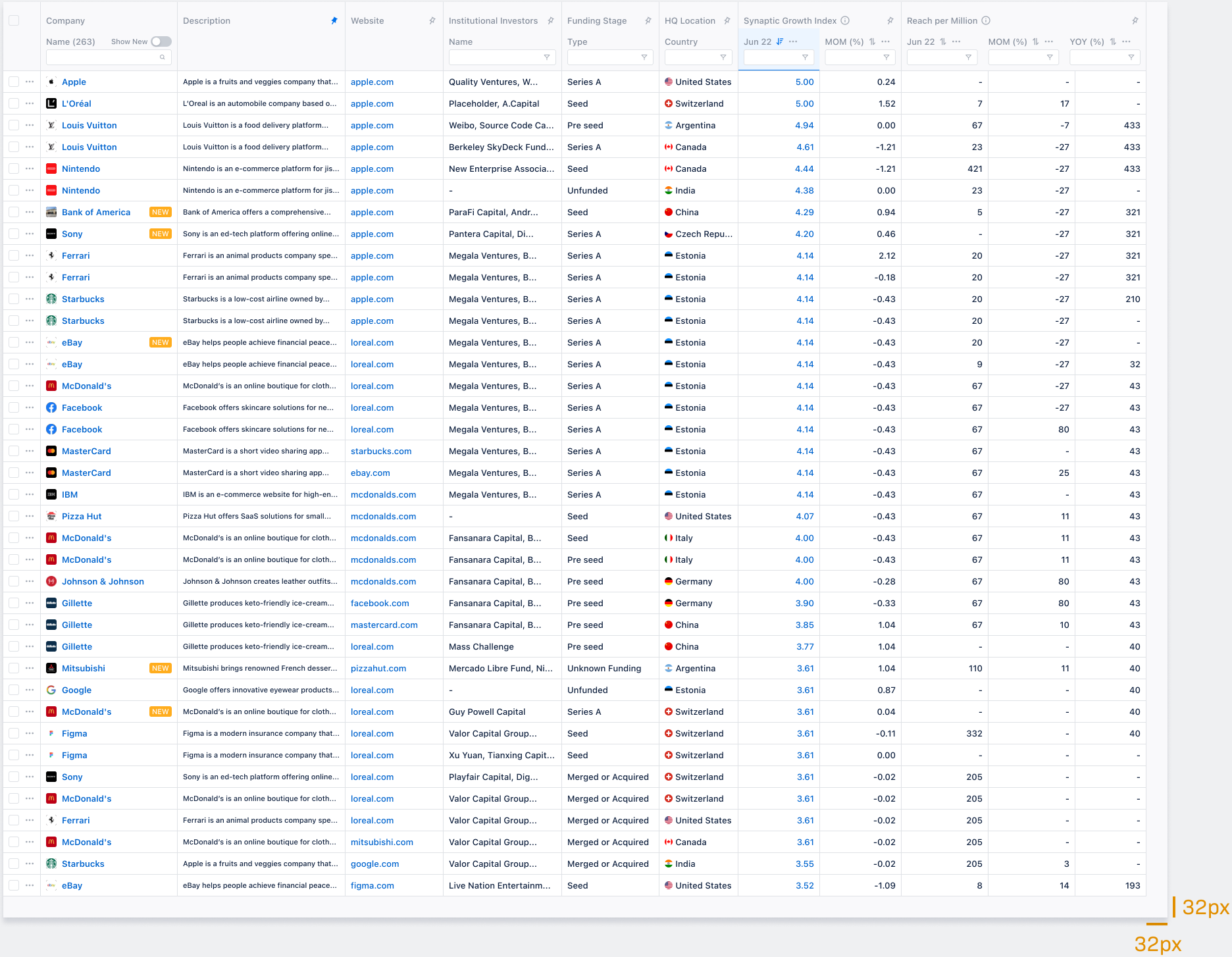
32px right and bottom padding
- Extra right and bottom padding around table to provide better visibility/readability to last column/row
- Provides a sense of ending to the table
Hover State

Selection State

Table Redesign
Overall changes
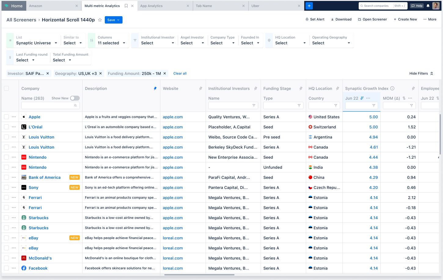
Horizontal scroll
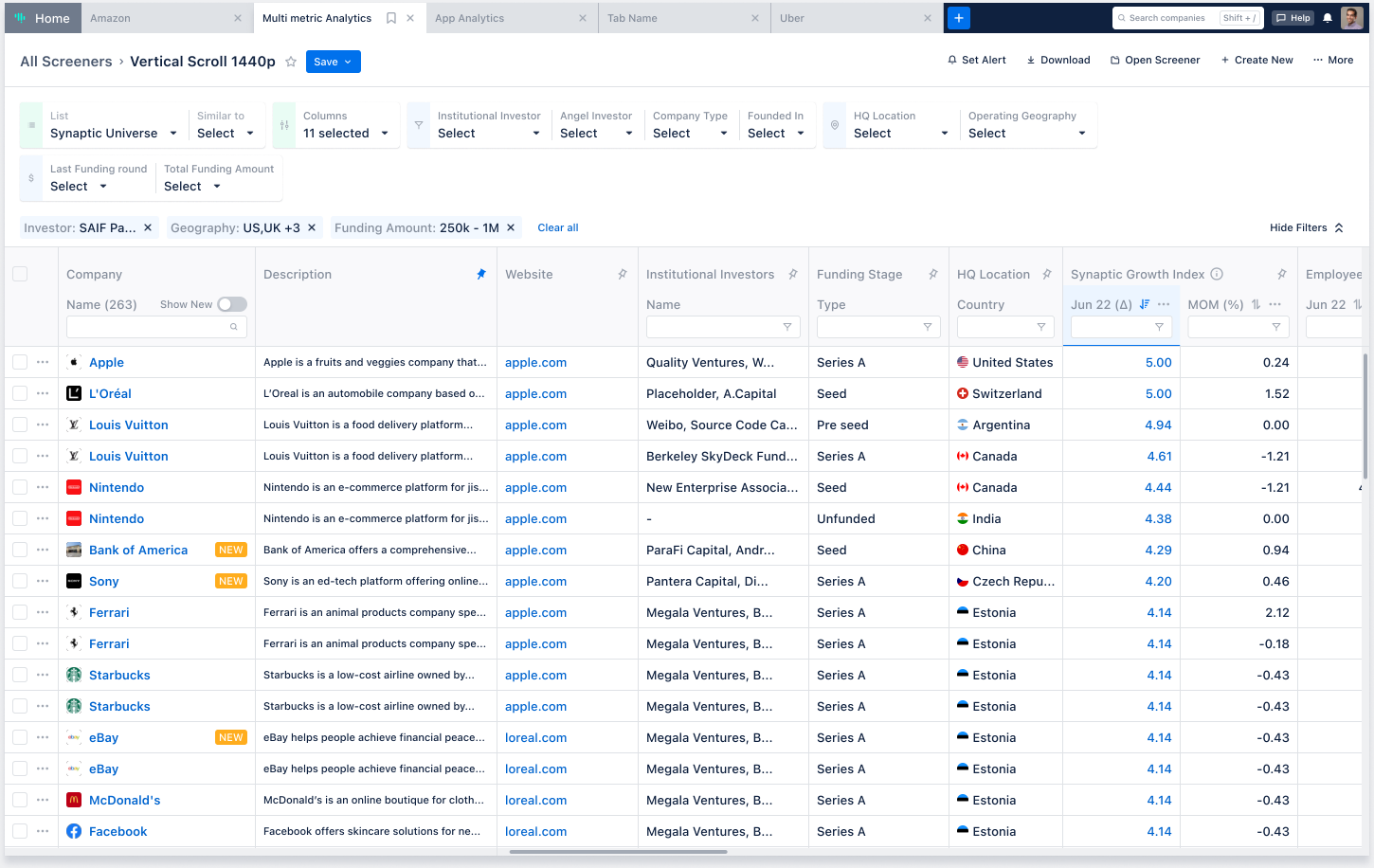
Vertical scroll
- Row styling redesign
- Header visual changes
- Column specific design changes
- Extra right and bottom padding around table
Column Redesign
Column specific changes
Company Column
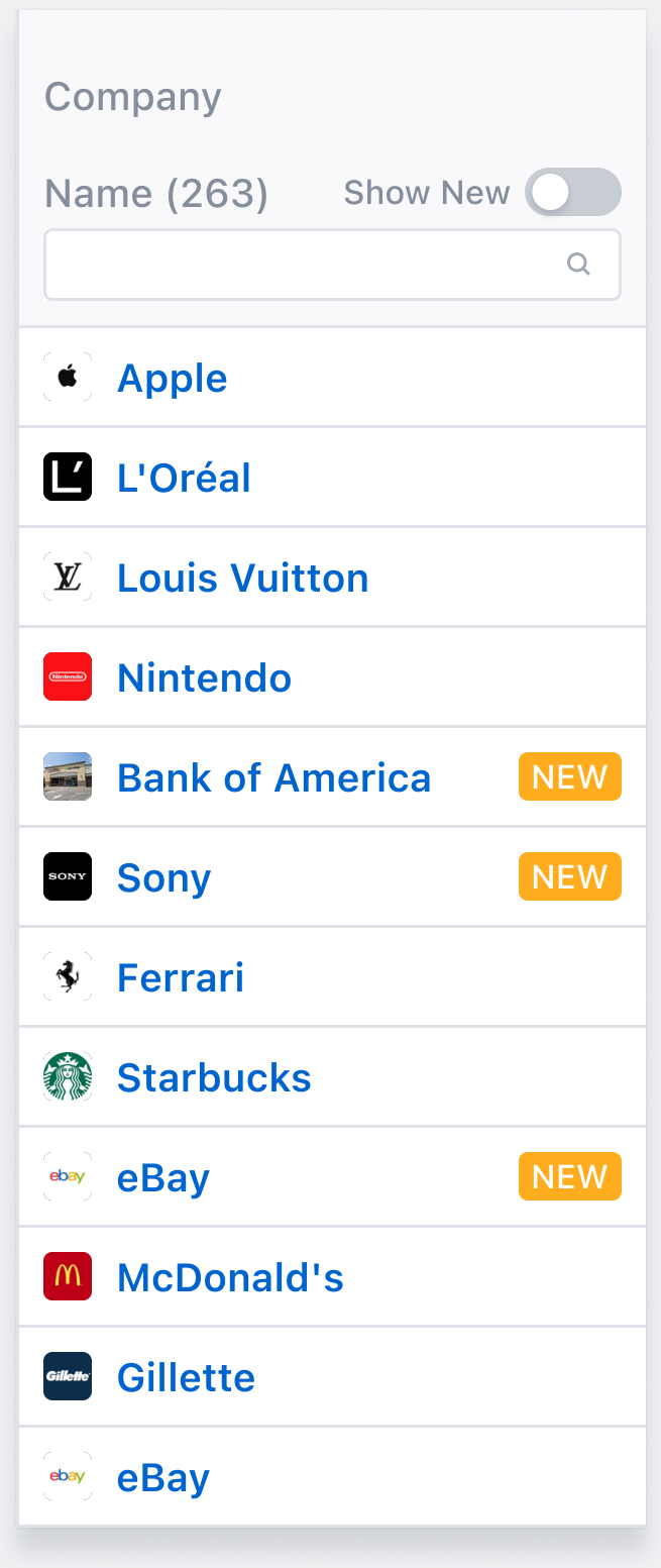
- Compare button moved to actions column
- Peek to appear on Hover (as before)
- New tag to appear (as before)
Actions Column
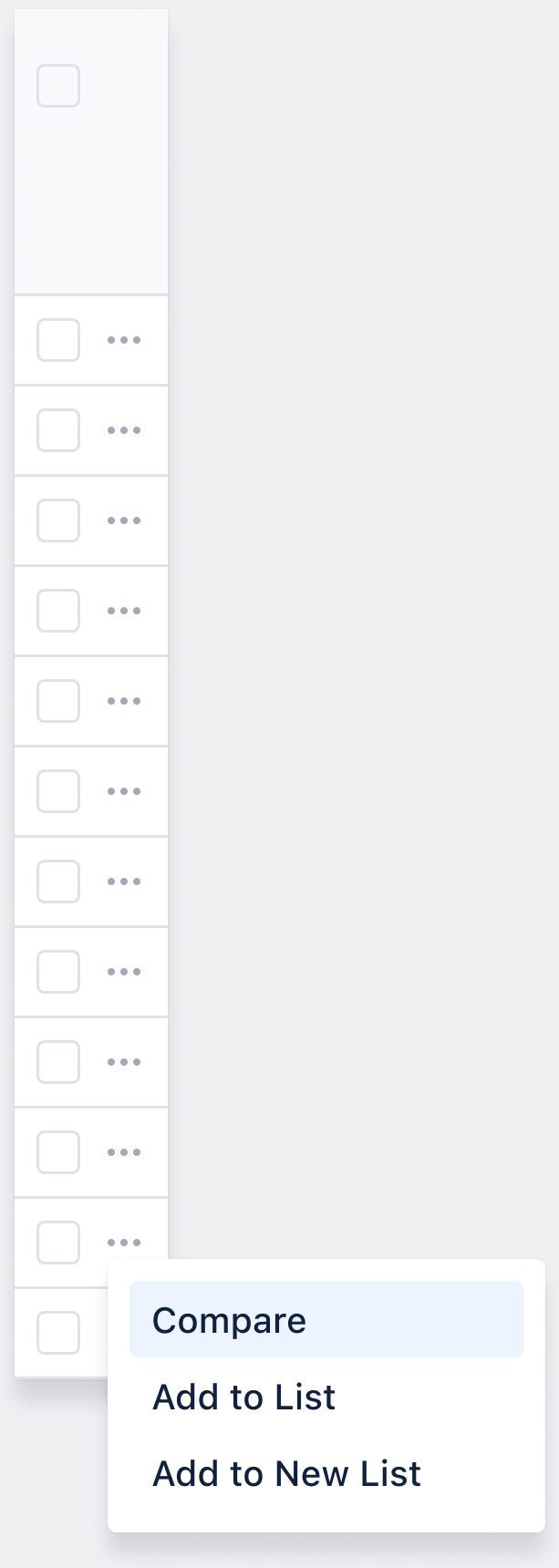
- Single actions support provided by ellipses (...) button next to checkboxes
- Dropdown menu on clicking this button to show Compare, Add to List, Add to New List actions
- More actions can be provided too in the future - Follow, Remove from List, Exclude etc.
Description Column
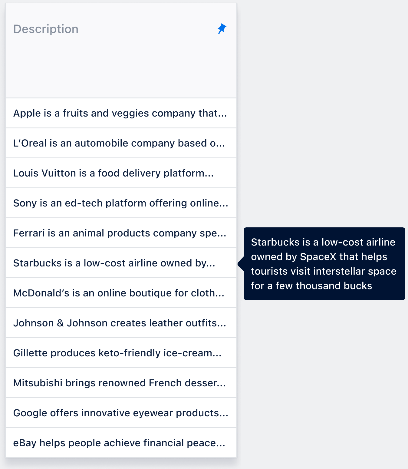
- 11px font; Single line text (truncated with ...)
- CSS tooltips to be provided on hover to show complete text
Headquarter Location Column
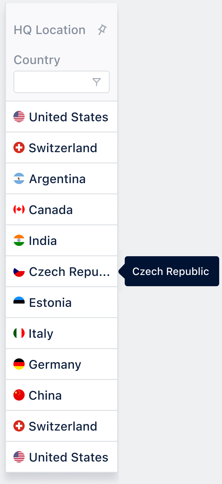
- Column to be renamed as ‘HQ Location’
- CSS flags + Full country name to be shown
- CSS Tooltips to be provided on hover to show truncated country names (where applicable)
- Min. width of column to be 120px
Tooltips
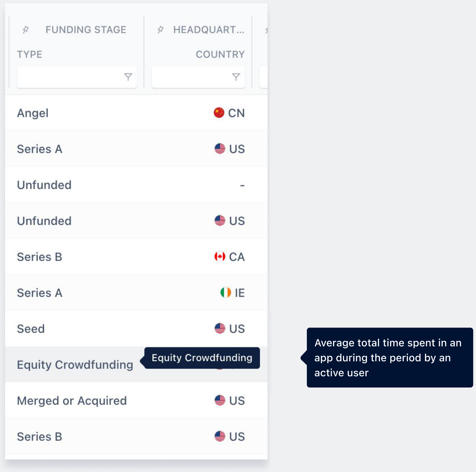
- CSS Tooltips to be used instead of custom Tuxedo tooltips
- Tooltips to match existing design as closely as possible (text, colours, padding, beak etc.)
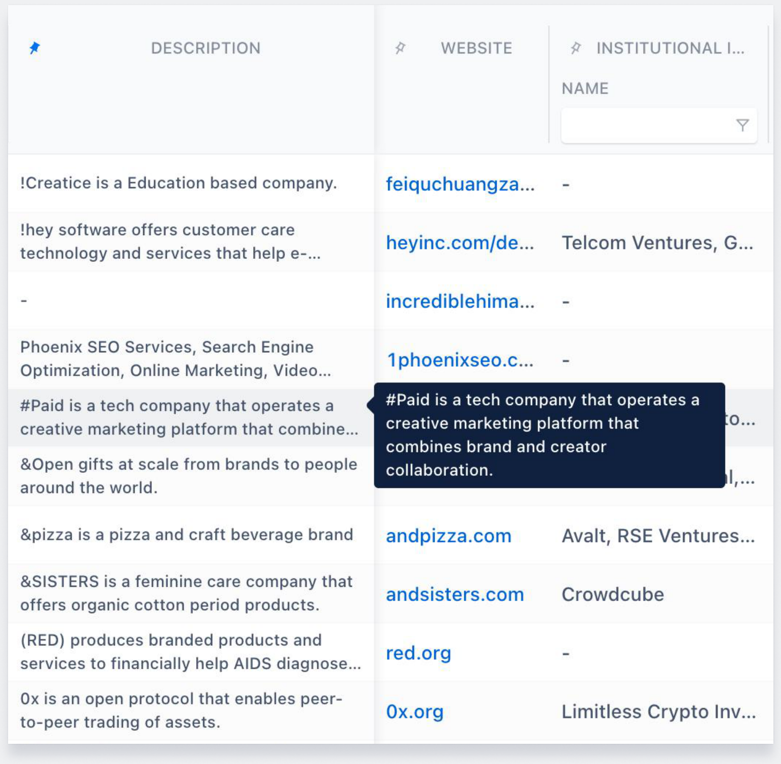
Existing tooltips
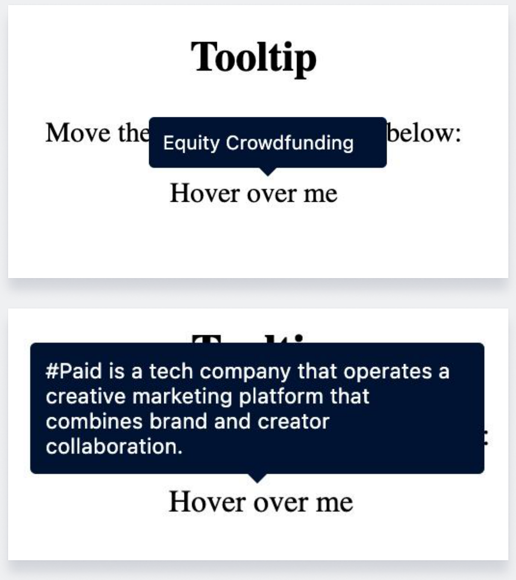
CSS tooltips
Numeric Columns
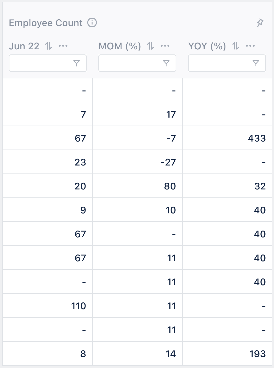
- Width of each sub-column in numeric columns to be 124 px (default; minimum)
Miscellaneous: Company Column Logos

Default logos (in case of missing logos)
Scrolling Experience
Interaction improvement
Pinned Columns
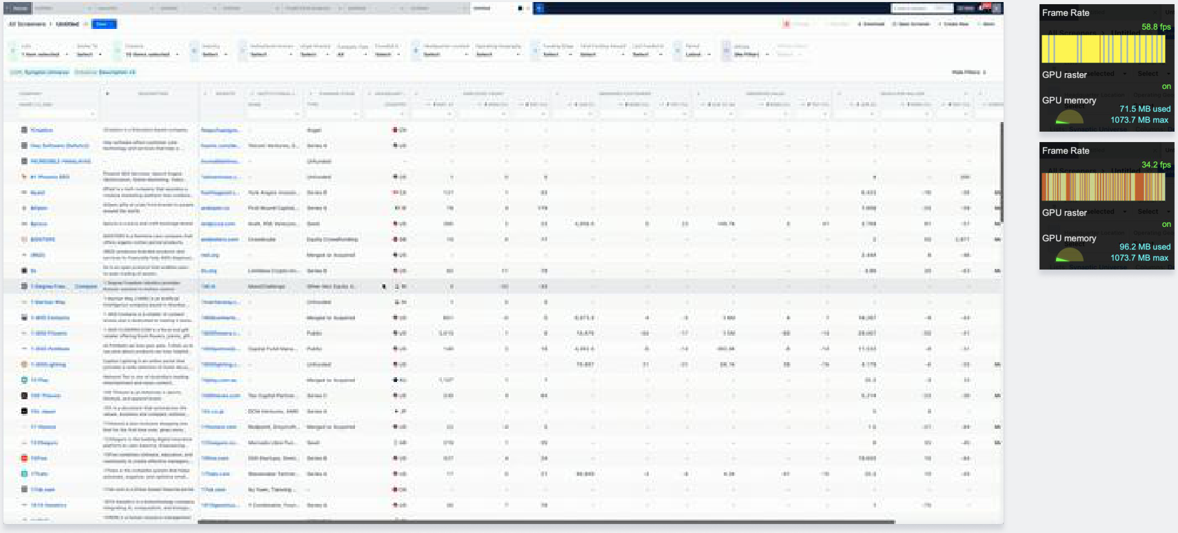
- When columns are pinned (by user or by default), scrolling experience becomes jittery
- Vertical scrolling (eg. on Chrome) is laggier when cursor is on unpinned columns and smoother when cursor is on pinned columns
- Horizontal scrolling (eg. on Safari) causes the header row to visibly lag behind the rest of the table making the screener feel slow and laggy
- All this makes the screener feel a lot more unresponsive and slower than it actually is
- Solution unknown
No Back/Forward on Horizontal Scroll
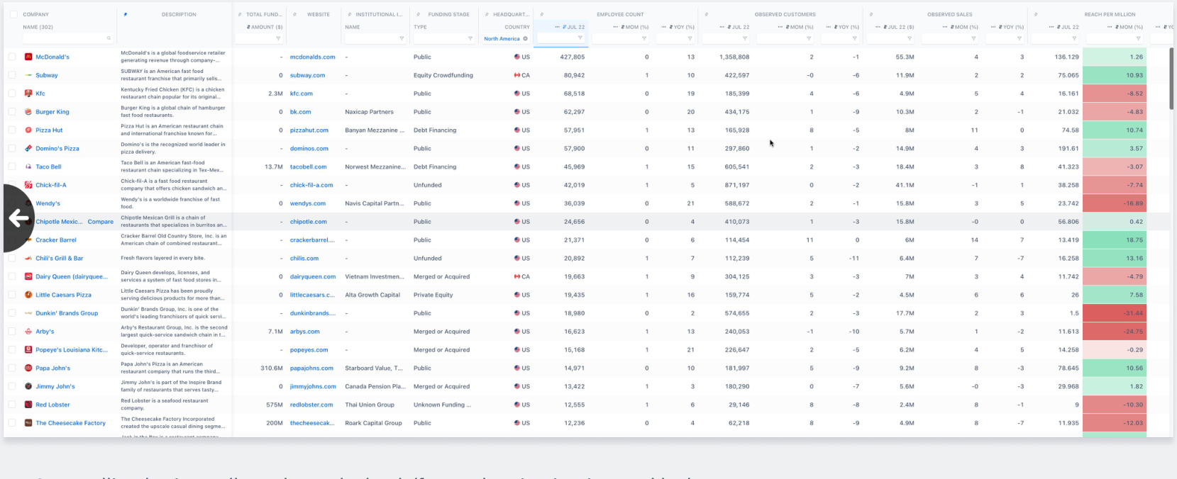
- On scrolling horizontally to the ends, back/forward action is triggered by browser
- This action is triggered unintentionally many times causing usability issues and therefore should be disabled on screener
Preventing Redundant API Calls
Avoid unnecessary delays - save time
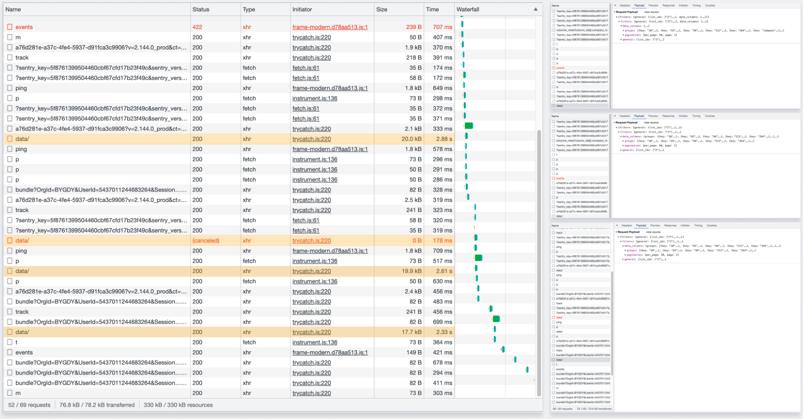
- Multiple Ranking API (data) calls takes up extra time - nearly doubling the time the screener takes to load
- Preventing this becomes critical to a faster screener experience